Figures & data
Figure 1. Schematic illustration of the EnKPF. Upper left: Background ensemble (blue dots) and observation (red dot). Upper right: Intermediate analysis distribution (Equation3
(3) ). Each ellipse covers 50% of one component in the mixture. Lower right: Final analysis distribution Equation (Equation6
(6) ). Ellipses again represent 50% of each component, and the colour intensity represents the weights
. Lower left: Analysis sample obtained by drawing from Equation (Equation6
(6) ). The mixture component closest to the observation has been resampled three times, while the two components farthest away have been discarded.
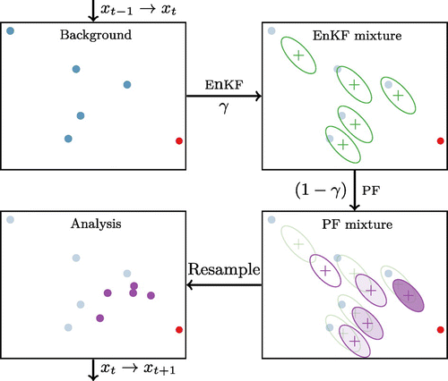
Figure 2. Illustration of the assimilation of one observation (red cross in panel (a)) with the BLOCK-LEnKPF. Each particle is shown in a different colour, the dotted lines being the background and the solid lines the analysis. In panel (b) is updated while
is unchanged. In panel (c) we see how the update in
makes a transition between
and
. For the orange and green particles, which are not resampled in
, the analysis has to bridge between two different particles by relying on Gaussian assumptions as described in Appendix .
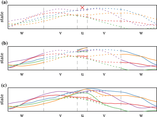
Figure 3. Typical example of the modified SWEQ model with artificial radar observations (red dots) and critical values (,
and
) as dashed lines.
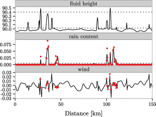
Figure 4. Typical example of analysis ensembles for the rain field after 1 h of high-frequency observations assimilation. Each of the red line is one ensemble member. On top is the LEnKF, followed by the NAIVE-LEnKPF and the BLOCK-LEnKPF.
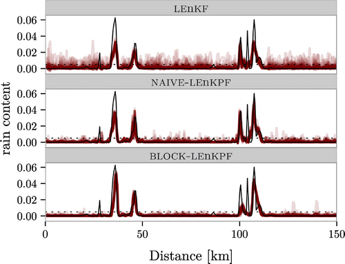
Figure 5. Evolution of the CRPS in the first hour with high-frequency observations. The value is given as a percentage relative to a free forecast run. Notice the truncated y-axis.
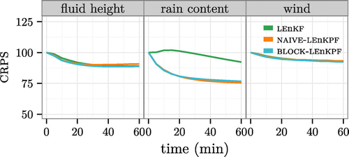
Figure 6. Evolution of the CRPS (relative to a free forecast run) for the fluid height and rain fields in the first 6 h with high-frequency observations. It becomes obvious that after the first initial improvement, all algorithms deteriorate in terms of their ability to capture the underlying fluid height. Notice the truncated y-axis.
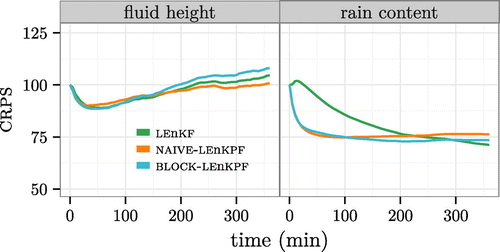
Figure 7. Rank histograms computed at one-step ahead forecast for the BLOCK-LEnKPF in the high-frequency observations experiment. Only every 10 grid points and every 30 min are used to increase independence between observations.
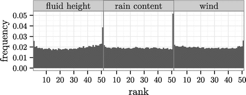
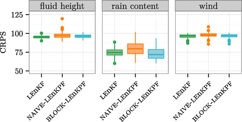
Figure 8. Low-frequency observations assimilated for a period of three days. Boxplot of the CRPS for the different algorithms and fields considered. The values are given relative to a free forecast. Notice the truncated y-axis.