Figures & data
Fig. 1. (a) Location map for Ny Ålesund (b) Daily temperature and Precipitation at Ny Ålesund during December 2015. Thickest purple (solid/broken) line indicates air temperature/longterm daily mean. Precipitation from Micro Rain Radar is represented by the thin blue line and thick brown line indicates snow bucket measurement of precipitation (www.eklima.org).
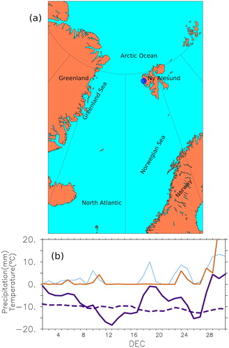
Fig. 2. 5-Day averaged SLP (contours (hPa)), Winds (vectors) north of 40 N and air temperature (a) 1–5 December, (b) 6–10 December, (c) 11–15 December, (d) 16–20 December, (e) 21–25 December, (f) 26–31 December. Latitude circles are at 25-degree intervals, while meridians are drawn at 60 degree intervals. The colour map indicates air temperature (°C)W.
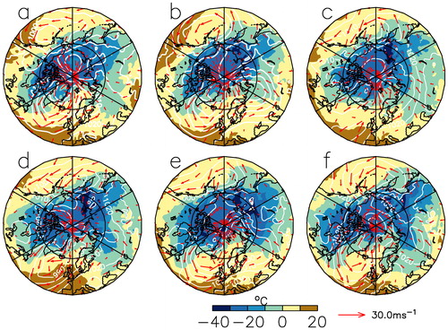
Fig. 3. Rossby wave activity flux computed as Takaya and Nakamura (Citation2001) for (a) 28 December 2015 and (b) 29 December 2015 AT 250 hPa. Wave trains emanating from western Pacific seen during both the days. Here daily geopotential height anomalies and monthly mean winds are used to derive the flux. Shading represents geopotential anomaly.
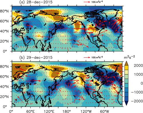
Fig. 4. Wheeler Hendon diagram depicting phases for MJO during DJF of 2015–16. Brown, blue, green lines represent phases of MJO during December, January and February, respectively.
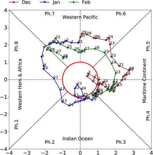
Fig. 5. Heat (×10-4 °Cs−1)and moisture advection (×10-8 kg kg−1 s−1) averaged over the region 10°W to 10°E and 60 to 80°N during December 2015 integrated over 1000 to 700 hPa.
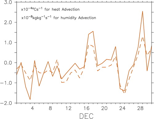
Fig. 6. Spatial patterns of EOF of seasonal (DJF) SLP anomalies in the region 40–90 N. (a) For the first mode (explains 33% of the variance) and (b) second mode (explains 17% of the variance). (c) Time series of EOF-1 and (d) EOF-2. The dashed line in (c) and (d) represents AO and Nino3 SST anomalies respectively. The correlation between AO time series of EOF-1 is –0.9 while the correlation of Nino3 SST anomalies with time series of EOF-2 is –0.7.
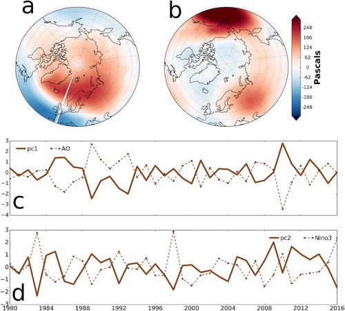
Fig. 7. DJF time series of (a) Precipitation (mm) and (b) Temperature (°C) observed at Ny Ålesund from 1979 to 2016. The lower panel (c) indicates NINO3 SST anomalies. The dots in the line indicate NINO3 SST anomalies greater than 0.5 C. It can be seen that some of the strongest precipitation and temperature occurred during La Nina years.
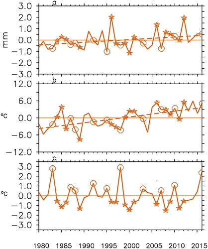
Fig. 8. Composites of SLP anomalies during positive (a,c) and negative (b,d) temperature (a,b) and precipitation (c,d) anomalies in Ny Alesund. The composites are constructed for years when temperature/precipitation anomalies were positive and negative during La Nina and El Nino respectively. Contours represent regions of significance at 95% confidence level.
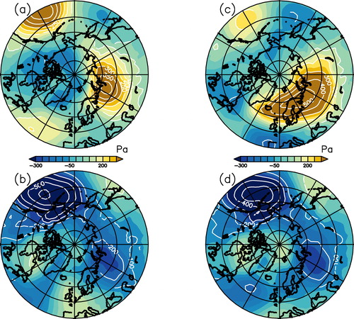
Fig. 9. Composites of temperature advection at 1000 hPa during positive (a) and negative (b) temperature anomalies in Ny Ålesund. The composites are constructed for years when temperature anomalies were positive and negative during La Nina/El Nino respectively. Contours represent regions of significance at 95% confidence level.
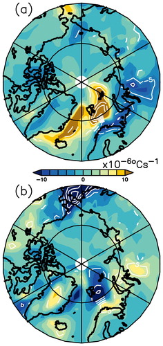
Fig. 10. Composites of specific humidity advection at 1000 hPa during positive (a) and negative (b) precipitation anomalies in NyÅlesund. The composites are constructed for years when precipitation anomalies were positive and negative during La Nina/El Nino respectively. Contours represent regions of significance at 95% confidence level.
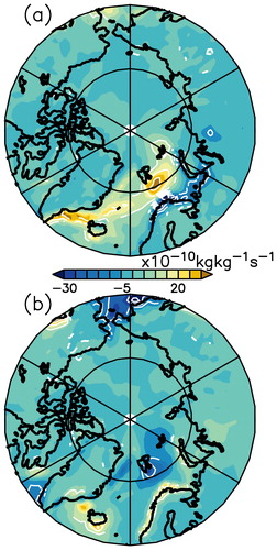
Fig. 11. Wheeler Hendon diagrams for the years of maximum temperature and precipitation .
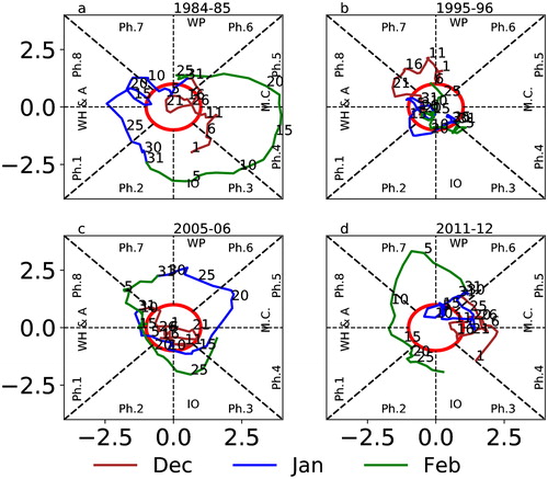
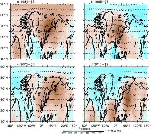
Fig. 12. DJF SLP anomalies north of 40N for 4 years when MJO was active as in . A high pressure anomaly can be noticed in the Northern Europe on all the years. The southerly flow associated with the pressure anomalies direct heat and moisture in to the Ny Ålesund influencing temperature and precipitation.•