Figures & data
Fig. 1. Maps showing (a) the location of Ny-Ålesund (78.93°N, 11.83°E) in Svalbard and the five regions selected for tagged tracer experiments of APO and (b) an enlarged map view of the area indicated by the polygon in the left-hand figure.
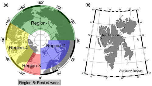
Fig. 2. Temporal variations in (a) δ(O2/N2), (b) CO2 and (c) APO observed at Ny-Ålesund from November 2012 to January 2015. Dots, solid lines and dashed lines represent hourly mean values, the best-fit curve, and the long-term trend, respectively. The results obtained from discrete flask sampling measurements (Ishidoya et al., Citation2012b) are shown by open circles. The vertical axis of APO is scaled 1.5 times compared to that of δ(O2/N2).
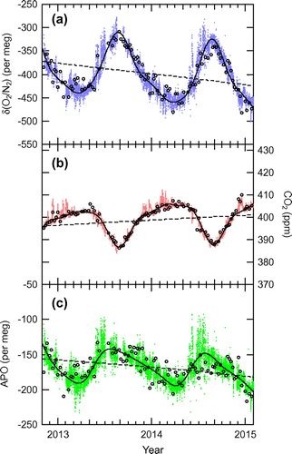
Fig. 3. Comparison of δ(O2/N2) obtained by continuous measurements (δ(O2/N2)daily) and discrete flask sampling (δ(O2/N2)flask) at Ny-Ålesund. Solid and dashed lines represent a linear regression and one-to-one relationship between δ(O2/N2)daily and δ(O2/N2)flask, respectively. δ(O2/N2)daily is the daily mean of continuously measured values for the day when each flask sampling was undertaken.
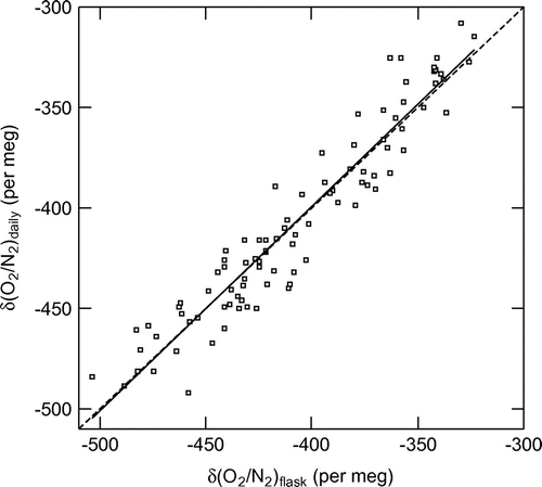
Fig. 4. Seasonal components of APO obtained from continuous measurements (grey dots) for the period of 2013–2014 at Ny-Ålesund, detrended using the digital filtering technique. Black solid line is the best-fit curve of the observed seasonal APO components. Error band (grey shade) represents the uncertainty of the best-fit curve of seasonal APO components estimated by a bootstrap analysis (Press et al., Citation2007). The results of model simulations with two different resolutions (T42 and T106) for the same period with continuous measurements are shown by red and blue solid lines, respectively.
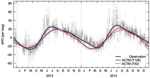
Fig. 5. Temporal variations in (a) δ(O2/N2) and CO2 and (b) APO observed at Ny-Ålesund for the period from 9 May to 29 June 2013. Green arrows marked a-1–a-5 and b-1–b-6 represent the times when air parcels were released for the backward trajectory calculations (see Fig. ). The model-calculated CO2 mole fractions with only air–sea CO2 flux ([CO2]OC, T106) are given in panel (a), and the results of the model APO simulations with both resolutions (T42 and T106) are shown in panel (b). Each value plotted for δ(O2/N2), CO2 and APO was obtained as a deviation from the corresponding best-fit curve shown in Fig. . Grey shaded times represent the time intervals regarded as ‘high APO’, defined as over 10 per meg of ΔAPO, in the backward trajectory calculations (see Fig. ). The vertical axis of APO is scaled 2 times compared to that of δ(O2/N2).
![Fig. 5. Temporal variations in (a) δ(O2/N2) and CO2 and (b) APO observed at Ny-Ålesund for the period from 9 May to 29 June 2013. Green arrows marked a-1–a-5 and b-1–b-6 represent the times when air parcels were released for the backward trajectory calculations (see Fig. 8). The model-calculated CO2 mole fractions with only air–sea CO2 flux ([CO2]OC, T106) are given in panel (a), and the results of the model APO simulations with both resolutions (T42 and T106) are shown in panel (b). Each value plotted for δ(O2/N2), CO2 and APO was obtained as a deviation from the corresponding best-fit curve shown in Fig. 2. Grey shaded times represent the time intervals regarded as ‘high APO’, defined as over 10 per meg of ΔAPO, in the backward trajectory calculations (see Fig. 6). The vertical axis of APO is scaled 2 times compared to that of δ(O2/N2).](/cms/asset/c0b52953-100a-4679-9753-36d732355893/zelb_a_1311767_f0005_oc.gif)
Fig. 6. Ten-day backward trajectories calculated for air parcels released from Ny-Ålesund (yellow star) every 6 h from 9 May to 29 June 2013. Red and blue lines indicate the trajectories for high and low APO, respectively.
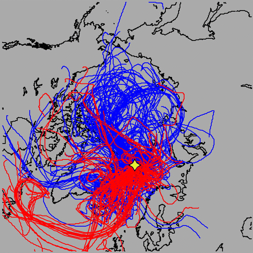
Fig. 7. (a) APO simulated using the ACTM for five tag regions and the total for the period from 9 May to 29 June 2013, and (b) contributions of the respective regions to the total.
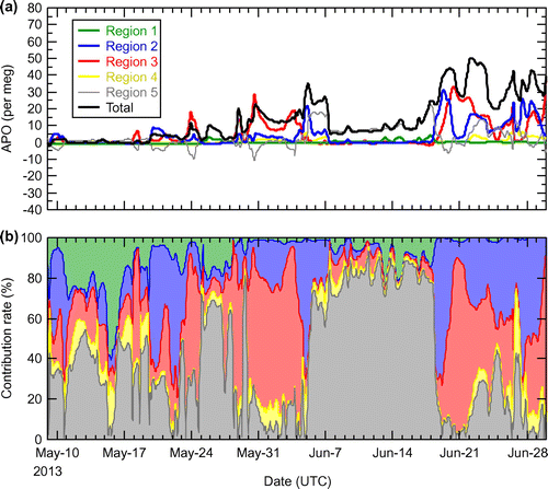
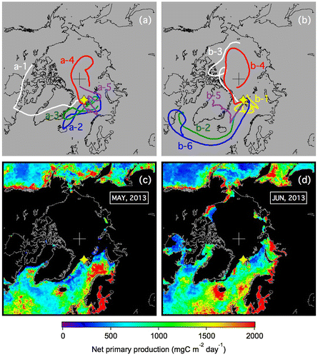
Fig. 8. Ten-day backward trajectories of air parcels released from Ny-Ålesund at selected times as indicated in Fig. a and b and the distributions of monthly averaged marine net primary production estimated using the Vertically Generalized Production Model (c and d) for May and June 2013. The yellow star in each panel represents the location of Ny-Ålesund.