Figures & data
Table 1. Demographics of participants.
Figure 1. Fibrinolytic parameters in LA group and healthy HA group. The 25th–75th quartiles of the data are shown in box plots, with the center lines (—) and solid boxes (▪) representing the median values and mean values respectively. The whisker plots represent 95% CI (2.5%–97.5%). ∗p < 0.05; ∗∗p < 0.01, ∗∗∗ p < 0.001. The differences between LA group and healthy HA group were calculated using two-tailed unpaired Student’s t-test.
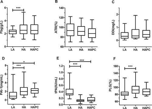
Table 2. Fibrinolytic parameters in healthy HA group and HAPC group.
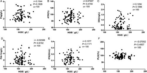
Supplementary Figure 1. No correlation between HGB and fibrinolytic parameters in HA group. Pearson correlation analysis was used. Correlation of HGB with (A) fibrinogen, (B) AT-III, (C) DDi, (D) PAI-1, (E) tPA, and (F) PLG in healthy HA group.