
Figures & data
Figure 1. Fow chart of analysing.
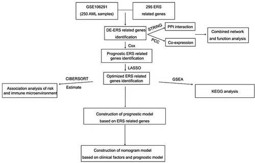
Figure 2. Differential analysis ER-stress-related genes and network construction. (A) Violin plot of 18 ER-stress-related genes between survival and death groups; (B) Significantly differentially expressed ER-stress-related genes integrated network; (C) Histogram of BP, CC, MF and KEGG signaling pathways with significant gene correlation in the comprehensive network.
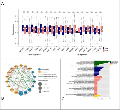
Figure 3. Forest map of ERS-related genes significantly associated with survival outcomes.
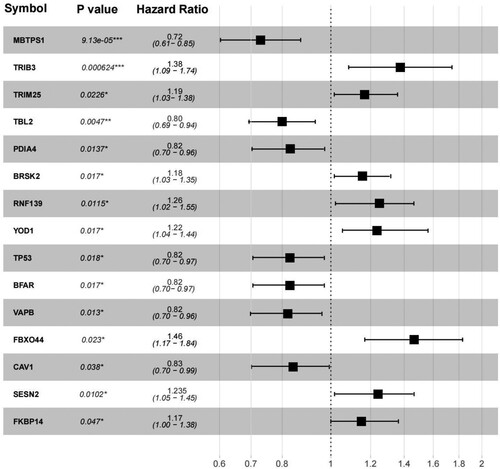
Figure 4. (A) LASSO parameter diagram, the intersection of horizontal and vertical black lines in the following figure is the location of the optimal parameter (−4.501,0.218), and the corresponding gene is the optimal gene combination; (B) LASSO coefficients of 10 genes; (C) 10 Prognostic KM curves of the optimized ERS-related genes.
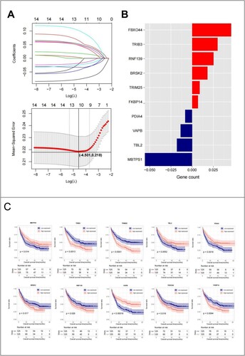
Figure 5. GSE106291 training set: (A) KM curves based on 10 optimized ER-stress related gene prognostic models; (B) RS distribution and survival time status; (C) The ROC curves of 10 optimal ER-stress related gene prognostic models were plotted, and the numbers in parentheses represent the corresponding ROC curves. GSE37642 validation set: (D) KM curves based on 10 optimized ER-stress related gene prognostic models; (E) RS distribution and survival time status; (F) The ROC curves of 10 optimal ER-stress related gene prognostic models were plotted, and the numbers in parentheses represent the corresponding ROC curves.
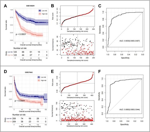
Figure 6. (A) Differential relationship between age clinical traits in risk group; (B) Differential relationship between sex clinical traits in risk group; (C) Differential relationship between runx1 mutation in risk group; (D) Differential relationship between runx1-runx1t1_fusion in risk group; (E) differential relationship between treatment response in risk group.
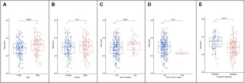
Figure 7. (A) Independent prognostic Mori diagram of clinical prognostic factors; (B) Nomogram of nomogram for survival prediction model with independent prognostic factors; (C) Nomogram (left to right) Consistency plots of predicted and actual survival rates at one、three、and five years. The horizontal axis shows the predicted and the vertical axis shows the actual survival rates;
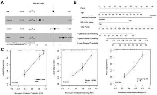
Table 1. Prognostic relevance clinical prognostic factors.
Figure 8. (A) Distribution of 10 immune cells with significantly different distribution in different risk groups; (B) Distribution of the estimated scores in different risk groups; (C) Heat map of correlation between expression levels of 10 DEGs with 10 immune cells, 4 ESTIMATE scores;Scatter plot of the best positive and negative correlations on the side.
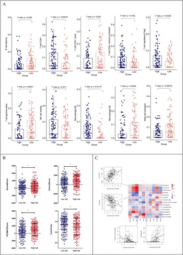
Figure 9. (A) Heatmap of KEGG signaling pathways with significant differences between risk groups; (B) Heat map of the correlation between the quantified KEGG signaling pathways and the expression levels of the 10 genes that constitute the RS model. Scatter plot of the best positive and negative correlations on the side.
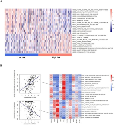
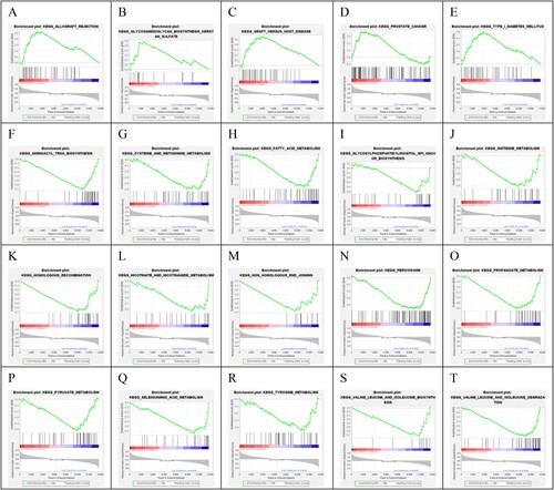
Figure 10. Twenty KEGG signaling pathways were significantly associated with different risk groups.
Supplemental Material
Download MS Word (11.8 KB)Data availability statement
Our data and related clinical information were retrieved from NCBI Gene Expression Omnibus database (GEO http://www.ncbi.nlm.nih.gov/geo/).