
Figures & data
Figure 1. Selecting Flowchart.
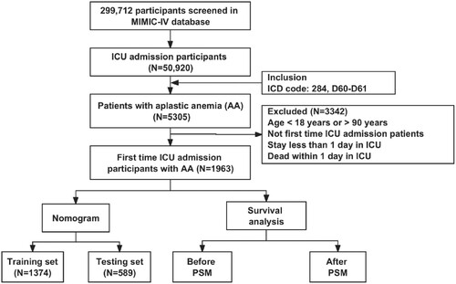
Table 1. Included patients’ characteristics at their initial ICU admission.
Figure 2. Forest plot of univariate and multivariate Cox regression analyses in the training set.
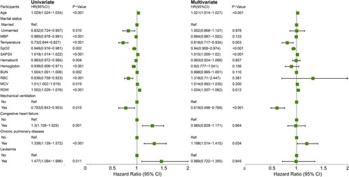
Figure 3. Nomogram for predicting 7-, 14-, and 28-day survival probability in participants. Cyan-colored box sizes represent the relative proportion differences among subgroups. The grey density plot of total points illustrates their distribution.
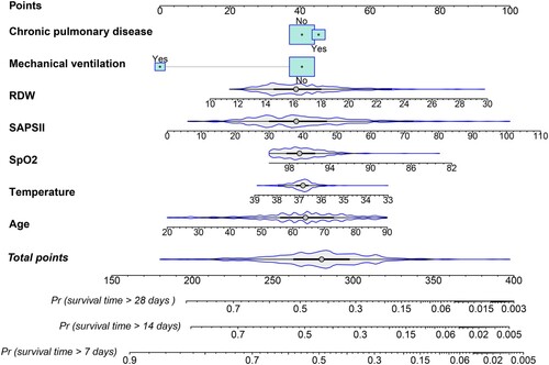
Figure 4. ROC curve analysis for the nomogram in both the training set (A) and testing set (B), with consistent variables included.
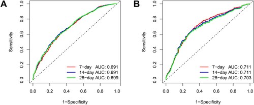
Figure 5. Calibration curves for the nomograms are presented, corresponding to participants in the training set (A) and testing set (B), respectively. The diagonal line signifies an optimal prediction by an ideal model. The red line represents the original cohort, and the green line indicates bias correction achieved through 500 repetitions of bootstrapping.
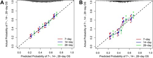
Figure 6. Decision curves for the nomogram illustrate the mortality benefit at 7, 14, and 28 days in both the training set (A) and testing set (B), respectively.
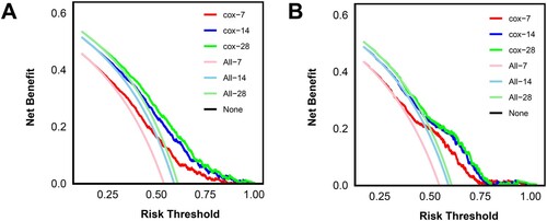
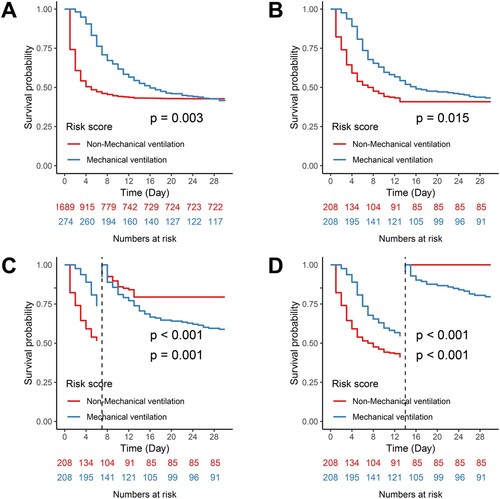
Figure 7. Kaplan-Meier survival curves delineate survival probabilities categorized by treatment measures. A and B correspond to Kaplan-Meier curves before and after PSM, respectively. C and D depict Kaplan-Meier curves after PSM with landmark times set at 7 and 14 days for the cohort, respectively.
Supplementary Tables.docx
Download MS Word (22.1 KB)Supplementary Fig1.docx
Download MS Word (217.4 KB)Data availability statement
The datasets generated and analysed during the current study are available in the [MIMIC-IV] public database.