Figures & data
Figure 1. Scaling and zonation effects on neighbourhood inequality.
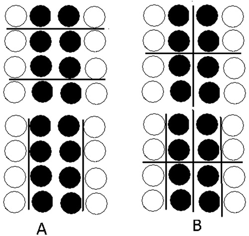
Figure 2. Neighbourhood inequality in Chicago, IL, 2014, versus two counterfactual distributions.
Note: Author analysis of US Census and American Community Survey (ACS) data. Confidence intervals are at the 95% level. (a) NI(F0, d) - NI(F1, d), (b) NI(F0, d) - NI(F2, d).
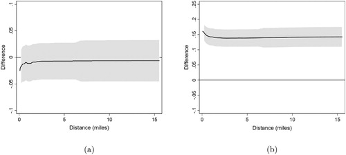
Table 1. Monte Carlo simulations of the size and power of dominance tests for NI curves that are based on the NI index SE approximations.
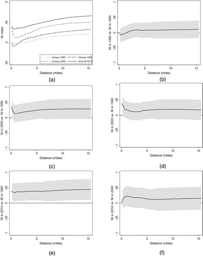
Figure 3. Trends in neighbourhood inequality in Chicago, IL.
Note: Author analysis of US Census and American Community Survey (ACS) data. Confidence intervals are at the 95% level.