Figures & data
Figure 1. Number of countries requiring a workplace for some sectors or categories of workers or all but essential workplaces.
Source: Authors using data from Hale et al. (Citation2020).
Figure 2. Overview of the agent-based model.
Note: Products flow from left to right, whereas orders flow in the opposite direction. Equation numbers correspond to those in the main text.
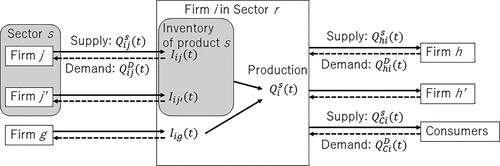
Figure 3. Economic impact of four-week prefectural lockdown of all sectors.
Note: Each cell colour presents the prefectural production loss in the horizontal axis as a percentage of its gross regional product (GRP) because of prefectural lockdowns on the vertical axis. (Readers of the print article can view the figure in colour online.)
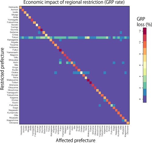
Figure 4. (left) Correlation between the prefectural gross regional product (GRP) and gross domestic product (GDP) loss because of the prefecture lockdown. The horizontal axis presents the GRP of the locked-down prefecture in log, whereas the vertical axis shows the GDP loss caused by the lockdown in log. (right) Correlation between the number of interprefectural links and GDP loss as a result the prefectural lockdown. The horizontal axis presents the number of links connected between the focal prefecture and the other prefectures. In both panels the lockdowns are assumed to restrict all sectors for four weeks. Each label indicates the name of the locked-down prefecture.
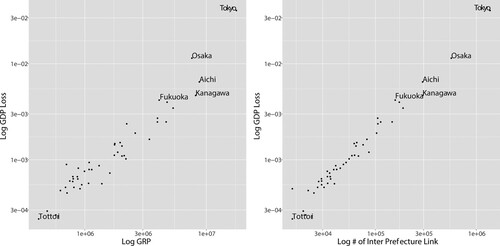
Figure 5. Economic impact of the synchronous and asynchronous lockdown of Tokyo and another prefecture.
Note: Blue and red bars show the average gross domestic product (GDP) loss because of the synchronous and asynchronous lockdown, respectively, of Tokyo and another prefecture shown on the vertical axis over 30 simulations. The lockdowns are assumed to be imposed on all sectors for four weeks. The black segments indicate the standard errors of GDP loss.
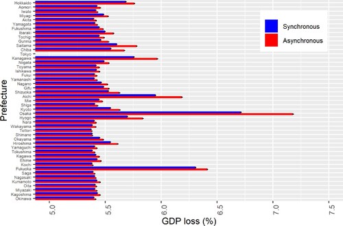
Figure 6. Relationships between the difference in gross domestic product (GDP) loss between the synchronous and asynchronous lockdowns of all prefecture pairs and their selected characteristics.
Note: The vertical axis shows GDP loss from the asynchronous lockdowns of two prefectures less the GDP loss from their synchronous lockdowns as a ratio of the sum of their gross regional products (GRPs). The horizontal axes in the left, middle and right panels show the number of supply chain links between the two prefectures in logs, the distance between the two prefectural capitals in logs, and the sum of GRP of the two prefectures in logs, respectively.
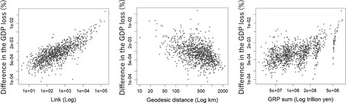
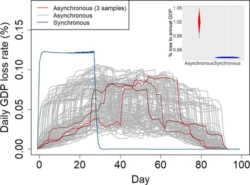
Figure 7. Gross domestic product (GDP) losses because of the synchronous and asynchronous lockdowns of all prefectures.
Note: The vertical axis shows the loss in daily GDP, that is, the daily GDP in the pre-COVID-19 period minus the daily simulated GDP assuming the synchronous (blue lines) or asynchronous (red and brown lines) lockdowns of all prefectures, divided by the daily GDP in the pre-COVID-19 period. The horizontal axis shows the number of days from the lockdown start. The synchronous lockdowns are imposed on all sectors in all prefectures simultaneously for four weeks at the beginning of the three-month period. The asynchronous lockdown in each prefecture is imposed on all sectors for four weeks from a randomly selected initial date during the three-week period. We run 30 simulations in the case of the synchronous lockdowns, changing the inventory size of each firm, and 100 simulations in the case of the asynchronous lockdowns, additionally changing the lockdown timing for each prefecture. The inset shows the violin plot of the GDP loss from the synchronous (blue) and asynchronous (red) lockdowns. (Readers of the print article can view the figure in colour online.)