
Figures & data
Figure 1. Flowchart of methodology.
The figure shows how the different building blocks integrate with the NiReMS model: Spatial models create a path for labour outcomes (wages and employment), the life-cycle dynamic microsimulation model is used to ensure that economic agents consumption and labour decisions are optimal, and static microsimulation is used to simulate households' non-structural decisions and outcomes.
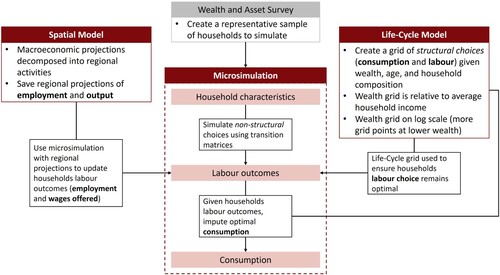
Figure 2. UK: GORs (ITL 1 regions) and estimated spatial structure.
The identified sparse structure of the English regions and the devolved nations. There is a clear, core-periphery structure identified with London being the centre.
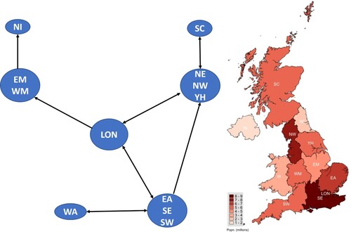
Table 1. Utility function parameters.
Table 2. Microsimulation algorithm.
Figure 3. Wage dynamics.
The average wages of the different regions over the simulated time-frame for the macroeconometric model and 2 microsimulated samples. The ‘loose’ microsimulation gives consistently lower wage dynamics. The ‘tight’ microsimulation is closer to the macroeconometric projection, but even there the simulated path is below the macroeconometric model in the medium-run.
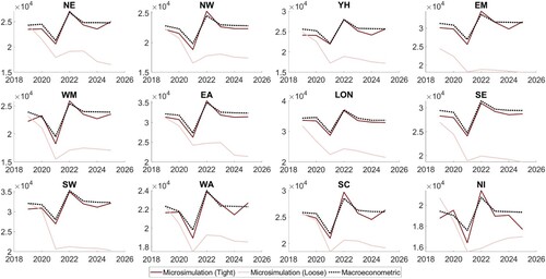
Figure 4. Consumption densities for low asset households per region (consumption £’000s).
Consumption densities for the different regions show that the impact of no UC benefit uplift extension has a non-uniform impact on the regions: low asset households in the North East, Yorkshire and the Humber, Wales, and Northern Ireland were hit particularly hard, with significantly more households pushed into consumption of £5000 per annum or less.
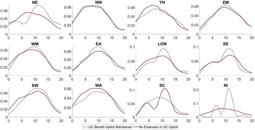
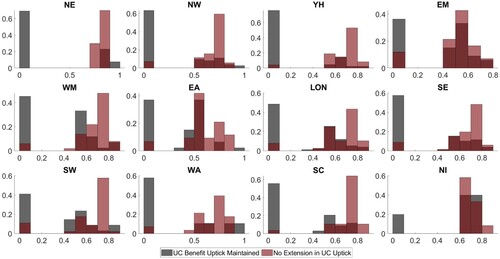
Figure 5. Labour choice histogram for low asset young adults per region (proportion of time compared to highest Labour hour).
Labour choice histograms for the different regions show that without the additional welfare support in maintaining the UC uplift, young adults’ labour hours shift upwards dramatically across all regions, highlighting that they are more likely to be pushed into full-time work.
Supplemental material