Figures & data
Figure 1. Life satisfaction in 2003 and 2021. Lighter shades denote higher life satisfaction.
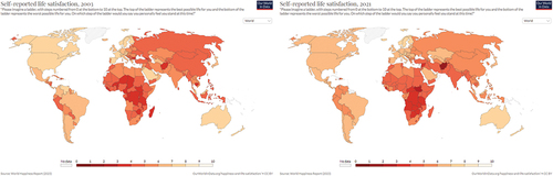
Figure 2. Happiness in 1998 and 2014. Darker shades denote higher happiness.
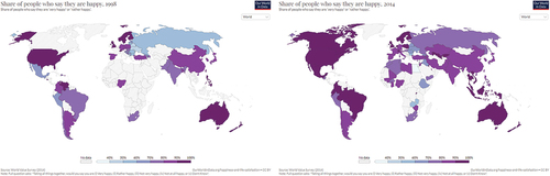
Figure 3. Depression from 1998 to 2019.
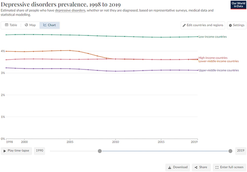
Figure 4. Suicide rates aggregated for entire world from 1998–2019.
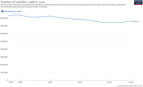
Figure 5. Anxiety in 1998 and 2019. Darker shades denote higher anxiety.
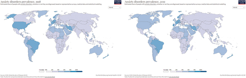
Figure 6. Alcohol use disorders aggregated across the world, 1998–2019.
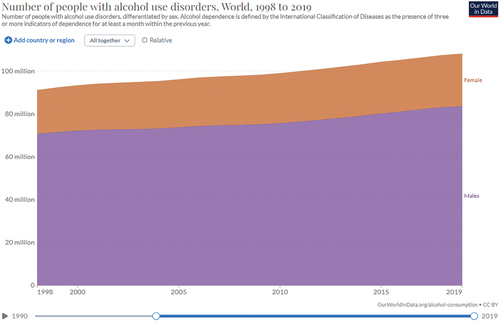
Figure 7. Democratic culture index compiled by the Economist Intelligence Unit shows preference for various forms of government, 2006–2023. Dark blue denotes strong preference for democracy, dark red denotes strong preference for nondemocratic government.
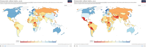
Figure 8. Electoral democracy index by V-Dem in which darker colors denote free, fair elections conducted under comprehensive voting rights, 1998–2022.
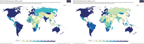
Figure 9. Darker colors denote greater percentage of people agreeing with statement ‘most people can be trusted’1998–2022.
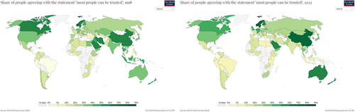
Figure 10. Gender inequality as indexed by reproductive health, empowerment, and economic status among available countries, 1998–2021. Lower values indicate less inequality.
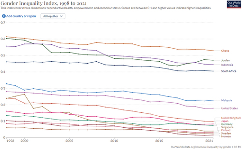
Figure 11. Share of income received by the poorest 50%, middle 40%, next highest 9%, and highest 1% of wealthy aggregated for the entire world from 1998 to 2021.
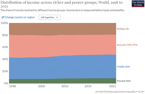
Figure 12. Share of income received by wealth quintiles in the United States of America from 1998 to 2019.
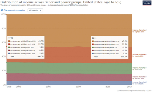
Figure 13. Percent of people who receive food intake that provides insufficient energy to maintain a healthy life from 2001–2020.
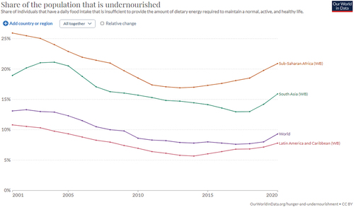
Figure 14. Fossil fuel carbon emissions from 1998 to 2021.
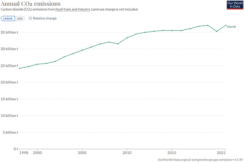
Figure 15. Average global temperature measured in degrees above historical, normal temperatures, 1998–2022.
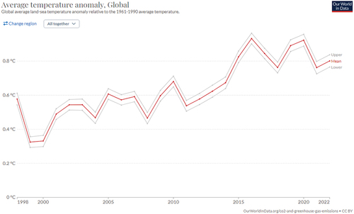
Figure 16. Number of deaths due to air pollution in 1990 and 2019. Countries to the lower-right of the yellow diagonal have experienced more deaths in 2019 than in 1990.
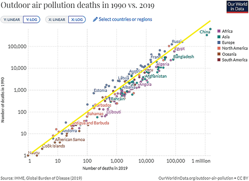
Figure 17. Annual change in forest area in 2010 (compared to 2009) and 2020 (compared to 2019). Deforestation is denoted in tan and darker brown, increase in forest area is denoted in light green.
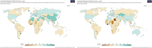
Figure 18. Decline in bird populations in North America from 1970–2018, blue arrow indicates 1998. Estimated 2.9 billion fewer birds alive today than in 1970, a loss of 29% (Rosenberg et al., Citation2019) Credit: Adam Smith.
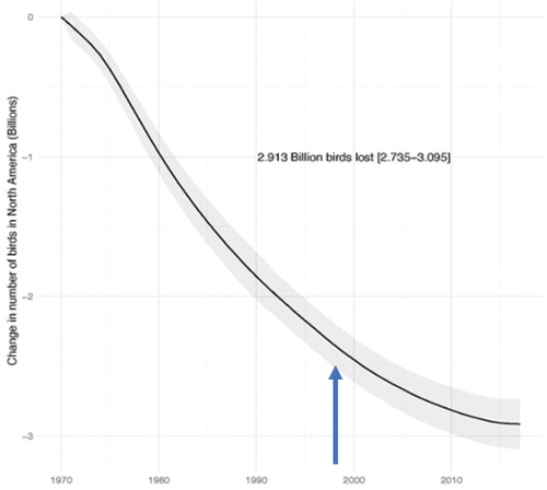
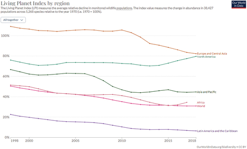
Figure 19. Decline in monitored wildlife populations from 1998 to 2018.