
Figures & data
Figure 1. Study area figure.
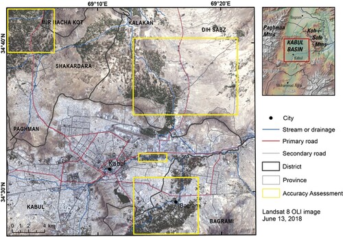
Table 1. Landsat images used in annual NDVI analysis; NA indicates that an image was not available during the growing season with low cloud coverage.
Table 2. Possible gridcell values of the accuracy assessment.
Table 3. Accuracy assessment results.
Figure 2. Results of the combined band ratio analysis.
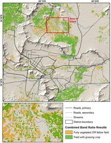
Figure 3. Results of combined band ratio analysis, indicating ‘agricultural area’ for 1988 and 2020.
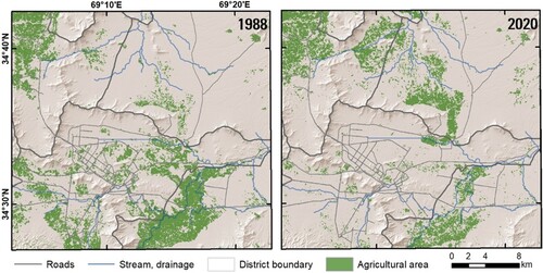
Figure 4. Area of agriculture mapped within each district.
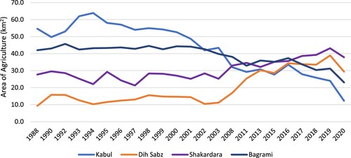
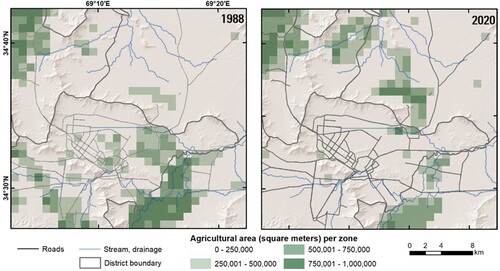
Figure 5. Results of combined band ratio analysis for 1988 (left) and 2020 (right).
JOM_Map_Large.pdf
Download PDF (7.9 MB)Data availability statement
The Landsat imagery used in this study is freely available and can be downloaded from the USGS Earth Explorer (https://earthexplorer.usgs.gov). Other files, including the band ratio analysis results for each year and the urban land cover data are available at Sciencebase.gov under https://doi.org/10.5066/P9IC4QFW.