Figures & data
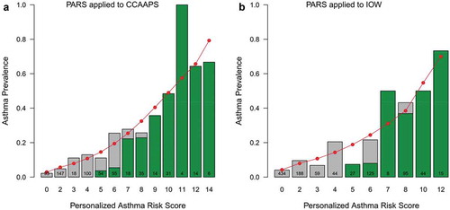
Figure 1. Pediatric asthma risk score (PARS) scoring sheet and associated interpretation.
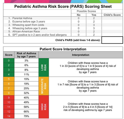
Figure 2. Comparison of PARS to loose API in the CCAAPS and Isle of Wight (IOW) cohort. The green shading indicates the proportion of at-risk children using the loose API (API) in each cohort. The red circles represent the predicted asthma prevalence using the PARS within each cohort, the grey bars represent the observed asthma prevalence in each cohort. Note that the predicted asthma prevalence (red dots) is more accurate than the loose API (green bars) for children with low- and moderate-risks of asthma. The two scoring systems perform equally well in children with a high-risk of asthma.