
Figures & data
Table 1. Patient demographics. Values are number unless otherwise specified
Figure 1. Bone quality assessed by the software; red color reveals a poor and green shows excellent bone quality. (a): Assessment of bone quality as described by Gelaude. (b): Defect analysis quantifies in percentages and colors bone loss in the different regions of the acetabulum on which the Paprosky classification is based. Red color reveals an inferior and green shows excellent bone quality while yellow is acceptable. The output data consists of a ratio and a graph, which allow the direct comparison between specimens. The amount of original acetabular bone that is missing is defined as a ratio. The remaining bone stock in the radial direction is presented by the graph (c).
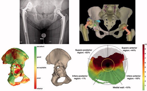
Figure 2. Custom made impalnt, planned screw positions and implant position based on CT scan. CT was taken prior to surgery. The radiograph shows the postoperative result. The position of the implant after surgery was compared with the preoperative planning using the pre- and postoperative CT scans.
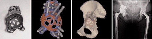
Table 2. Median difference between planned versus postoperative plus migration values from direct postoperative to 1-year follow-up
Table 3. The presented values are the average of the 2 repeated measurements (M1, M2) and show the difference between planned and postop position as well as the change in position postoperatively to 1 year follow-up. At the bottom rows, the median signed values show the direction of migration, whereas the unsigned median values show the amplitude of the migration