Figures & data
Table 1. Top 10 most expensive normalised losses.
Figure 1. (A) Annual aggregate losses by financial year in the dollars of the day; and (B) the annual aggregate of losses normalised to 2017 societal and demographic conditions. The heavy black line in the latter is the linear regression line considering all of the data; the dark grey area depicts the 95% confidence interval. Both graphs include losses from the 1989 Newcastle and other earthquakes.
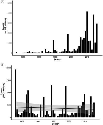
Figure 2. Normalised losses from weather-related events only. As for (B), the slope of the regression line is not significantly different from zero and the dark grey area depicts the 95% confidence interval.
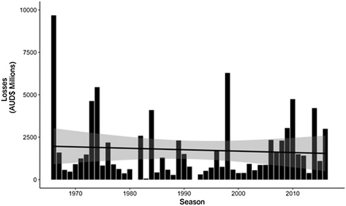
Table 2. Breakdown of normalised losses by State and Territory: New South Wales (NSW); Victoria (VIC); Queensland (QLD); Western Australia (WA); Northern Territory (NT); Australian Capital Territory (ACT); Tasmania (TAS).
Table 3. Breakdown of normalised losses by peril category. Percentages have been rounded up to single digit values.
Figure 3. Historical event losses adjusted by Consumer Price Index (CPI). The increasing trend is not consistent with the underlying peril data (see text).
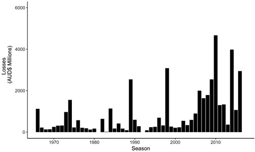
Table 4. Top 10 seasonal aggregate normalised losses in millions of Australian Dollars (AUD).
Figure A1. Normalised insurance losses caused by severe storms by financial year: 1966–2017. The absence of losses prior to 1976 is discussed in the text but is believed to be due to underreporting.
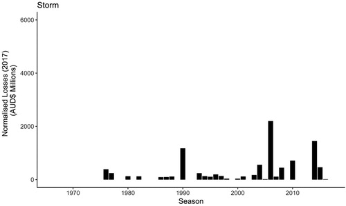
Figure A2. As for Figure A1 but for flooding losses.
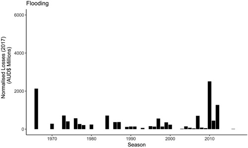
Figure A3. As for Figure A1 but for tropical cyclone losses.
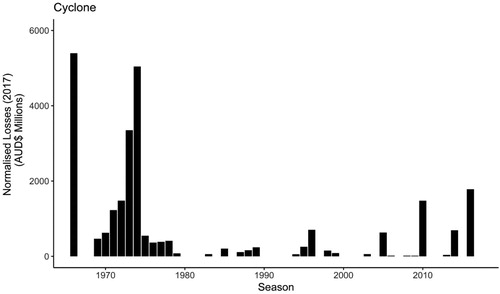
Figure A4. As for Figure A1 but for bushfire losses.
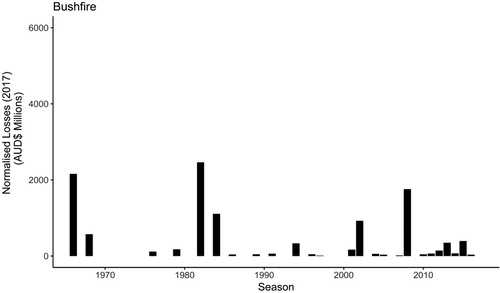
Figure A5. As for Figure A1 but for hailstorm losses.
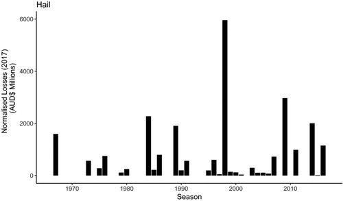
Figure A6. Number of proxy flood events register per climate zone per year: 1900–2107.
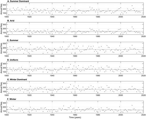
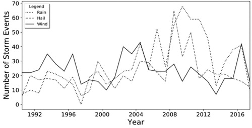
Figure A7. Number of severe storm events per ‘season’ in Capital Urban Centre Localities (Appendix 1).