Figures & data
Table 1. Growth, population, reproduction and numerical scheme parameters used for the base run scenario.
Table 2. Notation of the population dynamics model.
Figure 1. Spawning frequency function S(t) during a year.
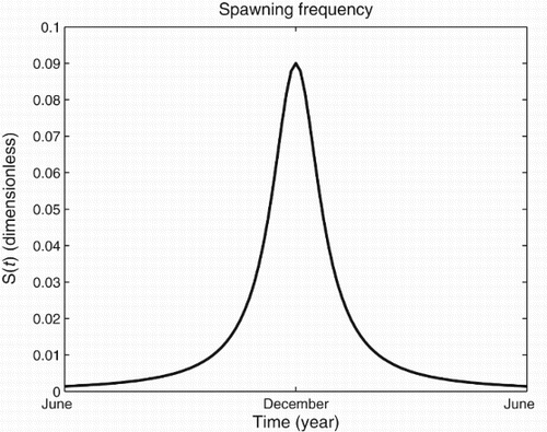
Table 3. List of examined scenarios.
Figure 2. Initial distribution of the population. The initial values are derived from [Citation4].
![Figure 2. Initial distribution of the population. The initial values are derived from [Citation4].](/cms/asset/c3fb1752-9cb3-43b6-9fc4-d4bdf44163bb/tjbd_a_826826_f0002_b.gif)
Figure 3. The black line shows the mean simulated sardine biomass from 500 runs, the dark grey shaded area covers the 25%–75%th percentile, while the light grey shaded area covers the 5–25%th and 75–95%th percentiles. The dot lines with the error bars represent the estimated biomass from acoustics with the corresponding 95% confidence intervals [Citation4].
![Figure 3. The black line shows the mean simulated sardine biomass from 500 runs, the dark grey shaded area covers the 25%–75%th percentile, while the light grey shaded area covers the 5–25%th and 75–95%th percentiles. The dot lines with the error bars represent the estimated biomass from acoustics with the corresponding 95% confidence intervals [Citation4].](/cms/asset/0587f86b-320d-4523-b417-165880ca66d9/tjbd_a_826826_f0003_b.gif)
Figure 4. Box plots for modelled annual catches. The top and bottom of the boxes represent the interquantile range while black dots represent the annual reported landings during 2003–2008 period.
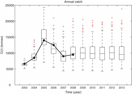
Figure 5. Empirical distribution of sardine biomass level at June 2013 for 500 sample paths.
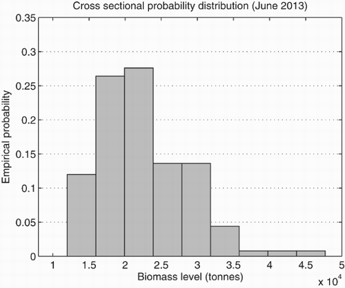
Table 4. Summary statistics of forecasted sardine biomass distribution.
Figure 6. Plots of median biomass for the base run (black line) and examined scenarios. Black vertical dot lines represent the reference dates (June 2014 and June 2020) to provide risk analysis.
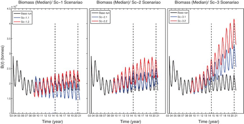
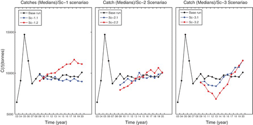
Figure 7. Plots of median annual yields for the base run (black dots) and examined scenarios.