Figures & data
Figure 1. (a) A population of randomly mixed nodes. The arrows between the nodes denote the chain of transmission within the population following the introduction of an initial infectious node (*). Purple nodes represent infectious nodes that have been tested and diagnosed positive. The red nodes are infectious but undiagnosed. The green node represents recovery of an infectious node that has not been diagnosed. (b) A tree of transmission resulting from interactions between infectious and susceptible nodes. The orange arcs represent the direction of contact tracing triggered from a positively diagnosed node.
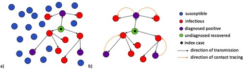
Figure 2. Flowchart of SIR model with testing and tracing (Population Dynamics).
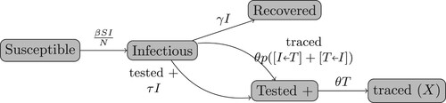
Figure 3. Flowchart of Pair Dynamics.
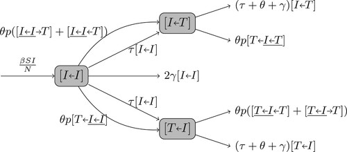
Figure 4. The comparison of numerically solved from our contact tracing model (Equation1a
(1a)
(1a) )-(1h) with the ensemble average of 100 runs of agent-based simulations with identical parameter values and initial conditions. The parameter values are
,
,
,
,
,
, and the coverage tracing probability (or probability of diagnosis) is
.
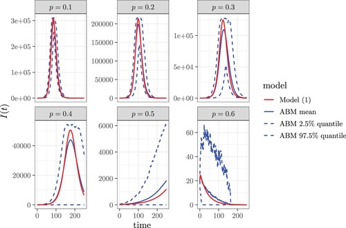
Figure 5. The contour plot of as a function of the contact tracing coverage probability p and the testing rate τ. Here
,
,
.
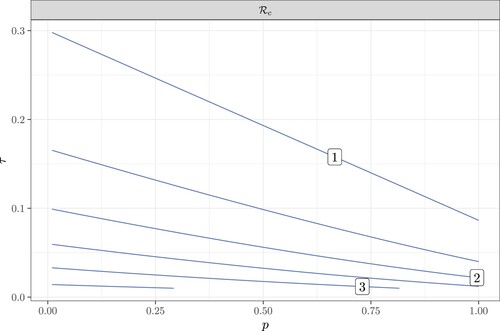
Figure 6. The dependence of the control reproduction number ,
, and
on the tracing rate θ. Here
,
, p = 1,
. Specifically, (b) reflects the contact tracing rate initiated from the infector and (c) reflects the rate initiated from an infectee. This figure also shows that contact tracing is more likely to originate from an infector as
.
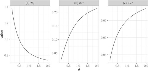
Figure 7. The dependence of the control reproduction number , the fraction of diagnosed infectors (
), and the average number of diagnosed secondary infections (
) on the transmission rate β. Here
,
, p = 1,
.
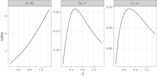
Figure 8. The change in the control reproduction number (, shown in the top panel), and the number of infectious individuals (I, shown in the bottom panel) as a function of time. The blue dashed curve with p = 0 reflects the case where contact tracing does not occur. Comparatively, the green dashed curve shows the case where: p = 0.4 and
. Finally, the red curve shows the case where p = 0.3 and
. Here, the remaining fixed values and parameters are:
,
,
,
,
.
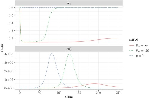
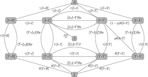
Figure A1. The full flowchart of the pair dynamics for Model (Equation1a(1a)
(1a) )-(1h).