Figures & data
Table 1. Our sample demographics compared to the 2015 ACS demographic and housing estimates (https://factfinder.census.org).
Table 2. Coefficients (b) and averaged predicted probabilities (pp) from multinomial logistic regression.
Table 3. Summary of study results.
Figure 1. Interaction effect of message by the frequency with which people purchase non-GMO labeled foods on the perception that the message represents the stance taken by the scientific community as a whole. Shaded areas represent 95% confidence intervals.
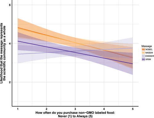
Figure 2. Interaction effect of Message by the frequency with which participants purchased non-GMO labeled foods on the perception that the message represents the stance taken by the scientific community as a whole. Shaded areas represent 95% confidence intervals.
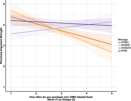
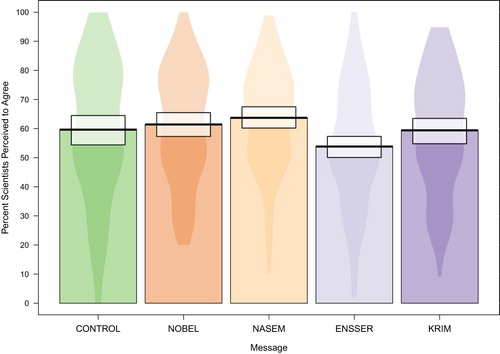
Figure 3. Violin plot of percent of scientists perceived to agree by condition. The “violins” illustrate kernel probability density (i.e. width is representative of the proportion of responses located at that value on the Y-axis). The thick black line is located at the mean value for each message and the error, illustrated by the white box, is the Bayesian high density interval.