1,227
Views
7
CrossRef citations to date
0
Altmetric
Research Papers

A comprehensive framework for exploratory spatial data analysis: Moran location and variance scatterplots

, , &
Pages 157-186 | Received 09 Sep 2008, Published online: 10 Nov 2009

Figures & data

Figure 1.  Layout of four-neighbor combinations, with all yielding the same neighbor average. The spatial heteroskedasticity question is not resolved by the conventional Moran scatterplot.

Figure 1.  Layout of four-neighbor combinations, with all yielding the same neighbor average. The spatial heteroskedasticity question is not resolved by the conventional Moran scatterplot.

Figure 2.  The contiguity plot of the covariogram, variogram, and their close relationship: γ(h)=sill–cov(h). Anisotropic phenomena can also be modeled by using different distances for the major and minor range in a perpendicular layout. As expected, closer samples hold higher weights than distant ones.
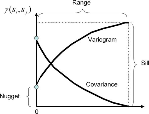
Figure 2.  The contiguity plot of the covariogram, variogram, and their close relationship: γ(h)=sill–cov(h). Anisotropic phenomena can also be modeled by using different distances for the major and minor range in a perpendicular layout. As expected, closer samples hold higher weights than distant ones.

Figure 3.  Overall picture of the Moran scatterplot showing the uncertainty regions, high–high, medium–medium, and low–low patterns, positive outliers (1), (3), (4), and (6), negative ones (5) and (2), and the Moran's I impact on the Moran scatterplot.

Figure 3.  Overall picture of the Moran scatterplot showing the uncertainty regions, high–high, medium–medium, and low–low patterns, positive outliers (1), (3), (4), and (6), negative ones (5) and (2), and the Moran's I impact on the Moran scatterplot.

Figure 4.  Flowchart for the SAKWeb© Moran location scatterplot.

Figure 4.  Flowchart for the SAKWeb© Moran location scatterplot.

Figure 5.  Theoretical four-sample layout for analysis of the weight impact on the Moran variance scatterplot.

Figure 5.  Theoretical four-sample layout for analysis of the weight impact on the Moran variance scatterplot.

Figure 6.  2D-view of the Moran variance scatterplot corresponding to the five cases presented in .

Figure 6.  2D-view of the Moran variance scatterplot corresponding to the five cases presented in Figure 1.

Table 1. The Moran variance scatterplot for the five theoretical situations of .

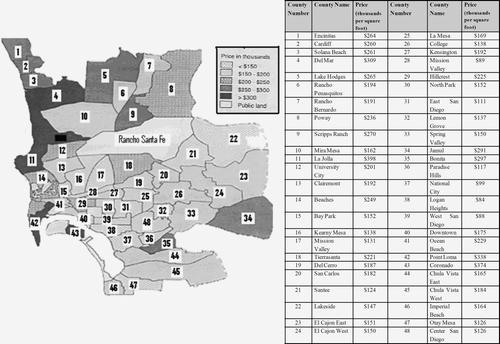
Figure 7.  The layout map for the San Diego housing costs dataset.

Figure 7.  The layout map for the San Diego housing costs dataset.

Figure 8.  Contour map for the Nebraska soil organic matter dataset. Black triangles represent sampling points.
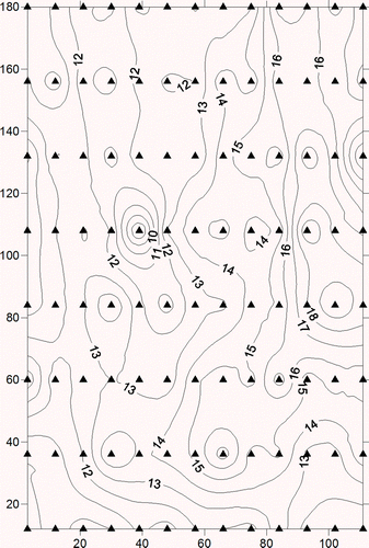
Figure 8.  Contour map for the Nebraska soil organic matter dataset. Black triangles represent sampling points.

Figure 9.  The Pb dataset mapping by the Moran location scatterplot. Filled squares represent location and type of spatial autocorrelation classification (depending on the corresponding quadrant) for each sample.
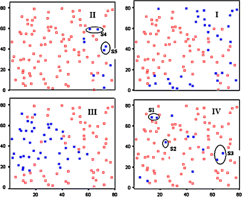
Figure 9.  The Pb dataset mapping by the Moran location scatterplot. Filled squares represent location and type of spatial autocorrelation classification (depending on the corresponding quadrant) for each sample.

Figure 10.  Effect of range misspecification in Moran's I calculation. Filled squares represent samples that lie within the uncertainty regions for the optimal range (I=+0.37, left) and a non-optimal range (I=+0.08, right).
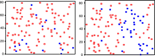
Figure 10.  Effect of range misspecification in Moran's I calculation. Filled squares represent samples that lie within the uncertainty regions for the optimal range (I=+0.37, left) and a non-optimal range (I=+0.08, right).

Figure 11.  The Moran location scatterplot view of the four quadrants of the San Diego dataset (part II). There is a clear improvement in this spatial autocorrelation measure when compared with the traditional one (part I).
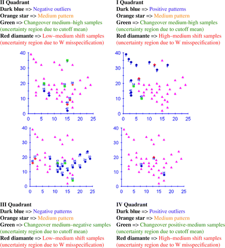
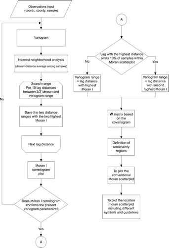
Figure 11.  The Moran location scatterplot view of the four quadrants of the San Diego dataset (part II). There is a clear improvement in this spatial autocorrelation measure when compared with the traditional one (part I).
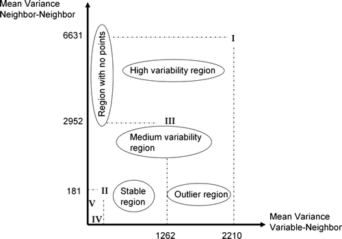
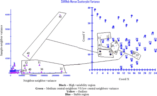
Figure 12.  The Moran variance scatterplot for the San Diego dataset.

Figure 12.  The Moran variance scatterplot for the San Diego dataset.

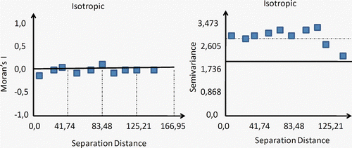
Figure 13.  On the left: Moran's I correlogram where the vertical axis represents the coefficient of autocorrelation (−1 to 1), while the horizontal axis is the separation distance. On the right: variogram representation. Both graphs relate to the Nebraska soil organic matter dataset.

Figure 13.  On the left: Moran's I correlogram where the vertical axis represents the coefficient of autocorrelation (−1 to 1), while the horizontal axis is the separation distance. On the right: variogram representation. Both graphs relate to the Nebraska soil organic matter dataset.

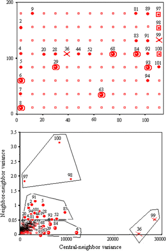
Figure 14.  The Moran variance scatterplot applied to the first polynomial residuals for the Nebraska soil organic matter dataset. Top: view corresponding to location of sampling points, including a code referring to their local variability (see text). Bottom: Moran variance scatterplot.

Figure 14.  The Moran variance scatterplot applied to the first polynomial residuals for the Nebraska soil organic matter dataset. Top: view corresponding to location of sampling points, including a code referring to their local variability (see text). Bottom: Moran variance scatterplot.

Reprints and Corporate Permissions

Please note: Selecting permissions does not provide access to the full text of the article, please see our help page How do I view content?

To request a reprint or corporate permissions for this article, please click on the relevant link below:

Academic Permissions

Please note: Selecting permissions does not provide access to the full text of the article, please see our help page How do I view content?

Obtain permissions instantly via Rightslink by clicking on the button below:

If you are unable to obtain permissions via Rightslink, please complete and submit this Permissions form. For more information, please visit our Permissions help page.