Figures & data
![Figure 1. Study area in GE. The blue line represents the GRA, the green grid represents the GPS survey area. Green points and red points represent the cadastral and GPSs CPs, respectively.](/cms/asset/98ea7a5a-3354-4e2d-a1b3-fd382c70fced/tjde_a_1031716_f0001_c.jpg)
![Figure 2. The location of the PF vertex: (a) GE image, (b) cadastral monograph, (c) Google Street view image. The CP is a manhole cover of an aqueduct.](/cms/asset/487606f2-e34d-444b-95c8-0e63e1a33fb1/tjde_a_1031716_f0002_c.jpg)
![Figure 3. The location of the GPS vertex: (a) GE image, (b) GPS survey, (c) Google Street view image. The red arrows show the ground control target where the GPS receiver was positioned to obtain the horizontal coordinates. The CP is a curb ramp of parking.](/cms/asset/496f92d9-6ab4-4a4f-b7f0-3326f051be2a/tjde_a_1031716_f0003_c.jpg)
![Figure 4. The zoomed image shows the location of the PF vertex represented in Figure 2 in the image 2007. Notice the pixel displacement between the positions of the data image coordinates and their corresponding position of the CP.](/cms/asset/0591b7a7-2a39-4032-8b3e-7784f04db5e8/tjde_a_1031716_f0004_c.jpg)
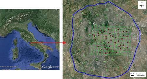
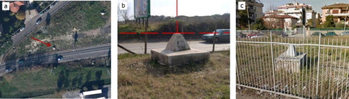
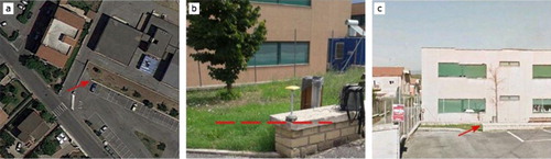
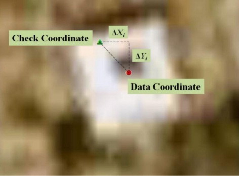
Table 1. Statistical differences between PFs and the respective points for the three GE images.
Table 2. Statistical differences between GPSs and the respective points for the three GE images.
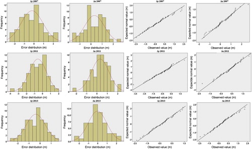
Table 3. Normality testing of PFs positional errors for the three GE images.
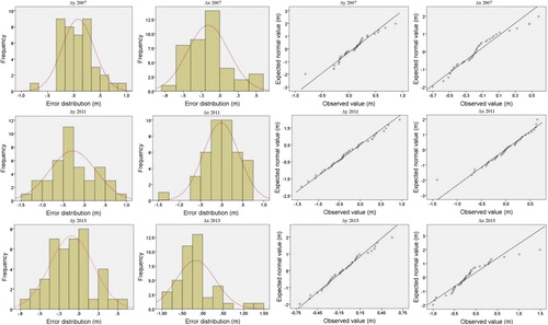
Table 4. Normality testing of GPSs positional errors for the three GE images.
![Figure 5. PF CP error frequencies and normal Q-Q plot for the distributions Δx and Δy. Superimposed curve in the histogram represents the normal distribution.](/cms/asset/c20f37d3-1242-4360-9ea4-8c8a14f2474c/tjde_a_1031716_f0005_c.jpg)
![Figure 6. Circular statistics of PF CPs azimuth vectors error. The blue arrows show the topographical direction of the vectors (0°/North clockwise), and the red arrow shows the mean direction of the vectors.](/cms/asset/a49c256b-d729-4d21-b82a-c22246bbf6d5/tjde_a_1031716_f0006_c.jpg)