Figures & data
Figure 1. Study area map showing Margalla Hills National Park and Rawal Lake.
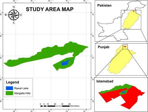
Figure 2. Schematic flow of the implemented methodology. Preprocessing included band stacking, reprojection and subsetting. And post-classification processing included reclassification (or recoding), vectorization of classes, class extraction, merging and geometry computation.
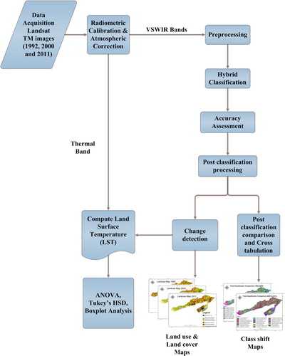
Figure 3. Pie-charts showing percentage of area coverage of land cover classes on MHNP in 1992, 2000 and 2011.
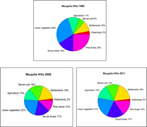
Figure 4. Land use and Land cover map of Margalla Hills National Park for the year 1992.
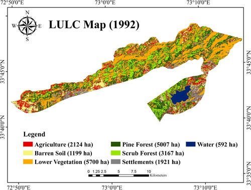
Figure 5. Land use and Land cover map of Margalla Hills National Park for the year 2000.
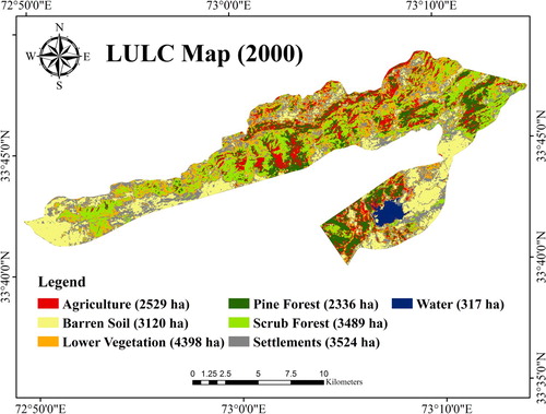
Figure 6. Land use and Land cover map of Margalla Hills National Park for the year 2011.

Table 1. The area coverage (both in hectare and percentage) of different land cover classes in MHNP for the year 1992, 2000 and 2011.
Figure 7. LULC changes in Margalla Hills from the year 1992–2011.
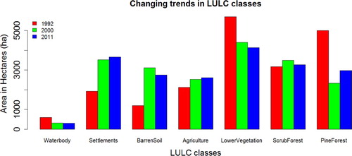
Figure 8. Post-classification comparison between the classified images of 1992 and 2000 presenting the shift among classes.
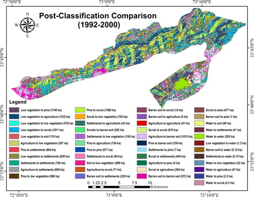
Figure 9. Post-classification comparison between the classified images of 2000 and 2011 presenting the shift among classes.
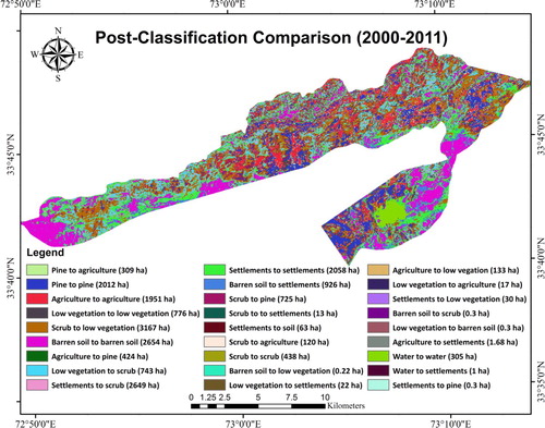
Table 2. Overall classification accuracy and kappa statistics.
Figure 10. Boxplots for temperature difference and graph of P-values for the change classes from 1992 to 2000.
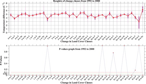
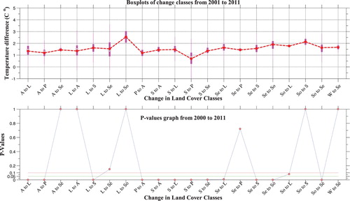
Figure 11. Boxplots for temperature difference and graph of P-values for the change classes from 2000 to 2011.