Figures & data
Figure 1. Hurricane Harvey and the study area of Houston, TX.
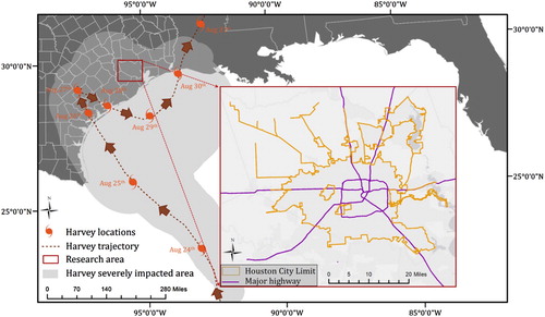
Figure 2. The workflow of the proposed approach. The methodology is composed of three steps: CNN design and training, word sensitivity test and duplication test.
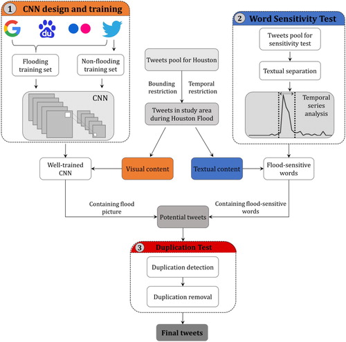
Figure 3. CNN architecture: the number before ‘@’ denotes the depth of a layer.
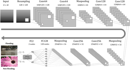
Table 1. Parameter settings.
Figure 4. Training accuracy and loss of designed CNN architecture on flooding and non-flooding dataset supported by GTX 1050 GPU and CUDA.
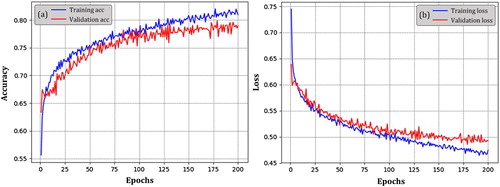
Figure 5. CNN performance with different : (a) number of pictures classified as positive (flooding), verified as positive (TP) and verified as negative (FP) given different
and (b) trend of precision and recall given different
.
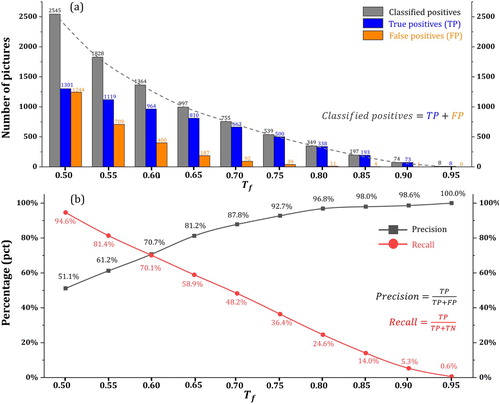
Table 2. CNN labeling result.
Figure 6. Temporal distribution of selected flood-sensitive words (). The X-axis and Y-axis in each subfigure denote time (from 15th August to 15th September in 2017) and number of tweets (count) respectively. Number of tweets for each word has been scaled for better visualization and comparison.
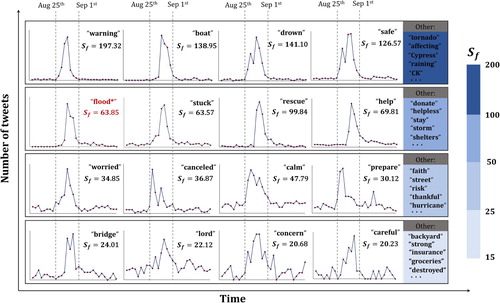
Table 3. Positive label (TPs and FPs) statistics in CNN only and CNN refined by sensitive words.
Table 4. Precision, recall and  score in CNN only and CNN refined by sensitive words.
Figure 7. Examples of selected originals and their duplications presented in their timeline. Only the originals (the first in timeline) were kept in the final selection.
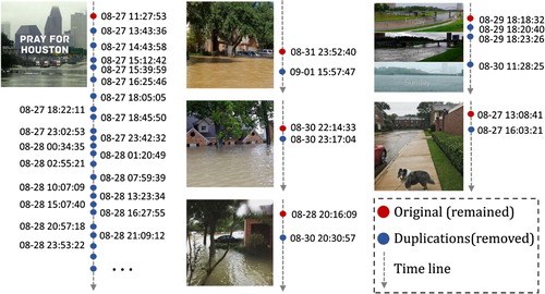
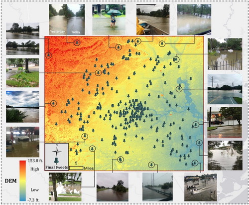
Figure 8. Selected examples of final tweets geotagging.