Figures & data
Figure 1. Extract of GHSL dataset over Izmir (Turkey) illustrating the transition from GHS-BUILT (a) and GHS-POP (b) to GHS-SMOD (c). Urban centres are represented in red.
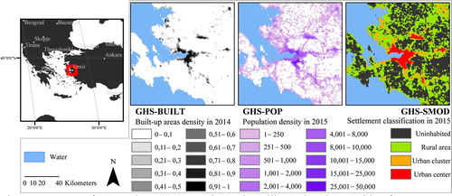
Figure 2. Urban centres in 2015 according to the GHS-SMOD. Source: Atlas of the Human Planet Pesaresi, Melchiorri, et al. (Citation2016).
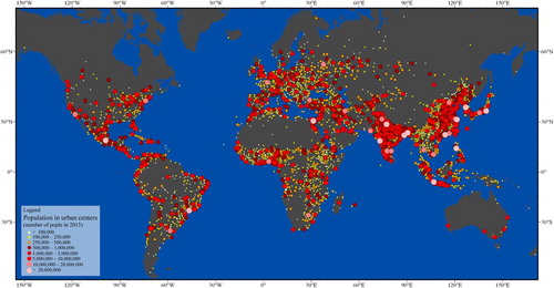
Figure 3. Methodology for calculating the multi-temporal greenness value in the built-up area of an urban centre at a spatial resolution of 30 meters. The example is given for Cairo city with the boundaries of the urban centre depicted in black (middle column). The first column represents the built-up areas for the three periods 1990, 2000 and 2014 derived from the GHSL-BUILT. The middle column represents the annual greenest pixel TOA reflectance composites (NDVI composites) masked by the non-built-up areas of each of the three periods. As a background, the full coverage of the NDVI composite is represented in a greyscale. The last column shows the histograms of the NDVI composites and the average value (red bar) that will be assigned to the urban centre.
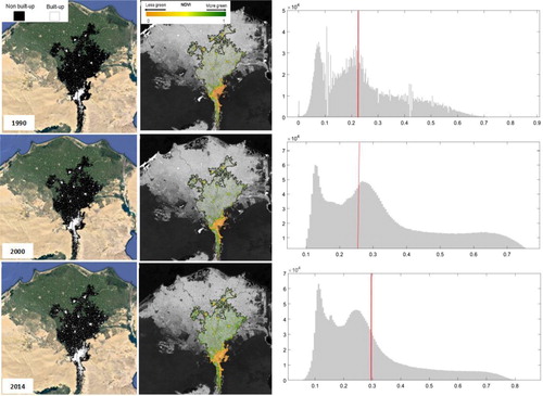
Figure 4. Greenness values in the built-up areas (period 2014) derived from NDVI composites in the urban centres of Minneapolis, Lagos, Manila, Mumbai, Paris and Buenos Aires. The maps are shown at the same scale and cover the same extent.
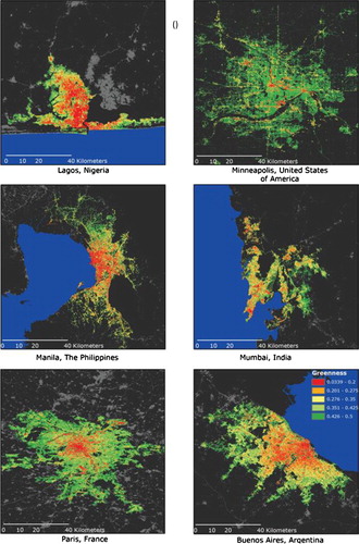
Figure 5. Average greenness in the time interval centred on the year 2014 calculated in the built-up and non-built-up areas of the urban centres.
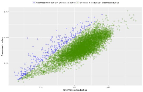
Figure 6. Frequency histograms of percentage changes of average greenness values in the 10,323 urban centres calculated in the period 1990–2000 and 2000–2014.
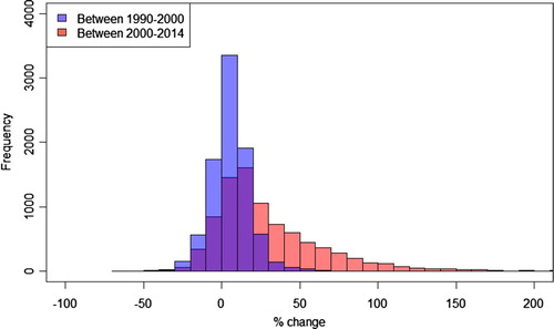
Figure 7. Spatial distribution of changes in greenness values for the 10,323 urban centres in the period 1990–2014.
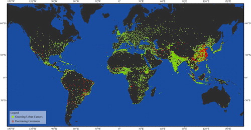
Figure 8. Scatter plots of Kendall's Tau values vs. percentage changes in greenness in the built-up areas. The Kendall's Tau gives an indication on overall greenness trends in the built-up areas of the urban centres for the periods 1990–2000 (a) and 2000–2014 (b). Kendall's Tau values are derived from the analysis of NDVI time series calculated on the basis of BOA Landsat data.
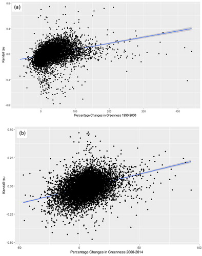
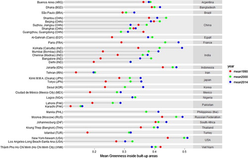
Figure 9. Average greenness values in the built-up areas of 32 megacities calculated for the time intervals centred on 1990, 2000 and 2014.