Figures & data
Figure 1. Track and timeline of Hurricane Harvey.
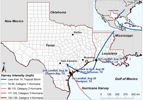
Figure 2. (A) Rainfall observations during Hurricane Harvey in Texas and Louisiana; (B) interpolated rainfall depth by Empirical Bayesian Kriging; (C) rainfall threat, averaged county-level rainfall depth; (D) track and wind speed of Hurricane Harvey; (E) kernel density surface by hurricane track and wind speed; (F) wind threat, county-level averaged kernel density.
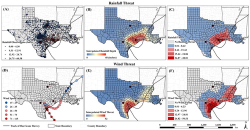
Table 1. List of geographical and social variables.
Figure 3. Twitter data mining framework (modified from Zou et al. Citation2018).
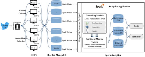
Figure 4. The four phases of emergency management.
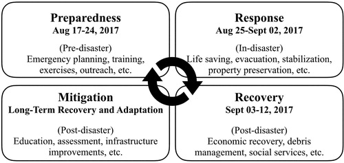
Table 2. Twitter data collected from internet archive (17 August-12 September 2017).
Figure 5. Temporal trends of hourly and daily Ratio and Sentiment indexes in the U.S. during (A) Hurricane Harvey in 2017 and (B) Hurricane Sandy in 2012.
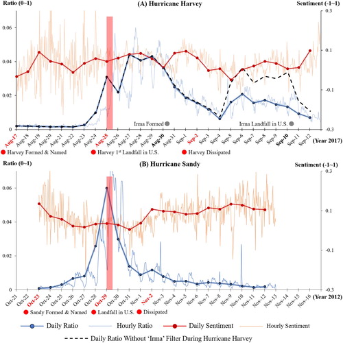
Table 3. Summary statistics of daily Ratio and Sentiment indexes at the national level during Harvey and Sandy.
Table 4. The top 5 happiest and saddest filtered Harvey-related Tweets by Sentiment scores.
Figure 6. Comparison of county-level ratio indexes of Hurricane Harvey in the United States: (A) unfiltered Harvey dataset (B) filtered Harvey dataset.
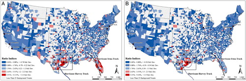
Figure 7. County-level ratio indexes for the entire period and at different phases of emergency management in affected areas.
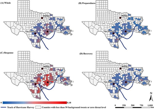
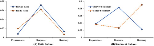
Figure 8. Comparison of the mean county-level Twitter indexes in the affected areas during Hurricanes Harvey and Sandy: (A) Ratio, (B) Sentiment.