Figures & data
Figure 1. Web-portal representing the entry point to the U-TEP.
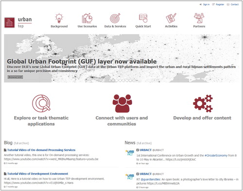
Figure 2. Graphical user interface of U-TEP’s visualisation and analytics toolbox.
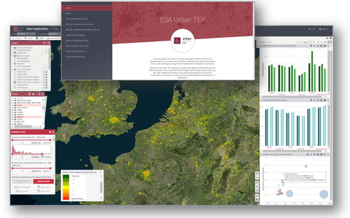
Figure 3. Thematic application ‘U-TEP Product Portfolio’ allowing the user to interactively browse and inspect all available data layers.
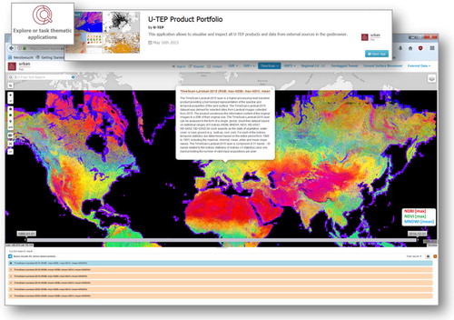
Figure 4. Spatiotemporal analysis of Sentinel 2 NDVI time series for Muscat Oman. The temporal feature space clearly shows at least eight temporal endmembers in the first three dimensions with clear distinction between terrestrial vegetation and marine algal blooms. Seasonal illumination effects are also seen in areas with terrain shadow. The PC composite shows most vegetation as yellow but the feature space clearly distinguishes irrigated (1) from indigenous (2) vegetation by senescence duration. The PC 3/2 projection identifies two distinct endmembers (7 & 8) corresponding to interannual increases and decreases in NDVI – although the areas of inter annual change are generally rather small (< ∼100 × 100 m) so difficult to see on the PC composite at the regional scale.
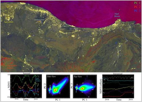
Figure 5. Digital surface model (A) and orthophoto mosaic (B) of Dar es Salam (TZ) derived from a total of 11,832 UAV images. The orange dots overlaid on the DSM in (a) show the centre point of each single image, whereas figures c-f represent zoom-ins at different scales.
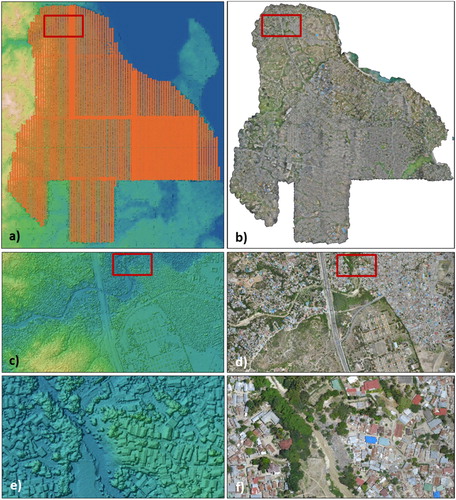
Figure 6. U-TEP analysis snapshot illustrates: (A) the accumulated nightlights intensity of 2015 in relation to the total population of a country 2015; selected countries are indicated with red dots; (B) the number of geotagged tweets per capita 2016; (C) a scatterplot with the accumulated nightlights intensity of 2015 (y-axis) in relation to the electric power consumption per capita in kWh (x-axis).
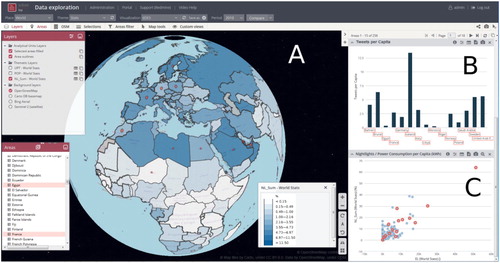
Figure 7. U-TEP analysis snapshot illustrates: (A) the population density in inhabitants per km² of GUF settlement area; (B) a scatterplot with the population density in inhabitants per km² (y-axis) and the share of GUF area in km² (x-axis); the size indicates the number of tweets per capita; and (C) the share of GUF area in relation to the total area of the country in percent for selected countries.
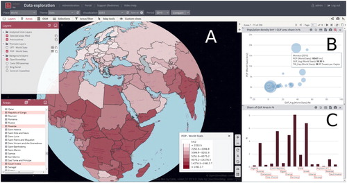
Figure 8. U-TEP analysis snapshot illustrates: (A) the number of Tweets per Capita and selected countries with red dots; (B) a bar chart with the tweets per capita for selected countries (C) a scatterplot with the number of tweets per GUF area (in km²; x-axis) to the gross national income (GNI) per capita in USD (y-axis).
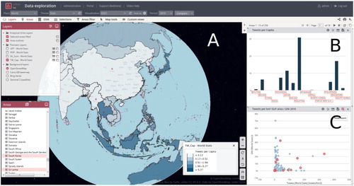
Figure 9. U-TEP analysis snapshot illustrates: (A) the share of urban population in relation to the total population of a country in percent for the years 1985 (ul), 1995 (ur), 2005 (ll) and 2015 (lr); (B) a scatterplot with gross national income (GNI) per capita in USD (y-axis) and the percentage of urban population (x-axis) for the years 1985, 1995, 2005 and 2015; (C) urban population in relation to the total population of a country in percent for the years 1985, 1995, 2005 and 2015 for selected countries.
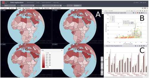
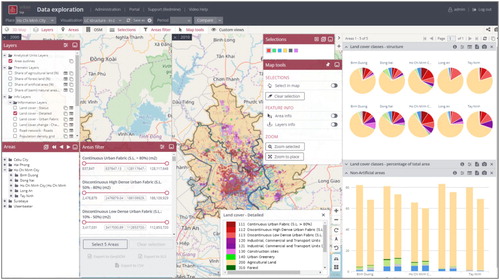
Figure 10. Visualisation and analysis of land use pattern and dynamics in Ho Chi Minh City.