Figures & data
Figure 1. Flow chart of the ‘split and merge’ approach.
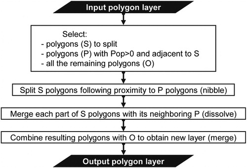
Figure 2. Examples of detected discrepancies (patches larger than 1 km2) between GPWv4 (blue line) and GHS-BUILT 2014 (orange) along the coasts of (A) Japan (JPN), (B) Tunisia (TUN), (C) China (CHN), and (D) Romania (ROU).
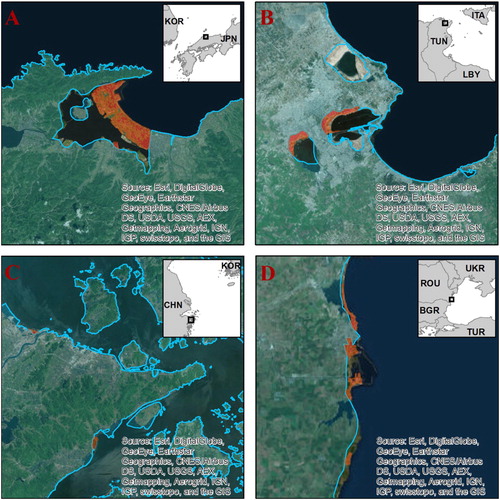
Figure 3. Global distribution of census units without population in GPWv4.10 data and those flagged based on the automated procedure developed (USA not considered). Note that existence of unpopulated units is merely a feature of census design and not of the landscape.
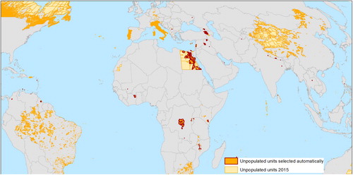
Table 1. List of countries in which problematic polygons were selected.
Figure 4. Examples of application of the ‘split and merge’ approach to census units incorrectly deemed as unpopulated in (A) Guyana and (B) Lebanon, before (1) and after (2) the procedure is applied. Orange filling and red dashed boundary represent the original problematic polygon; blue solid line delineates borders of upper administrative level; grey solid polygons are correctly declared unpopulated polygons; solid coloured areas are the resulting polygons; areas outside the processed administrative unit are shaded.
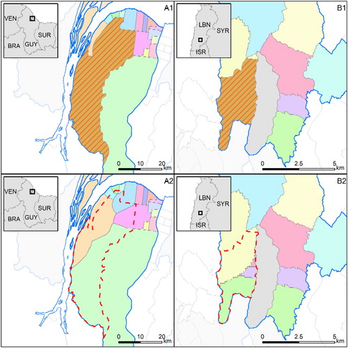
Figure 5. Illustration of resulting 250-m population grids for 2015 in (A) Guyana and (B) Lebanon.
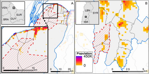
Figure 6. Visually confirmed coastline discrepancy patches larger than 1 km2.
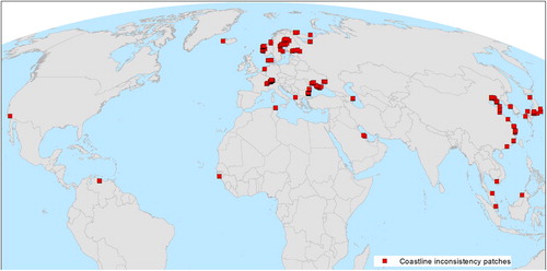
Figure 7. Example illustrating situation (A) before and (B) after manual harmonization of a stretch of Caspian Sea coastline in Russia. Solid black lines enclose original census units; black pixels denote mapped built-up areas (shaded: already within census boundaries; solid: outside original census areas).
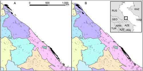
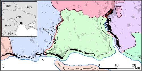
Figure 8. Example of automated approach to mitigate inconsistencies along the coastline of Ukraine. This example shows the generation of a 2-km buffer that was split using the ‘split and merge’ approach. Solid black lines enclose original census units; solid blue line represents the extended boundary into the sea through 2-km buffer; solid red lines represent the splitting of buffer into parts assigned to the nearest neighbouring unit; black pixels represent mapped built-up areas (shaded: already within census boundaries; solid: outside original census areas).