Figures & data
Figure 1. Overview of research framework.
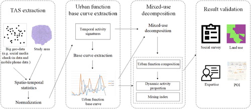
Figure 2. Overview of linear decomposition.
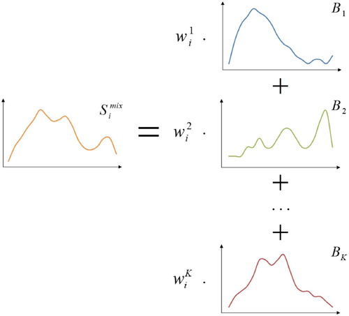
Figure 3. TAZs within the 5th Ring Road in Beijing.
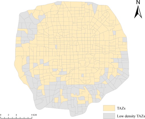
Table 1. Sample of data.
Figure 4. Urban function base curves extracted by four methods. The result of statistics by POI types is selected for the following experiment. (a) K-means, (b) SISAL, (c) manual sampling, and (d) statistics by POI types.
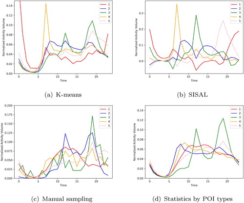
Figure 5. Urban function composition and optimization evaluation. (a–e) Intensity proportion of each urban function, where a deeper color indicates a higher proportion. (f) Cosine similarity between TASs and combining base curves weighted by corresponding proportions. More than half of the coefficients are larger than 0.95, and few are lower than 0.80. (a) Outdoor recreation, (b) residence and transportation, (c) dining, (d) work and education, (e) entertainment, and (f) cosine similarity.
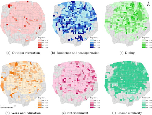
Figure 6. Dynamic human activity proportions of the entire study area. Each color corresponds to one activity type ( outdoor recreation(O), residence and transportation(RT), dining(D), work and education(WE), and entertainment(E)). A longer bar in a certain time slot indicates a higher intensity proportion of human activities.
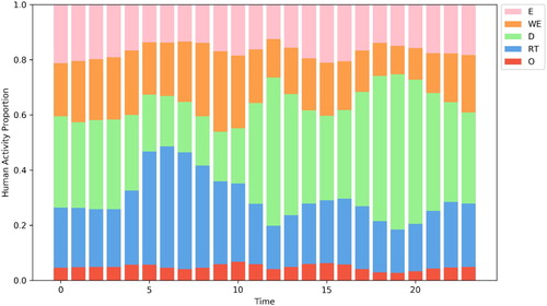
Figure 7. Spatial distribution of mixing index. A warmer color indicates a higher index, denoting a more diverse urban function composition.
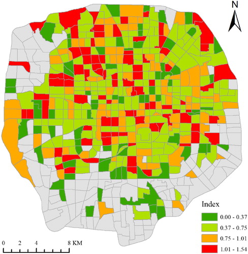
Figure 8. Validation of dining proportion based on POI data. (a) Relationship between two sets of dining proportions extracted by mixed-use decomposition and POI data, respectively. Each scatter point corresponds to one zone in the study area. The gray line is the linear fitting result. (b) Distribution of dining proportion based on POI data. A deeper color indicates a higher proportion.
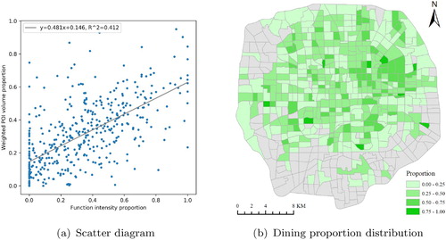
Figure 9. Validation of mixing index based on taxi OD data. (a) Box plot of average trip distance based on nine zone groups ordered by mixing index (from lowest to highest). Outliers are displayed as circle points. The light-colored line indicates the median of each group. (b) Spatial distribution of outliers.
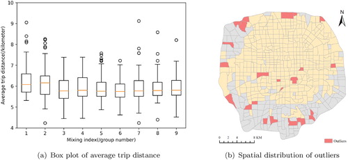
Figure 10. Location and urban function composition of three sample zones. (a) The locations of zones A to C are displayed as polygons with thick outlines. (b) Urban function composition of zones A to C. Each color corresponds to one function type. A longer bar indicates a higher function intensity proportion.
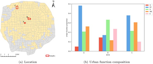
Figure 11. Satellite images and dynamic activity proportions of three sample zones. (a–c) Satellite images (from AMAP, a mapping company in China) of zones A to C. The transparent polygon indicates the boundary of each zone. (d–f) Dynamic activity proportions of zones A to C. Each color corresponds to one activity type. A longer bar indicates a higher intensity. The gray curve illustrates the TAS of each zone. It can be viewed as the proxy of actual human activities, and is similar to the sum of all the bars (i.e. combining base curves). Note that the acronym for each human activity in the legend is the same as in Figure .
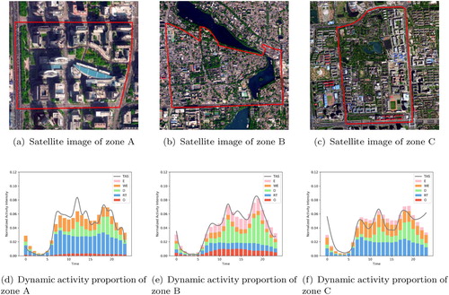
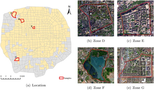
Figure 12. Locations and satellite images of four sample zones. (a) The locations of zones D to G are displayed as polygons with thick outlines. (b–e) Satellite images (from AMAP) of zones D to G. Transparent polygons indicate the zone boundaries.