Figures & data
Table 1. Typologies for disaster-relevant tweets, classification methods and overlaying with disaster data.
Figure 1. Analytical framework for identifying disaster-related information and impact areas from tweets.
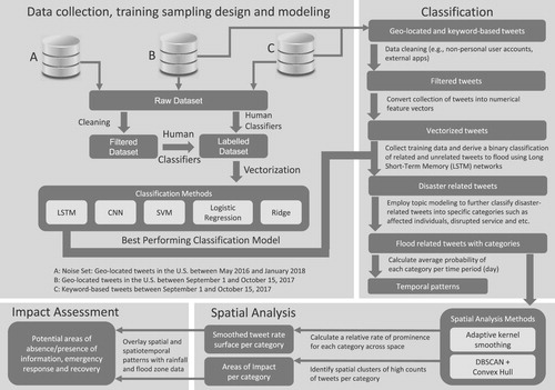
Table 2. Top 26 keyword counts in the raw dataset.
Table 3. Filtering with the most common sources from Twitter metadata.
Figure 2. (a) Instructions for the labeling task (b) Training data collection interface. ‘No’ and ‘Yes’ buttons to allow the user to label the presented tweet as ‘Related’ or ‘Unrelated’, or ‘Not Sure’ button is used to skip the tweet.
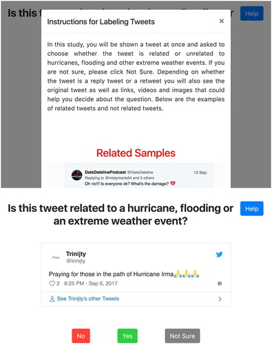
Figure 3. Convolutional Neural Network Architecture.
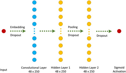
Figure 4. An LSTM Node and its connection formulations.
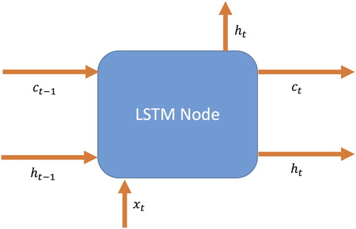
Figure 5. An LSTM layer and connections between LSTM nodes.
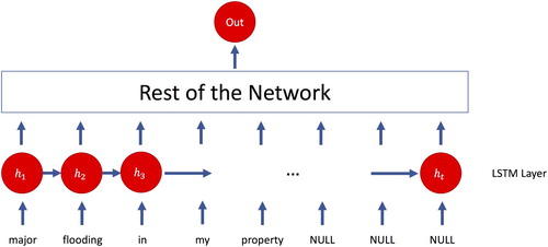
Figure 6. Proposed Long Short-term Memory (LSTM) Architecture.
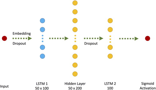
Table 4. Accuracy, precision, recall and F1 scores for proposed classifier models.
Table 5. Twelve latent topics with words and diagnostics measures.
Figure 7. Temporal distribution of top 10 coherent categories of disaster-related tweets.
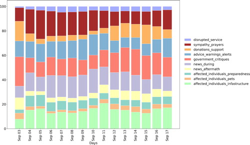
Table 6. Sample of tweets for each category of information.
Figure 8. Spatial and temporal distribution of tweets about affected individuals and infrastructure.
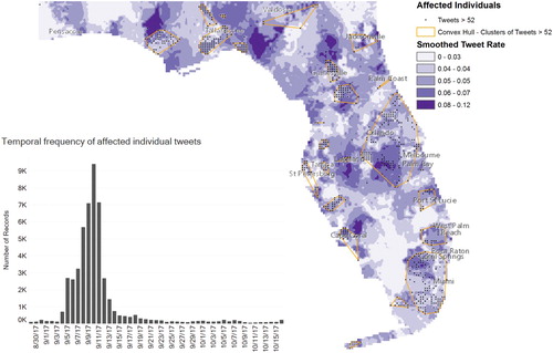
Figure 9. Overlaying of tweets with total rain in inches and flood zones between September 5 and September 12.
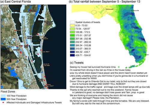
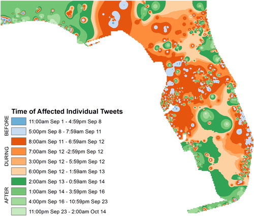
Figure 10. Temporal progression of affected individuals and infrastructure tweets by area. On average, Blue areas tweeted before, orange areas tweeted during, and green areas tweeted after Hurricane Irma.