Figures & data
Figure 1. Location of Wuhan city and the study area. The green dots represent the fixed water quality monitoring stations and the green squares represent emergency hospitals (HH and LH). Several major lakes in this study are marked by yellow lines. The map is made by Landsat 8/OLI image, with RGB of band5, band4, and band3. (Colour online)
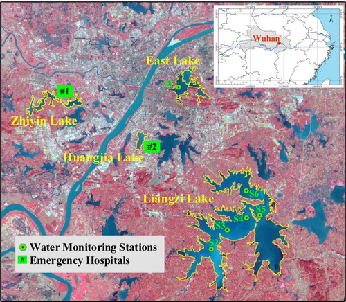
Figure 2. Number statistics of Landsat-8/OLI, Sentinel-2/MSI, and HY-1C/CZI images used in this study and the time coverage for major events during the COVID-19 epidemic. (Colour online)
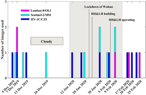
Table 1. Basic characteristic parameters of Landsat-8/OLI, Sentinel-2/MSI and HY-1C/CZI.
Table 2. Statistic parameters of the field turbidity measurement in Wuhan (unit: NTU).
Figure 3. The development and validation of the turbidity retrieval models. (a) OLI-based turbidity retrieval model, plotted by Rrs(655 nm)/Rrs(561 nm) versus the in-situ turbidity measurement; (b)MSI-based turbidity retrieval model, plotted by Rrs(655 nm)/Rrs(561 nm) versus the in-situ turbidity measurement; (c) CZI-based turbidity retrieval model, plotted by Rrs(664 nm)/Rrs(560 nm) versus the in-situ turbidity measurement; (d) validation of turbidity retrieval models, plotted by the in-situ turbidity value and the satellite-derived turbidity value. (Colour online)
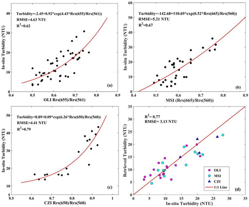
Figure 4. Synchronous comparison of multi-sensor derived turbidity maps in Liangzi Lake. Landsat-8/OLI was regarded as a benchmark and compared with HY-1C/CZI and Sentinel-2/MSI on 29 October 2019 and 9 February 2020, respectively. (Colour online)
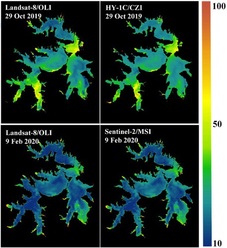
Figure 5. Consistency of multi-sensor derived turbidity. (a) scatterplot of turbidity results derived from OLI and CZI; (b) scatterplot of turbidity results derived from OLI and MSI. Note that the red solid lines are the optimal fitting curves corresponding to the regression equation. (Colour online)
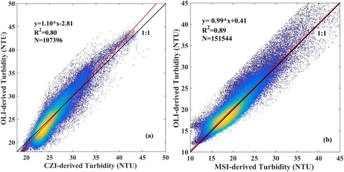
Figure 6. Time series of satellite-derived turbidity maps over Wuhan lakes during the COVID-19 epidemic from 4 December 2019 to 25 February 2020. (Colour online)
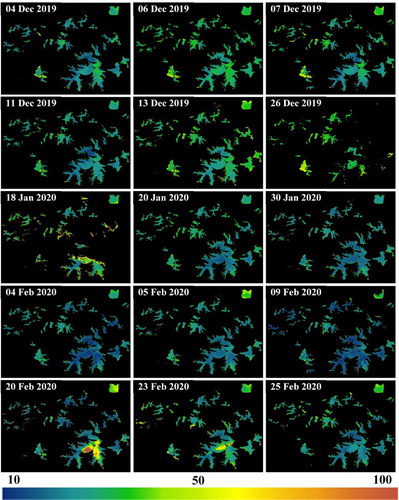
Figure 7. The mean turbidity of Wuhan lakes and the change trend during the COVID-19 epidemic, along with the daily accumulated precipitation records and wind force records (Beaufort Scale). The boxplots (including minimum, maximum, median, first quartile, and third quartile) of turbidity values are plotted to show spatial heterogeneity. Note that the shadow box, which represents three weeks before and after the lockdown of Wuhan, is the specific period selected for the trend analysis. The red circle highlights the fresh breeze (Beaufort Scale = 5) on 15 February 2020. (Colour online)
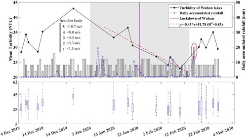
Figure 8. Comparison of monthly mean turbidity over Wuhan lakes between the COVID-19 and the same period in the previous year, along with the monthly mean rainfall and wind force. Note that the wind force (Beaufort Scale) is also scaled by the right y axis. (Colour online)
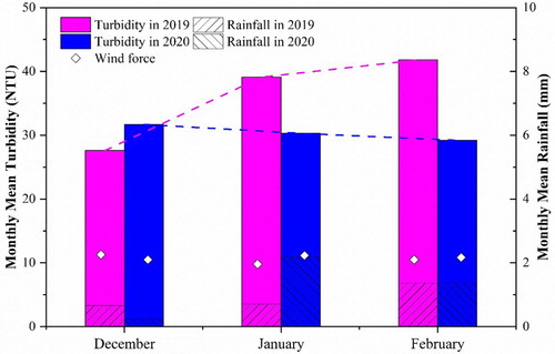
Figure 9. Turbidity variation in Zhiyin Lake and Huangjia Lake during the construction and operation of HH and LH. (Colour online)
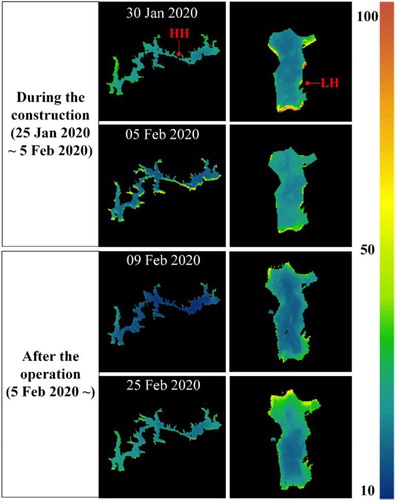
Figure 10. Mean turbidity of Zhiyin Lake and Huangjia Lake during the COVID-19 epidemic from 4 December 2019 to 20 February 2020. Note that the red and blue dashed lines represent the changing trend of turbidity value in two phases. (Colour online)
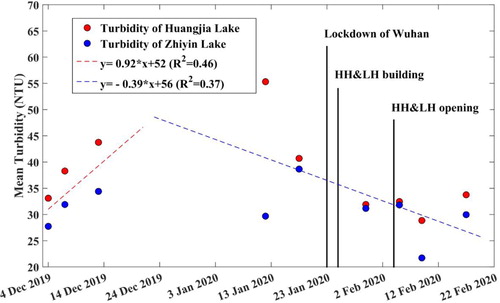
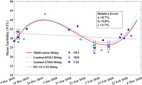
Figure 11. The variation trend of mean turbidity in Wuhan lakes from multi-sensor retrievals. Note that all the fitting curves were obtained by the nonlinear least-square regression. (Colour online)