
Figures & data
Figure 1. Map of 20 sites (solid circles) with matched in situ radiometric measurements within ± 2 h of Landsat-8 overpasses. Dots of the same color represent sites given the same name listed in . Names of six locations whose remote sensing reflectance (Rrs) spectra are shown in are annotated. Please refer to for details. (For interpretation of the references to color in this figure legend, the reader is referred to the web version of this article.)
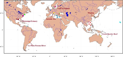
Figure 2. OLI/Landsat-8 derived RGB composites for the 20 stations listed in .
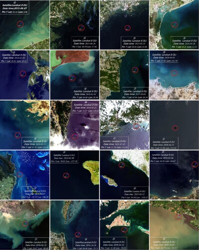
Table 1. Information for locations with matched in situ radiometric and Landsat 8 OLI measurements, including station number, station name and their abbreviations, latitude, and longitude.
Figure 3. Averaged Rrs spectra for the five optical water types (OWTs).
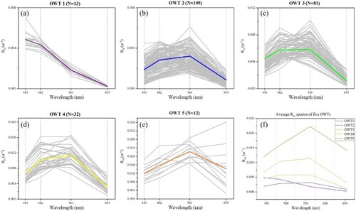
Figure 4. Flowchart for matchup analysis and satellite data processing in this study.
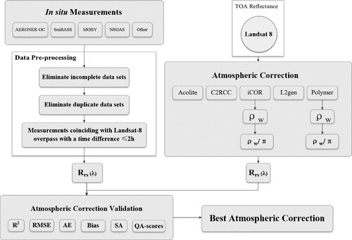
Figure 5. Scatter plots of satellite-derived versus in situ measured Rrs for visible bands of OLI/Landsat-8. The orange dashed lines refer to the 1:1 relationship and other colored lines represent the best-fitted relationships. Note that the scale for each band is different.
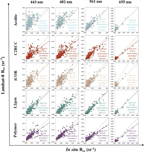
Figure 6. Histograms for absolute error (AE), bias, root mean square error (RMSE), and R2 for satellite-derived vs in situ measured Rrs at visible bands of OLI/Landsat-8.
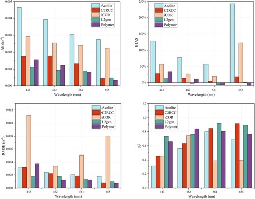
Table 2. Statistical results for remote sensing reflectance (Rrs) at four visible bands of Operational Lands Imager (OLI) Landsat 8 using five atmospheric correction (AC) algorithms, including Acolite, C2RCC, iCOR, L2gen, and Polymer. Statistical measures for comparison between in situ and satellite measurements include slope, intercept, R2, root mean square error (RMSE), absolute error (AE), bias, spectral angle (SA), quality assurance (QA) score. N denotes the number of data samples. Best metrics for each band are highlighted in bold.
Figure 7. Radar map for each visible band of OLI in terms of bias, slope, intercept, R2, RMSE, and AE.
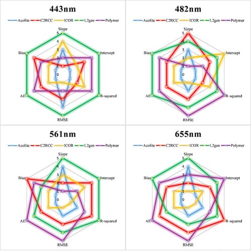
Table 3. ACs with the best performance for each station in terms of SA and average of AE (AAE) between in situ and satellite measured Rrs. The number in brackets in the second column indicates the number of matched in situ and OLI measured Rrs. The sixth to ninth columns represent ACs with the best performance for each visible band of Landsat 8 OLI for each station.
Figure 8. Performance assessment of five AC algorithms for five optical water types (OWTs). Different colors indicate their rankings for the visible bands of OLI/Landsat 8. Warm color indicates better performance. (For interpretation of the references to color in this figure legend, the reader is referred to the web version of this article.)
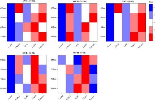
Figure 9. Comparison between averaged Rrs spectra from in-situ and satellite observations using different AC algorithms for five OWTs.
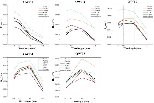
Table 4. AC algorithm assessment for different optical water types (OWTs) using SA and the optimal algorithm is highlighted in bold. The best band-specific algorithm for each OWT is also presented. The number in brackets in the first column indicates the number of matched in situ and OLI-measured Rrs for each OWT.
Figure 10. In situ measured Rrs spectra at six sampling sites. Only those with matched satellite observations are shown here.
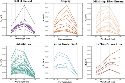
Figure 11. Spectral angle for each AC processor. Smaller spectral angle would imply more similar shape. The red line represents the median and the boxes cover the 25–75% range. The upper and lower whiskers represent values outside the middle 50% (excluding outliers), defined as 1.5 × interquartile range (1.5 IQR). Box plot in depicts median (horizontal line), interquartile range (box), 1.5 × interquartile range (error bars), and outliers (black dots) which fall more than 1.5 times the interquartile range. (For interpretation of the references to color in this figure legend, the reader is referred to the web version of this article.)
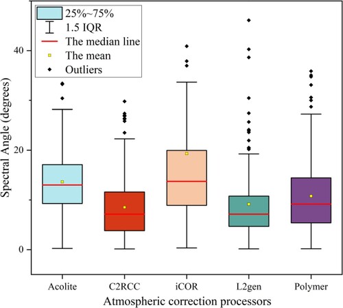
Figure 12. Comparison between averaged Rrs spectra from field measurements and satellite observations using different atmospheric correction algorithms.
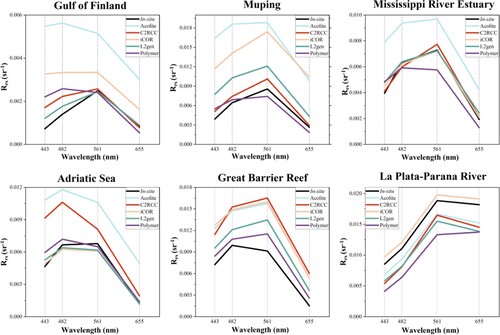
Figure 13. True color composite for 10 February 2016 over the area affected by the Atchafalaya River and the Mississippi River. Landsat-8 OLI-derived Rrs spectra for five locations, i.e. A–E, representing different water conditions are shown. The colored line denotes the averaged Rrs for the 30 × 30 pixels and the shaded color denotes standard deviation. (For interpretation of the references to color in this figure legend, the reader is referred to the web version of this article.)
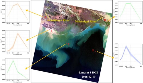
Figure 14. Quality assurance score (QAS) for OLI/Landsat 8-measured Rrs from different atmospheric correction processors. The scene was collected on 10 February 2016. The higher QAS, the better data quality.
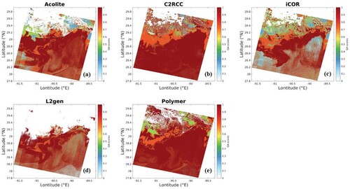
Table 5. Comparison among the five AC algorithms in terms of computation efficiency and output data size.
Data availability statement
The data that support the findings of this study are openly available in https://seabass.gsfc.nasa.gov/search_results/val. https://aeronet.gsfc.nasa.gov/new_web/data.html. Please contact us if you need additional materials.