
Figures & data
Figure 1. Workflow of outage detection using NASA’s Black Marble product suites.
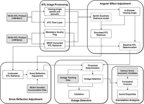
Figure 2. (a) National Weather Services (NWS) winter weather forecast near Texas, (b) counties that declared Winter Storm Uri as a major disaster.
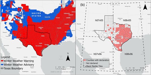
Table 1. Descriptions of layers extracted from NASA’s Black Marble product.
Table 2. The list of tables and socio-economic variables extracted from the 2019 American Community Survey.
Figure 3. Hourly ratio of power outage from Feb 11 to Feb 24 (lines, left axis) and the number of counties where > 80% area is covered by high-quality NTL pixels (bars, right axis). The red dashed line indicates the general NTL acquisition time (close to 2:45 AM Central Standard Time) of NTL images on Feb 16, 2021.
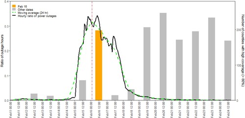
Figure 4. (a) Acquisition time in Central Standard Time (CST) and VIIRS satellite orbit from VNP46A2 on Feb 16, 2021, (b) power outage ratios (tracking data) between 2–3 AM in Texas counties, areas that did not experience extensive power outages are highlighted in blue dashed boundaries.
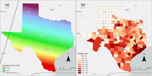
Figure 5. Scatterplots of radiance by zenith angle from Jan 1, 2020, to Mar 2, 2021, in random four pixels in the study area. The red box indicates the radiance values on dates that have a similar viewing zenith angle as Feb 16, 2021.
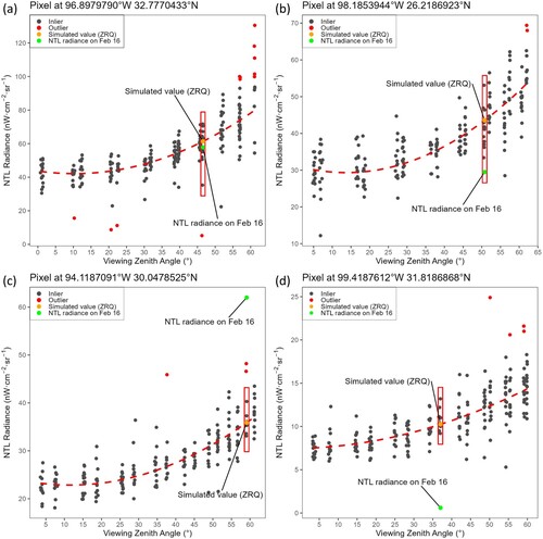
Figure 6. Comparison between NTL radiance change and snow accumulation: (a) spatial distribution of NTL radiance change (), (b) snowfall accumulation from NOAA National Gridded Snowfall Analysis (72-hour snowfall accumulation) at 12:00 AM, Feb 16, 2021.
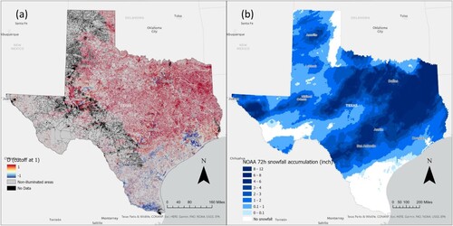
Figure 7. (a) Bin-fit scatterplot between 72-hour snowfall and NTL difference ratio (D) of pixels in the Feb 16 NTL image, (b) density plots between 72-hour snowfall and NTL difference ratio (D) of pixels in the Feb 16 NTL image. The white horizontal line (D = 0) represents no change in NTL. The blue dashed line in (a) and white dashed line in (b) indicate the actual bin fit to the target (equation and R2 listed at the bottom of each graph).
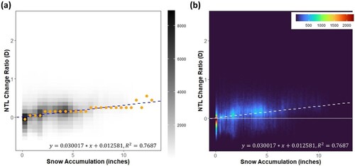
Table 3. Coefficients in NTL radiance adjustment function by snow accumulation category.
Figure 8. (a) Bin-fit scatterplot between the actual NTL radiance and simulated NTL radiance on Feb 16 (bin width = 0.25 unit), (b) density plots between the actual NTL radiance and simulated NTL radiance on Feb 16, (c) bin-fit scatterplot between the actual NTL radiance and simulated NTL radiance on Feb 16 (bin width = 0.25 unit), (d) density plots between the adjusted NTL radiance and simulated NTL radiance on Feb 16. Black lines in (a)&(c) and white lines in (b)&(d) indicate the adjustment target (f(x) = x). The blue dashed lines in (a)&(c) and white dashed lines in (b)&(d) indicate the actual bin fit to the target in all figures (equation and R2 listed at the bottom of each graph).
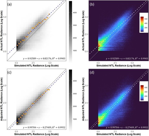
Figure 9. Changes of R2 with increasing (left) and
(right) in the iterative program. Blue and red curves are calculated with adjusted and original radiance, respectively.
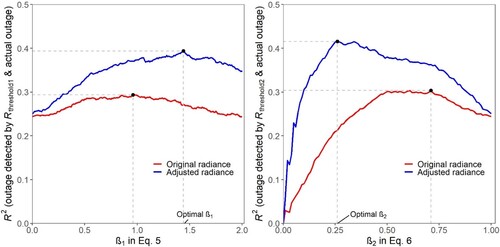
Table 4. Highest coefficient of determination (R2) in each NTL threshold and the optimal coefficient (if applicable) that generates the highest R2.
Figure 10. (a) Outage pixels from NTL images in the declared disaster counties in Texas, (b) zoom-in view of Austin (Travis County) and San Antonio (Bexar County), (c) zoom-in view of Houston (Harris County), (d) zoom-in view of Dallas (Dallas County) and Fort Worth (Tarrant County).
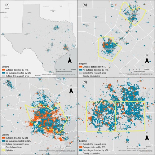
Figure 11. (a) Power outage ratios aggregated in counties, (b) power outage ratios aggregated in census tracts.
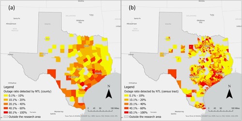
Table 5. The statistics (p-value and Pearson correlation coefficient) of the correlation models between socio-economic variables and the NTL power outage ratio.
Data availability statement
The data is freely available upon contacting the corresponding author.