Figures & data
Figure 1. F4ESS architecture with methodical/technical building blocks.
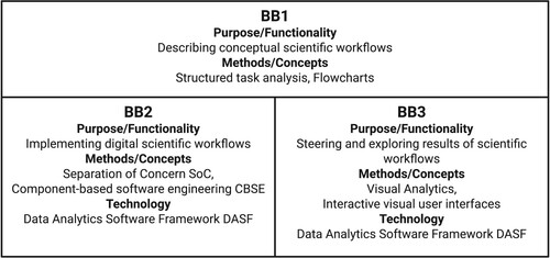
Figure 2. Each scientific discipline, Atmo, Terra, and Mare, provide its perspective and question to the generation, evolution, and impact of flood events. This figure is adapted from ‘Integrating Data Science and Earth Science [https://doi.org/10.1007/978-3-030-99546-1]’, used under CC BY 4.0.
![Figure 2. Each scientific discipline, Atmo, Terra, and Mare, provide its perspective and question to the generation, evolution, and impact of flood events. This figure is adapted from ‘Integrating Data Science and Earth Science [https://doi.org/10.1007/978-3-030-99546-1]’, used under CC BY 4.0.](/cms/asset/04968692-4361-4864-98fd-dff8add394ef/tjde_a_2259361_f0002_oc.jpg)
Figure 3. Flowchart of the hydrologists’ workflow.
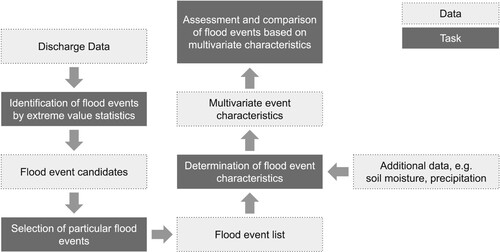
Figure 4. Flowchart of the marine scientists’ workflow.
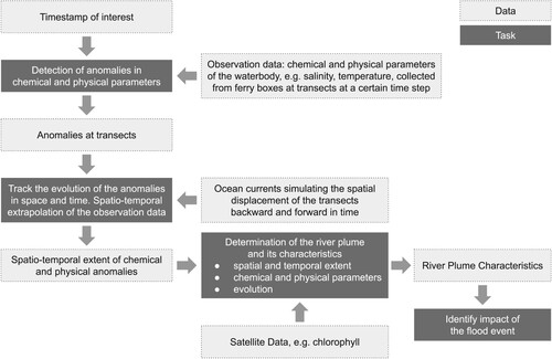
Figure 5. Flowchart of the combined workflow.
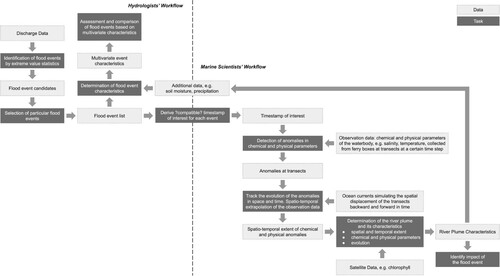
Figure 6. Visual interface of the collaborative work environment presenting an overview of height and duration of flood events determined for selected gauges and time intervals. The visual interface supports the selection of gauges (map) and time intervals (time line at the top) and the identification of corresponding flood events (line graph). The line graph depicts water runoff with flood event candidates shown as yellow segments and selected events shown as purple segments. The list at the bottom specifies the parameters and data for selected events. This figure is adapted from ‘Integrating Data Science and Earth Science [https://doi.org/10.1007/978-3-030-99546-1]’, used under CC BY 4.0.
![Figure 6. Visual interface of the collaborative work environment presenting an overview of height and duration of flood events determined for selected gauges and time intervals. The visual interface supports the selection of gauges (map) and time intervals (time line at the top) and the identification of corresponding flood events (line graph). The line graph depicts water runoff with flood event candidates shown as yellow segments and selected events shown as purple segments. The list at the bottom specifies the parameters and data for selected events. This figure is adapted from ‘Integrating Data Science and Earth Science [https://doi.org/10.1007/978-3-030-99546-1]’, used under CC BY 4.0.](/cms/asset/950b8c6c-1b5b-4c11-84b7-b0a8a17afd20/tjde_a_2259361_f0006_oc.jpg)
Figure 7. Visual interface of the collaborative work environment supporting detailed investigation and comparison of selected flood events. Linked view on the water run off (on the top) and corresponding precipitation for picked days (purple marker in the line graph).
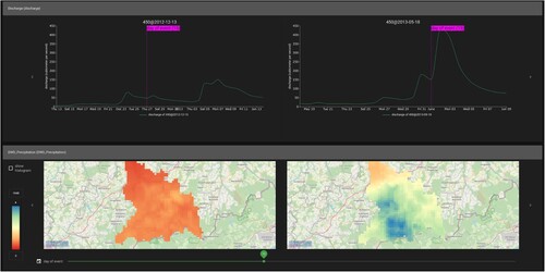
Figure 8. Visual interface of the collaborative work environment supporting the determination of marine impact characteristics for a specific flood event. Dates with detected anomalies aligning with the event date are shown in the calendar heatmap at the bottom. The spatial distribution and behaviour of the anomalies can be explored in the map, areas of interest can be selected for detailed investigation of physical and chemical parameters presented in the bar chart. An interactive timeline at the top facilitates investigating the variation of the anomaly in its spatial distribution (map) and its parameter values (bar chart) during a defined time interval. This figure is adapted from ‘Integrating Data Science and Earth Science [https://doi.org/10.1007/978-3-030-99546-1]’, used under CC BY 4.0.
![Figure 8. Visual interface of the collaborative work environment supporting the determination of marine impact characteristics for a specific flood event. Dates with detected anomalies aligning with the event date are shown in the calendar heatmap at the bottom. The spatial distribution and behaviour of the anomalies can be explored in the map, areas of interest can be selected for detailed investigation of physical and chemical parameters presented in the bar chart. An interactive timeline at the top facilitates investigating the variation of the anomaly in its spatial distribution (map) and its parameter values (bar chart) during a defined time interval. This figure is adapted from ‘Integrating Data Science and Earth Science [https://doi.org/10.1007/978-3-030-99546-1]’, used under CC BY 4.0.](/cms/asset/fa6d90f9-f7a3-473f-a666-64ca107cb49e/tjde_a_2259361_f0008_oc.jpg)
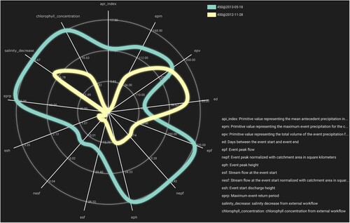
Figure 9. Visual interface of the collaborative work environment supporting the comparison of characteristics of flood events and marine impact. The radar plot shows the parameter values of two flood events and corresponding marine impact.