Figures & data
Figure 1. Schematic overview on data products used in the CMEMS OSR. Three types of multi-year products for the global ocean and regional seas (see map) are distributed in the CMEMS catalogue, i.e. ocean reanalysis (RAN) products, reprocessed in situ products and reprocessed satellite products. ESA-CCI products were also used to complement CMEMS multi-year satellite products. Time series generally start from the year 1993 and are extended close to real time through the additional use of CMEMS near-real-time products. See text for more details. CMEMS geographical areas on the map are for: 1 – Global Ocean; 2 – Arctic Ocean from 62°N to North Pole; 3 – Baltic Sea, which includes the whole Baltic Sea including Kattegat at 57.5°N from 10.5°E to 12.0°E; 4- European North-West Shelf Sea, which includes part of the North-East Atlantic Ocean from 48°N to 62°N and from 20°W to 13°E. The border with the Baltic Sea is situated in the Kattegat Strait at 57.5°N from 10.5°E.to 12.0°E; 5 – Iberia-Biscay-Ireland Regional Seas, which include part of the North-East Atlantic Ocean from 26°N to 48°N and 20°W to the coast. The border with the Mediterranean Sea is situated in the Gibraltar Strait at 5.61°W; 6- Mediterranean Sea, which includes the whole Mediterranean Sea until the Gibraltar Strait at 5.61°W and the Dardanelles Strait; 7- Black Sea, which includes the whole Black Sea until the Bosphorus Strait.
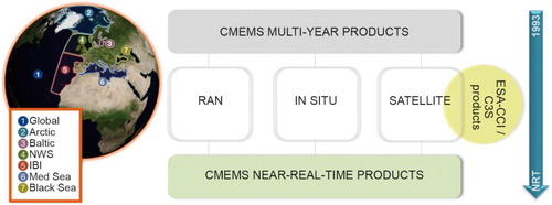
Figure 2 (a) SST monthly global mean anomaly time series based on the ESA-CCI product (see text for details) (b) Mediterranean and (c) Black Sea SST monthly mean anomaly time series (see text for more details on data use). Dedicated assessment during the overlapping period between the reprocessed and near-real-time product (2008–2012) shows the consistency between the two SST time records. Major biases between the reprocessed and near-real-time products have been removed from the latter for the recent years.
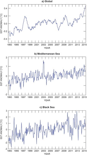
Figure 3 (a): Yearly-mean global 2015 SST anomaly map (−3/ + 3°C, see text for information on data use) relative to the 1993–2007 climatology. Specific comparison between the near-real-time and reprocessed SST estimates shows maximum differences of around 0.6°C, except in very specific locations (Roberts-Jones et al. Citation2011). Hence, this analysis is relevant for demonstrating features whose amplitude is significantly greater than 1°C. (b): Same as (a), but over the Black Sea and Mediterranean Sea (−1.5/ + 1.5°C).
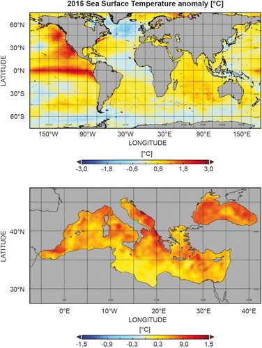
Figure 4. 1993–2015 SST trend map in degrees Celsius per year, over the Black Sea and Mediterranean Sea, derived from the same data set as in .
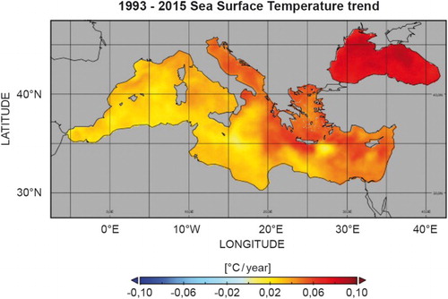
Figure 5 (a) Depth/time section of globally averaged subsurface temperature (T) anomalies during the period 1993–2015 and relative to the climatological period 1993–2014 (in °C, contour interval is 0.01 for colours, 0.05 in black) and (b) Depth/latitude section of zonally averaged subsurface temperature trends during the period 1993–2015 (in °C/year, contour interval is 0.0025 for colours, the black line corresponds to the area where the formal error adjustment of the least-square fit is greater than 0.005°C/year), see text for more details on data use.
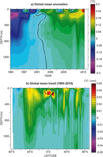
Figure 6. Depth/latitude sections of subsurface temperature anomalies in 2015 relative to the climatological period 1993–2014. Averages are given for (a) the Atlantic Ocean, (b) the Pacific Ocean, (c) the Indian Ocean and (d) the Mediterranean Sea. Units are °C, contour interval is 0.05, except for the two extreme colours. See text for more details on the data use.
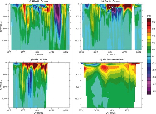
Figure 7. Temperature anomalies at 209 m in 2015 relative to the climatological period 1993–2014 for the Mediterranean Sea, see text for more details on the data use. Units are °C.
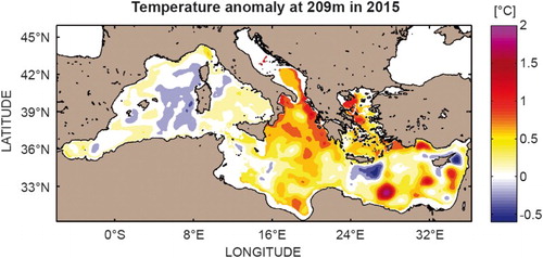
Figure 8. Horizontal maps (global and zoom over the European Seas) of near-surface (10 m) salinity (a) anomalies in 2015 relative to the climatological period 1993–2014 (units are psu) and (b) trends during the period 1993–2015 (units are psu/year, the red line corresponds to the areas where the formal error adjustment of the least-square fit is greater than 0.001 psu/year), see text for more details on data use.
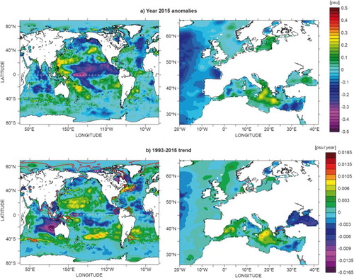
Figure 9. Depth/latitude sections of subsurface salinity anomalies in 2015 relative to the climatological period 1993–2014, see text for more details on the data use. Averages are given for (a) the Atlantic Ocean, (b) the Pacific Ocean, (c) the Indian Ocean and (d) the Mediterranean Sea. Units are psu, contour interval is 0.01, except for the two extreme colours.
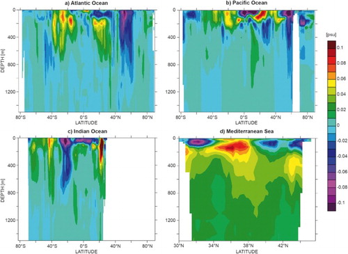
Figure 10. Salinity (upper panel) and depth (bottom panel) trends of the LIW core between 2001 and 2015. Locations of Argo profiles in the Ionian Sea are shown in cyan dots (small panel). The identification of the core of the LIW is made possible through a salinity-signature approach (Zu et al. Citation2014), by looking for the salinity maximal values. See text for more details on data use (only Argo data selected).
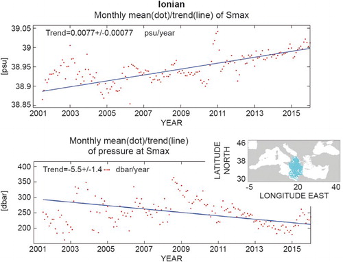
Figure 11. Temporal evolution of globally (left) and regionally (right) averaged daily MSL without annual and semi-annual signals (blue), 9-month low-pass filtered MSL (red) and annual mean thermosteric sea level (0–700 m) (green, uncertainty estimation method after von Schuckmann et al. Citation2009) anomalies relative to the 1993–2014 mean. In the right panel an arbitrary offset has been introduced for more clarity. From top to bottom, the regions are NW Shelf, IBI, Med. Sea and Black Sea. No thermosteric contribution is shown for the Black Sea due to the scarcity of the in situ temperature observations in this region. In this figure, no Glacial Isostatic Adjustment (GIA) correction has been applied to the total MSL whereas a correction for the glacial isostatic adjustment was added for the MSL trends in . See for the definition of the dataset.
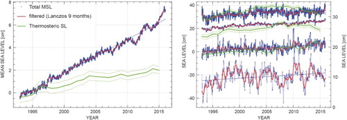
Table 1. Mean sea level trends during January 1993–December 2015 for the global ocean and different CMEMS regions for the total altimeter sea level (corrected from the Glacial Isostatic Adjustment – GIA, e.g. Tamisiea, Citation2011) and the thermosteric sea level. Associated uncertainties at global and regional scales are derived from Ablain et al. (Citation2015), Prandi et al. (Citation2016) and von Schuckmann et al. (Citation2009), respectively. Results are based on the CMEMS reprocessed altimeter sea level producta for total sea level. Thermosteric sea level (0–700 m) is derived from the CMEMS reprocessed product of global in-situ observationsb for the 1993–2014 period, and extended using the CMEMS real-time productc. A mean salinity climatology over the period 1993–2014 is used from the CMEMS reprocessed product for the evaluation of thermosteric sea level. The thermosteric anomalies are derived relative to the 1993–2014 period and relative to the 1993–2012 period for total sea level.
Figure 12. Spatial distribution of the total (top) and thermosteric (0–700 m) (bottom) sea level trends during 1993 – December 2015 (in mm/yr) over the global ocean (left) and the European Seas (right). No GIA correction has been applied on the altimeter data. See for the definition of the dataset.
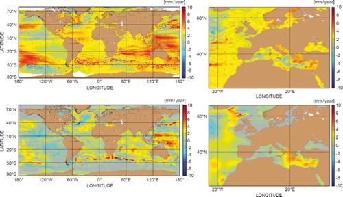
Figure 13. Global (left) and regional (right) spatial variability of the difference between the detrended altimeter MSL during [2015] and [1993–2014].
![Figure 13. Global (left) and regional (right) spatial variability of the difference between the detrended altimeter MSL during [2015] and [1993–2014].](/cms/asset/66a1a3ec-77b4-41ce-8aff-71a04d204a2f/tjoo_a_1273446_f0013_c.jpg)
Figure 14. Relationship between chlorophyll-a concentration and the ratio of blue to green remote-sensing reflectance (Rrs), with the maximum Rrs in blue bands (443–510 nm) divided by that at 555 nm (green bands). In situ chlorophyll-a data (coloured-squares, coloured according to the number of samples, N) were collected as part of the OC-CCI project (Valente et al. Citation2016) and these were matched to Rrs data from the OC-CCI project (version 2.0). The global algorithm is that of O’Reilly et al. (Citation2000); Med (Mediterranean) is that of Volpe et al. (Citation2007); Baltic is from Pitarch et al. (Citation2016); and the Arctic is that of Cota et al. (Citation2004). Note that the global algorithms are designed for open-ocean (so-called Case 1) waters, and regional algorithms tend to diverge most from global algorithms in coastal (Case 2) waters. Note that none of the algorithms shown in the figure have been re-tuned using the OC-CCI in situ data shown in the figure.
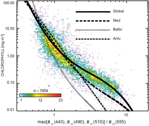
Figure 15 (a) Climatology of chlorophyll concentration in the Atlantic and Artic Oceans. See text for more details on data use. (b) Microscopic image of phytoplankton (credit NOAA MESA Project, source http://www.photolib.noaa.gov/bigs/fish1880.jpg). (c) Assorted phytoplankton (diatoms) living between crystals of annual sea ice in Antarctica (credit NSF Polar Programs, source http://www.photolib.noaa.gov/htmls/corp2365.htm).
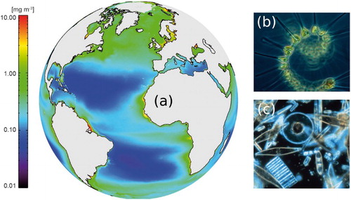
Figure 16. Relationship between chlorophyll-a and the ENSO and IOD climate modes. Note that the scale of chlorophyll anomalies is inverted. Chlorophyll images are from an annual climatology (see text on more details for data use). The monthly multivariate ENSO Index (MEI) was downloaded from the NOAA website (http://www.esrl.noaa.gov/) and the IOD Mode Index (IOD) was taken from the JAMSTEC website (http://www.jamstec.go.jp). Weekly values of the IOD from 1981 to the present were derived from NOAA OISST version 2, and were smoothed with a 12-point (3-month) running mean. Monthly chlorophyll data were taken from OC-CCI/CMEMS (see text). The time series of chlorophyll anomalies for the IOD represent the difference in chlorophyll anomaly between the two boxes in the Indian Ocean (see Brewin et al. Citation2012).
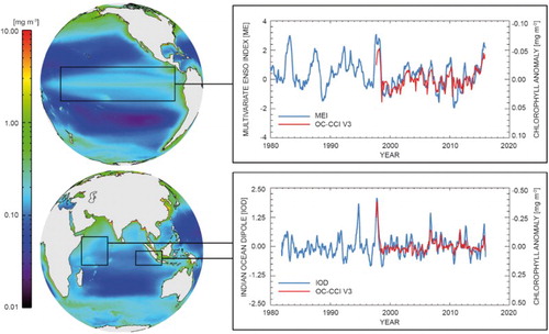
Figure 17. Annual anomalies in chlorophyll from 1998 to 2015 (see text for details on data use). Anomalies were computed by calculating annual averages (from monthly composites) then subtracting the average of all 18 years from each year. Computations were done in log10-space, considering the typical distribution of chlorophyll concentration (Campbell Citation1995).
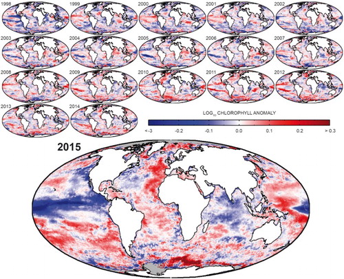
Figure 18. 1993–2014 average near surface (15 m) zonal current (a) and zonal current anomaly in 2015 (relative to the 1993–2014 mean) (b) computed from in situ observations (see text for more details on data use). (c) and (d) identical to (a) and (b) but computed from GLORYS (see text for more details). Spurious strong currents are diagnosed by the reanalysis off New Guinea, which is a known sea surface height bias of the Mercator Ocean monitoring system (Lellouche et al. Citation2013). Positive values indicate eastward, negative values westward currents.
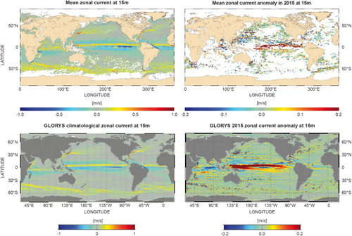
Figure 19 (a): total velocity at 15 m (m/s) climatology 1993–2014, and (b) the same quantity in 2015 computed from GLORYS (see text for more details), and c) for the year 1997. The colours stand for the velocity (m/s) and the arrows indicate the direction of the current.
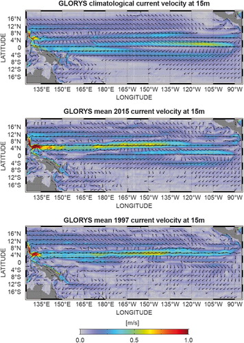
Figure 20. Latitude time diagram of the zonal current anomaly (m/s) in the Tropical Pacific Ocean (25°S–25°N), with respect to the 1993–2014 climatology, and computed from the in situ current observations (see text for more details). Positive values indicate eastward, negative values westward currents. The pink line indicates the NINO3.4 index from GLORYS, and the black line is the standardised Southern Oscillation Index (https://www.ncdc.noaa.gov/teleconnections/enso/indicators/soi/).
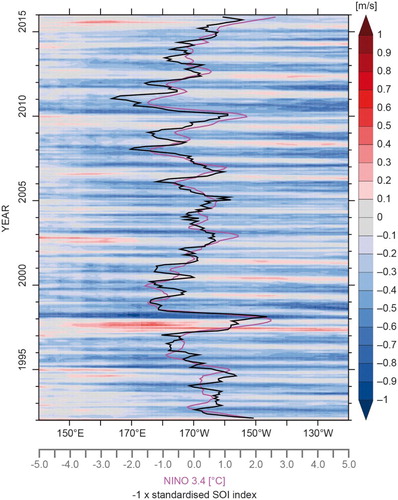
Figure 21 (a) First low-frequency (all inputs are filtered with 4 years running window) spatio-temporal variability mode of 15 m zonal current (m/s) from EOF analysis of GLORYS (1993–2015, see text for more details). The colour shading shows the adimensional spatial pattern of the mode, and a white box (hereafter called index box) is drawn on a high variability region inside this pattern. The time series of amplitude (m/s) of the mode is shown in the bottom panel: black line: zonal current anomaly (m/s) the corresponding mode; blue line: zonal current average from GLORYS in the index box, thick red line: median of zonal velocity (m/s) from drifter in situ observations (see text for more details) in the index box, thin red lines: interval of confidence for the thick red line defined as 40th and 60th percentiles. The median of all drifters in the index box and on the whole period was retrieved to time varying median and percentiles, in order to build monthly anomaly ‘distributions’ within a 4-year running window. The correlation between the thick blue and red lines is indicated along the x-axis.
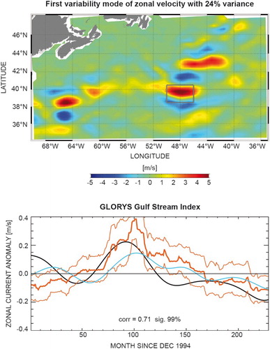
Figure 22. As in , but for the first mode of variability of zonal current in the Kuroshio region.
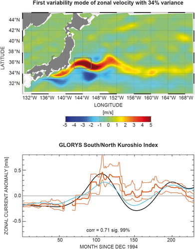
Figure 23. Map of the border of the March and September sea ice extent in the Arctic (left) and Antarctic (right), respectively. The sea ice extent is from the CMEMS global reanalysis product GLORYS, except for the Arctic September sea ice extent which is from the CMEMS regional reanalysis product for the Arctic and the Arctic forecasting product (see text for more details).
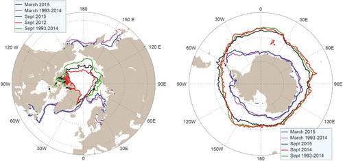
Figure 24. (a) Arctic seasonal cycle of the sea ice extent; long-term mean (blue line) and standard deviation (blue shading), 2012 (green line) and 2015 (red line). (b) Time series for Arctic sea ice extent anomaly (with respect to the mean seasonal cycle). Both plots are based on the CMEMS reprocessed regional product, see text for more details on data use.
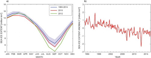
Figure 25 (a) Baltic seasonal cycle of the sea ice extent; long-term mean (blue line), standard deviation (blue shading) and 2015 (red line). (b) Time series for Baltic sea ice extent from 1993 to 2015. Both plots are based on operational ice charts from SMHI.
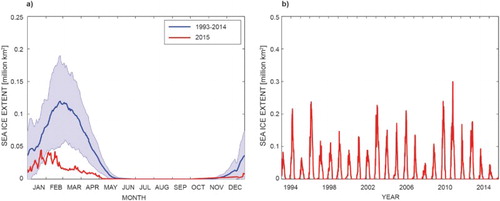
Figure 26 (a) Antarctic seasonal cycle of the sea ice extent; long-term mean (blue line) and standard deviation (blue shading), and 2015 (red line). (b) Time series for Antarctic sea ice extent anomaly. Both plots are based on the CMEMS global reanalysis product GLORYS (see text for more details).
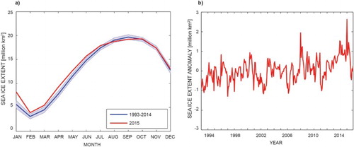
Figure 27 (a) Estimates of OHC anomalies for the near-global (60°S–60°N, blue), Mediterranean Sea (red), Iberian-Biscay (green) and North-West-Shelf (black) areas, integrated from the ocean’s surface down to 700 m depth. Regional boundaries are given in the introduction. Temperature anomalies are obtained relative to the 1993–2014 climatology. All in situ temperature data for the 1993–2014 period were obtained from the CMEMS product (see text for more details). For 2015, near-real-time in situ data are used based on the CMEMS product 013_030 (note 17). Note that estimates of area average OHC for the Baltic Sea and Arctic Ocean are still too limited by sparse in-situ data sampling during the period in question. Details on the error bar estimation are given in von Schuckmann et al. Citation2009. (b) Time series of upper 300 m OHC anomalies (seasonal cycle removed) in the Tropical Pacific (30°N–30°S), as estimated by the ocean reanalysis system ORAS4 (Balmaseda, Mogensen, et al. Citation2013). Note that an up-dated version of this reanalysis will be part of CMEMS in the near future. The loss of heat during the warm El Niño events of 1997/98, 2010 and the current 2015 are apparent. Units are Zeta Joules (1ZJ = 1021 Joules).
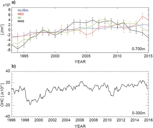
Figure 28. Map of OHC decadal trends over the period 1993–2015 for the global ocean. Details on method and datasets used are described in the caption for (a). Units are W/m2.
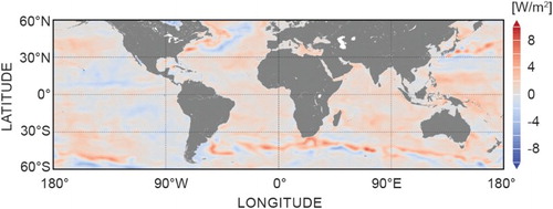
Figure 29. Mean 1993–2015 (a) volume (Sverdrup (SV = 106 m3/s)) and (b) heat (Petawatt (PW = 1015 Watt) transports across the WOCE sections (green) from GLORYS reanalysis (see Section 1.6, endnote 13) (in red) with interannual standard deviation and Lumpkin and Speer’s (Citation2007) estimations (in blue) with associated error. Arrows indicate the direction of the transport (positive in the northward and eastward directions).
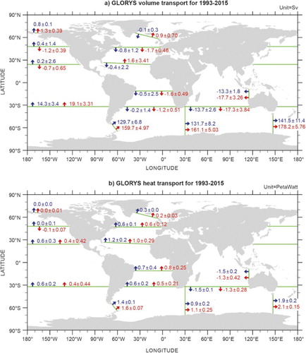
Figure 30. Time–mean (1993–2014) meridional heat transport (PW) for the global ocean (zonally and from surface to bottom integrated over the global ocean) estimated from GLORY reanalysis (see Section 1.6, endnote 13). The year 2015 is superimposed in red.
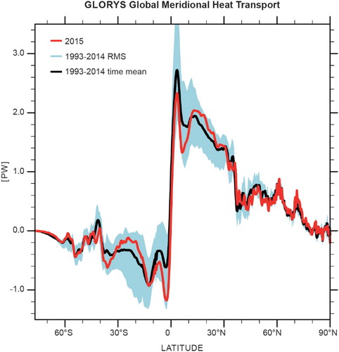
Figure 31. Time series of maximum AMOC at 26°N in Sv from the reanalysis GLORYS (see Section 1.6, endnote 13) in blue and from the RAPID array in red, plotted with a running mean of 10 days (thin line) and with a 3-month running mean (thick solid line).
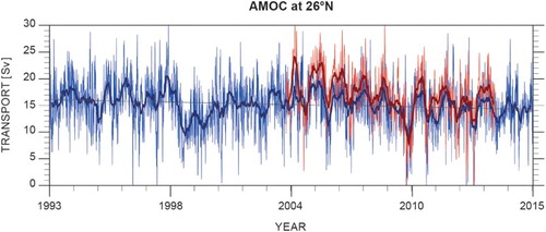
Figure 32. Maximum mixed layer depth in the North Atlantic from the reanalysis GLORYS (see Section 1.6; endnote 13) over the period 1993–2015. Red arrows indicate major pathways for Atlantic Water flow into the Nordic Seas. Blue arrows indicate pathways for dense water overflow from the Nordic Seas to the North Atlantic. Red lines show key oceanographic sections: A – Faroe North section; B – FSC; C – Svinøy Northwest section; D – Barents Sea Opening; E – Fram Strait; F – DS.
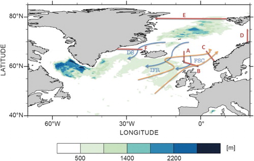
Figure 33. Volume transport time series of overflow waters as estimated from the CMEMS regional reanalysis and forecast product for the Arctic area (see text for more details). (a) Net volume transport of water masses with σθ > 27.8 through the Færøy-Shetland Channel. Negative indicate transports towards the south. Black line shows monthly averages and grey-shaded area denotes associated standard deviation. (b) Similar to (a), but showing for the DS. The reanalysis has been evaluated against observations in terms of ocean transports (Lien et al. Citation2016). The operational product is evaluated internally against observations on a weekly basis.
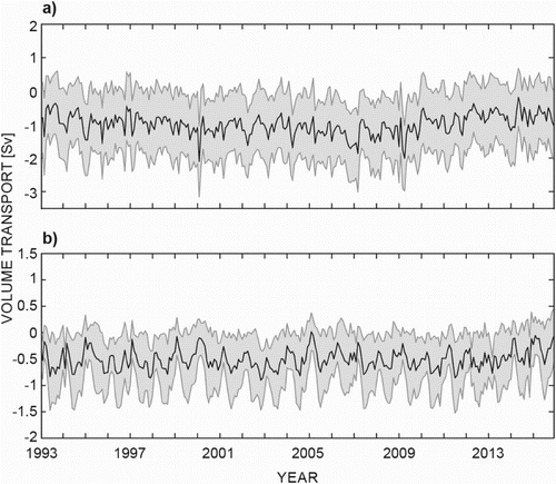
Figure 34. Climatological mean EKE computed from daily data (see Section 1.4, table footnote c) over the 1993–2015 period for the (a) global and (b) Mediterranean Sea (note the different colourbar range).
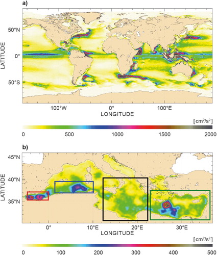
Figure 35. Anomalies of EKE for 2015 [09/2014–08/2015] with respect to the [1993–2014] climatological mean over the global ocean (a) and Mediterranean Sea (b) (note the different colourbar range).
![Figure 35. Anomalies of EKE for 2015 [09/2014–08/2015] with respect to the [1993–2014] climatological mean over the global ocean (a) and Mediterranean Sea (b) (note the different colourbar range).](/cms/asset/c9ade751-d844-4497-a289-170cd1902073/tjoo_a_1273446_f0035_c.jpg)
Figure 36. Mediterranean Sea circulation at 15 m: (a) computed from the CMEMS regional reanalysis product for the Mediterranean Sea over the time period 1987–2014; (b) computed from the CMEMS regional analysis data for 2015, see text for more details on data use.
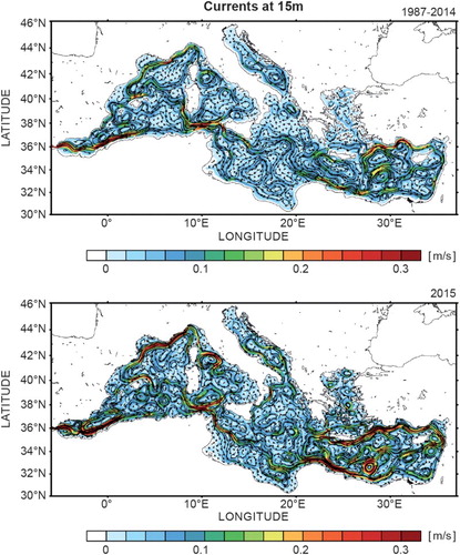
Figure 37. Surface circulation in the Ionian Sea computed from the CMEMS regional reanalysis product (see text for more details) over three time periods: (left) 1987–1996; (middle) 1997–2006; (right) 2007–2014.
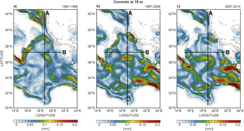
Figure 38. Mean meridional (left, 18.875°E) and zonal (right, 37.3125°N) salinity sections computed from the CMEMS regional reanalysis product (see text for more details) over three time periods down to 1000 m of depth: (top) 1987–1996; (middle) 1997–2006; (bottom) 2007–2014.
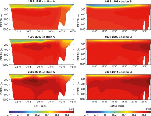
Figure 39. Mean surface currents and wind, annual, winter (DJF) and summer (JJA) mean (left to right) for the 1994–2013 climatology (upper row), 2015 (middle row) and anomaly (2015 minus the 1994–2013 climatology). Streamlines show the 10 m winds. The colours show the surface current magnitude (m/s) (log scale for the upper and middle rows) with the current directions given with vectors. These are shaded off the shelf. The anomaly (bottom row) shows 2015 minus climatology. For example, colours representing a positive value reflect a stronger current magnitude in 2015 than in the 1994–2013 mean, and the vectors show how the current direction has changed.
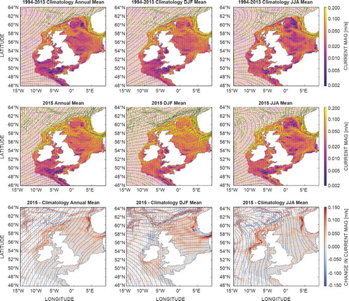
Figure 40. The climatology represents the mean of the years between 1994 and 2013; however these individual years can be expressed as a distribution. Here we ask where the 2015 wind and surface current magnitude fit within the distribution of values from 1994 to 2013, for the annual mean (ANN), winter (DJF, for 2014/2015) and summer (JJA) (left to right), for the magnitude of the 10 m wind and surface currents (upper row and lower row, respectively). The values off the shelf are greyed out. To highlight the extreme values, the values from the centre of the distribution (within 20th to 80th percentile) are lightly greyed out.
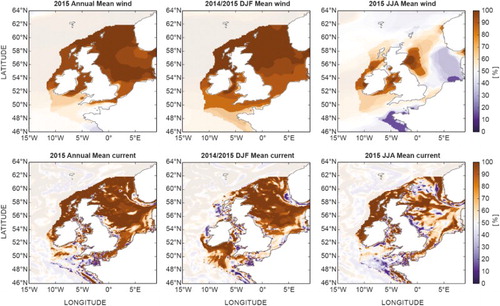
Figure 41. Volume transport time series of the Atlantic Water flow towards the Arctic. (a) Net volume transport through the Fram Strait (T > 2 °C). Positive values towards the north. Black line shows monthly averages and grey-shaded area denotes associated standard deviation. (b) Similar to (a), but showing for the Barents Sea Opening (N70° 15′ – N74° 15′; T > 3°C). Positive values towards the east (into the Barents Sea). Red line shows observations (N71° 30′ – N73 30′; T > 3°C). c) Similar to (a), but showing for the FSC (T > 5 °C). Positive values towards the north. For section positions, please see . The model data are based on the CMEMS regional re-analysis product (see Section 1.7, endnote 14) for the years prior to 2015 and the CMEMS forecast product for 2015 (see Section 1.7, endnote 15). The reanalysis has been evaluated against observations in terms of ocean transports (Lien et al. Citation2016). The operational product is evaluated internally against observations on a weekly basis.
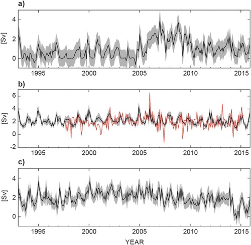
Figure 42. Salinity at the MARNET station in the Arkona Basin from observations (a) and reproduced by the CMEMS forecast product (see text for details) (b).
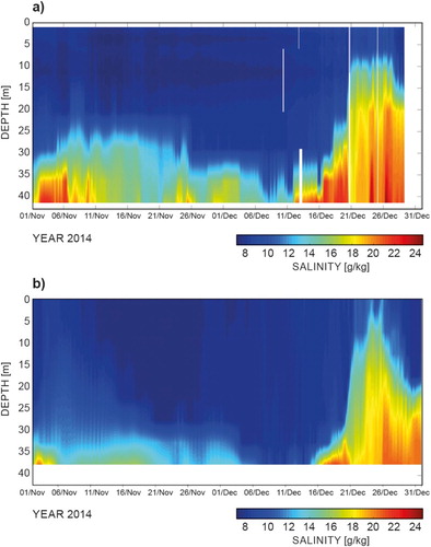
Figure 43. Bottom salinity (a) and salinity along the transect from Kattegat to the Bornholm Basin (b) from the CMEMS forecast product (see text for details) on 26 December 2014.
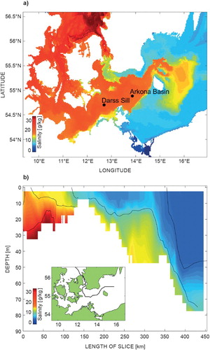
Figure 44. Measured salinity at station BY1 in the Arkona Basin (a) and at station BY15 in the Gotland Basin (b). Dots show the actual measurements. Data originate from the SHARK database (http://www.smhi.se/klimatdata/oceanografi/havsmiljodata, discussions are under the way to include this database into the CMEMS catalogue in the future).
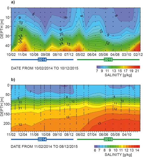
Figure 45. Schematic description of main IBI oceanographic features (Figure from Sotillo et al. Citation2015).
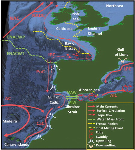
Figure 46. (a) August SST climatology derived from the IBI Reanalysis product (reference period: 2002–2014). (b) Surface Zonal Velocity (positive values not shaded): August climatology derived from IBI Reanalysis (reference period: 2002–2014) (bc) and (c) monthly field for August 2015 from the IBI operational near-real-time Forecast Service (cd). See text for more details on data use.
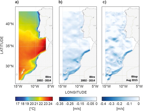
Figure 47. IBI CUIs: (a) and (b) Time series of CUIEK at 42°N (Western IP coast) and 30°N (NWA coast), respectively. CUIEK Index derived from estimation of Ekman transport perpendicular to shoreline of atmospheric forcing of the CMEMS IBI reanalysis. (c) CUISST, zonal Hovmöller diagram. CUISST Index derived from the CMEMS IBI reanalysis data for the 2002–2014 period and from the CMEMS IBI Forecast & Analysis service for the year 2015 (see text for more details on data use). The vertical black line limits the use of both datasets. White horizontal dashed lines denote the latitudes 42°N and 30°N, where CUIEK time series are shown in panels (a) and (b).
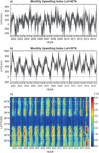
Figure 48. Averaged monthly CUIek (a) and CUISST (b) indexes, contoured by latitude and month. Reference period: 2002–2014 (the CMEMS IBI reanalysis time coverage). Grey horizontal dashed lines denote the latitudes 42°N and 30°N, where CUIEK time series are shown.
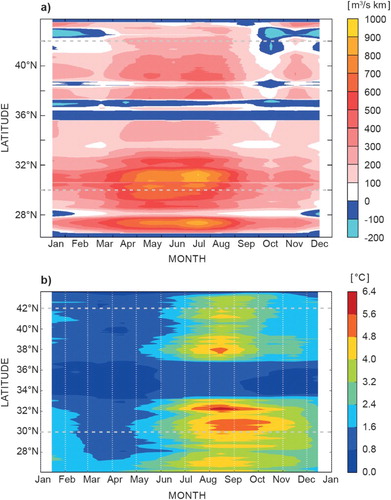
Figure 49 (a): Monthly SST average anomaly (°C, black line and colour shading) in the nino3.4 box (as shown by the white rectangle in b) from the Mercator Ocean monitoring system, with respect to the GLORYS (see Section 1.6, endnote 13) 1993–2014 climatology. (b): December 2015 average anomaly of heat content in the 0–300 m layer (GJ/m2) from the Mercator Ocean monitoring system with respect to GLORYS (1993–2014) December climatology. (c): Annual 2015 average of surface salinity anomaly SSS (psu) in the Tropical Pacific from the Mercator Ocean monitoring system with respect to GLORYS (1993–2014) climatology.
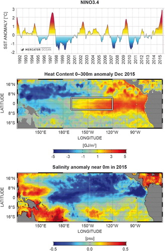
Figure 50. Longitude–time diagrams (October 2013 to October 2015) from the ocean reanalysis system ORAS4 (Balmaseda, Mogensen, et al. Citation2013) It should be noted that an updated version of this reanalysis will be part of CMEMS in the near future. (a) zonal wind stress at the Equator (m/s), (b) depth of the 20°C isotherm at the Equator and (c) SST. The anomalies are with respect to the 1981–2009 climatology.
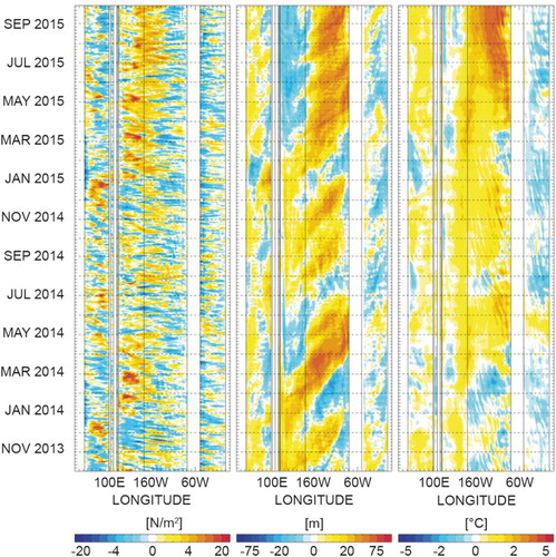
Figure 51. Annual mean regional OHC (0–700 m) anomaly for 2015. Based on monthly averages of the CMEMS ¼° global daily reanalysis GLORYS (see Section 1.6, endnote 13). Anomalies are relative to the climatology over 1993–2014 from the reanalysis. Units are in gigaJ/m2. The yellow dot corresponds to the location of the virtual mooring presented in .
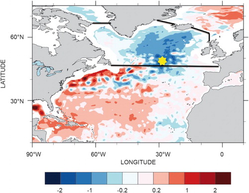
Figure 52. Left panel: Time series diagram of a virtual mooring from 0 to 2000m depth at 48.7°N/27.5°W (see ) over 2012–2015 of temperature (shaded, in °C) and salinity anomalies (thick contours, every 0.1 PSU, for negative anomalies). The stamped map in the bottom left corner of the diagram gives the position (red dot) of this virtual mooring plot. Monthly averages of the CMEMS ¼° global daily CMEMS reanalysis product GLORYS (see Section 1.6, endnote 13) are used. Anomalies are relative to the monthly climatology over 1993–2014 from the reanalysis. Right panel: For each depth corresponding to this virtual mooring time series, the temperature anomaly minimum (black) and maximum (red) are plotted, together with the absolute amplitude of the seasonal cycle (orange), as derived from the reanalysis monthly climatology. Depth of the min/max values are indicated.
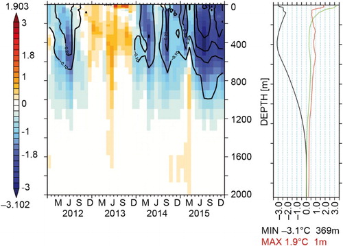
Figure 53. Area of mean OHC (0–700 m) anomaly in J/m2 averaged between 45°N and 65°N (see limits in ) in the Atlantic Ocean over the last two decades. The annual mean values obtained from the in situ observing system (red curve, see Section 2.1, endnote 17) are superimposed on monthly mean values using the CMEMS ¼° model products used in (see also Section 1.6, endnote 13). Uncertainty estimates on the observed OHC changes are detailed in von Schuckmann et al. (Citation2009).
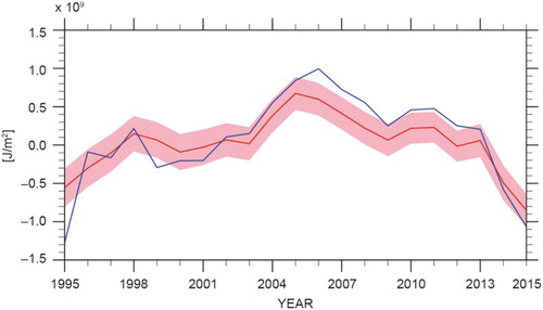
Figure 54. A Ferrybox system on the merchant vessel TransPaper was used to collect data continuously on the route Lübeck-Oulu-Kemi-Lübeck every week. Data were collected every 20 s. Results from June to September are presented. (A) Temperature, (B) Salinity, (C) Chlorophyll fluorescence, a proxy for total phytoplankton biomass and (D) Fluorescence from phycocyanin, a proxy for the biomass of phycocyanin-containg cyanobacteria. The map indicates the route of the ship in 2015. Red lines show the area from which data are presented.
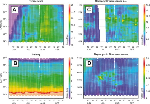
Figure 55. Number of days of satellite observations of cyanobacteria surface accumulations in June–August 2010–2015. The observations are based on a combination of Aqua-MODIS (NASA, https://modis.gsfc.nasa.gov/) (2010–2015) and EnviSAT-MERIS (2010–2011, https://earth.esa.int), figure from Öberg (Citation2015).
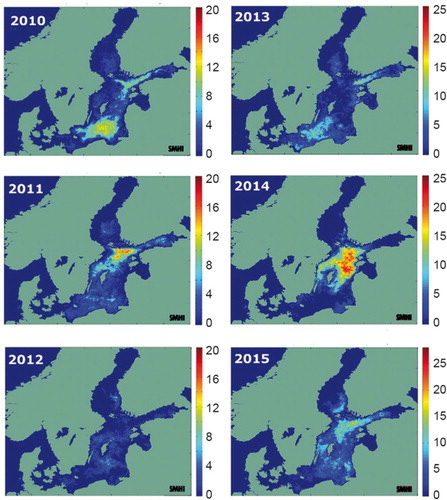
Figure 56. (a) 99th percentile annual level of hourly surge data for each tide gauge in the IBI region; large circles: 99th percentile for 2015 mean value at each station for the period 1993–2014, inner smaller diamonds: mean value at each station for the period 1993–2014. (b) evolution of the 99th (top) and first (bottom) annual percentile levels of hourly surge data averaged for all the stations in the IBI region: black lines: averaged value and standard deviation for each year; magenta lines: maximum and minimum values in the whole region for each year. See endnote 24 for more details on data use.
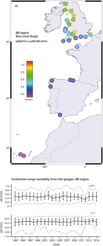
Figure 57. (a) 99th percentile annual levels of hourly surge data, for each tide gauge in the NWS region: large circles: 99th percentile for 2015, inner smaller diamonds: 99th percentile for 2015. (b) evolution of the 99th (top) and 1st (bottom) annual percentile levels of hourly surge data averaged for all the stations in the NWS region: black lines: averaged value and standard deviation for each year; magenta lines: maximum and minimum values in the whole region for each year. See endnote 25 for more details on data use.
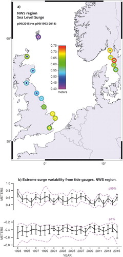
Figure 58. (a) 99th percentile annual levels of hourly surge data for each tide gauge in the BAL region: large circles: 99th percentile levels for 2015, inner smaller diamond: mean value at each station for the period 1993–2014. (b) evolution of the 99th (top) and 1st (bottom) annual percentiles of hourly surge data averaged for all the stations in the BAL region: black lines: averaged value and standard deviation for each year; magenta lines: maximum and minimum values in the whole region for each year. See endnote 26 for more details on data use.
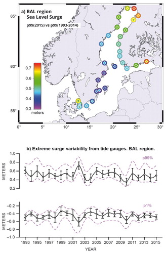
Figure 59. Overview on decadal scale changes during the period 1993–2015 as obtained from the first CMEMS OSR 2016. The flash icons indicate increasing or decreasing decadal trends for the different physical parameters, which have been evaluated for the global ocean (GLOB), and for specific regions whenever possible such as the Mediterranean Sea (MED), the IBI Sea, the North-West-Shelf (NWS) and Black Sea (BS), see . Information on uncertainty estimates can be found in the corresponding sections.
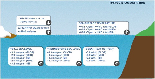
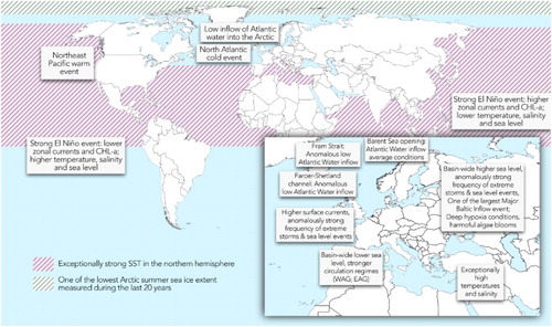
Figure 60. Schematic overview on characteristic feature in 2015 of the global ocean and the European Seas. The period 1993–2014 is used as a reference. See text for more details.