
Figures & data
Table 1. Sources of data used on the analysis of domestic GHG emissions.
Table 2. Emission levels and reductions across major UK region Local Authorities (LA), Population (Pop), Average (avg), Standard Deviation (Std Dev).
Figure 1. Rank-order plot of absolute GHG emissions in UK Local Authorities, with the median trend.
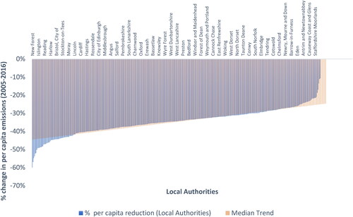
Figure 2. Choropleth map displaying GHG emissions reductions in Great Britain local authorities in 2016 relative to 2005, categorized by quintile in fractions of emissions reductions (i.e. −0.403 = −40.3% reduction relative to 2005). Inset focuses on the southeast of England, including the regions of the East of England, Greater London, and the South East).
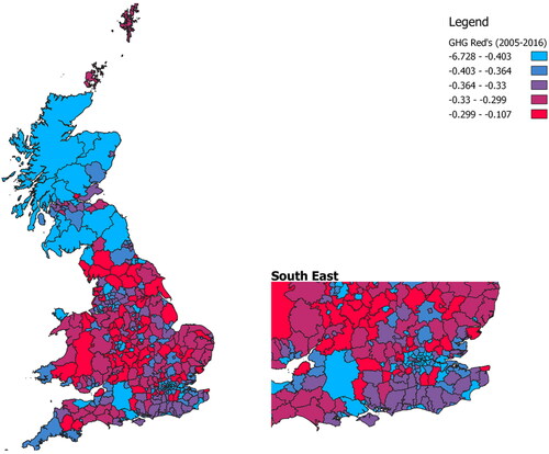
Figure 3. Scatter plots showing the relationship between % per capita reductions 2005-2016 in UK local authority domestic GHG emissions and 2011 population density a) Overall, b) top 60 reducers, c) bottom 60 reducers (Kensington & Chelsea removed as an outlier).
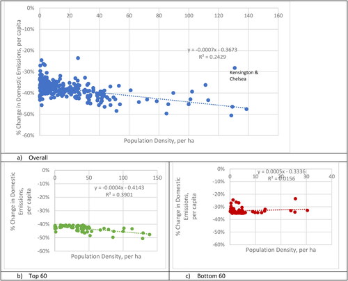
Figure 4. a) Absolute domestic emissions vs population, 2016, along with the regression line; b) Absolute domestic emissions vs Gross Disposable Household Income, 2016, along with the regression line.
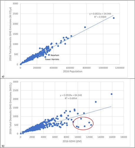
Figure 5. Transportation emissions reduction per capita, 2005-2016, with average reductions across all LAs highlighted.
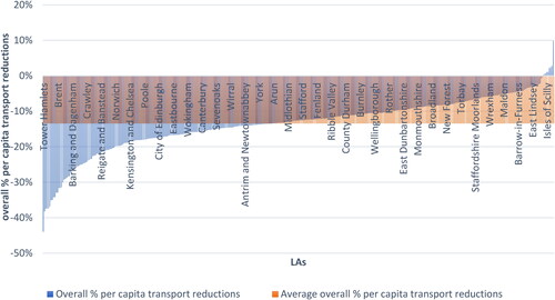
Figure 6. Relationships of reductions in per capita transportation GHG emissions vs population density per hectare for a) all LAs, b) the top 60 reducing LAs and c) the bottom 60 reducing LAs. Regression lines are included for each.
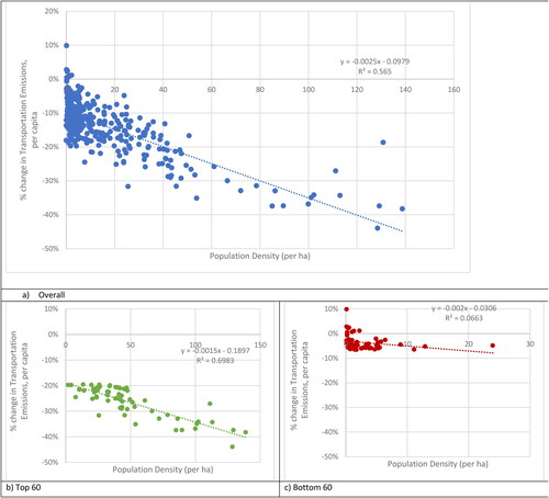
Figure 7. Rank-order plot of Industrial & Commercial Sector Emissions Change, 2005-2016; the black line (bold) represents the average Industrial & Commercial reduction across all local authorities.
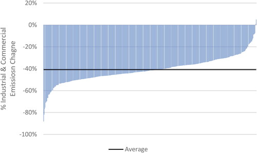
Figure 8. Change in emissions and manufacturing jobs for selected LAs, 2005-2016; numbers of LAs per quadrant are listed in each corner, with number on axes excluded from the count [Citation4,Citation79].
![Figure 8. Change in emissions and manufacturing jobs for selected LAs, 2005-2016; numbers of LAs per quadrant are listed in each corner, with number on axes excluded from the count [Citation4,Citation79].](/cms/asset/6d96e55d-9329-4c3e-a6c4-576da40519bd/tcmt_a_2120418_f0008_c.jpg)
Figure 9. Rank-order plot of percent change in LAs domestic electricity emissions per capita, compared with change in electricity grid emissions intensity (2005-2016).
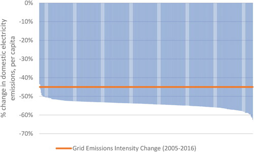
Figure 10. Greenhouse Gas Emissions Reductions from Selected LAs versus Score of Mitigation Plan as Evaluated by Heidrich et al. [Citation40].
![Figure 10. Greenhouse Gas Emissions Reductions from Selected LAs versus Score of Mitigation Plan as Evaluated by Heidrich et al. [Citation40].](/cms/asset/39d97340-2c9d-46df-a6df-eabcbcde496e/tcmt_a_2120418_f0010_c.jpg)
Supplemental Material
Download MS Word (34.1 KB)Data availability
All data used in this analysis will be posted in supplementary materials (on Figshare Project “UK Local Authority GHG Emission Reductions (2005-2016), DOI: 10.6084/m9.figshare.16802617).