
Figures & data
Figure 1. Base peak chromatogram. A, base peak chromatogram in negative ion mode; B, base peak chromatogram in positive ion mode. The components that flow out after chromatographic separation continue to enter the mass spectrum, and the mass spectrum is continuously scanned for data collection. A mass spectrum is obtained for each scan, and the ions with the highest intensity in each mass spectrum are selected for continuous depiction. Take the ion intensity as the ordinate and time as the abscissa to get the spectrum. In the image, W represents white shell eggs, and G represents green shell eggs. The peaks of white shells were larger than those of green shells.
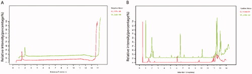
Figure 2. Quality control and partial least squares discriminant analysis (PLS-DA). (A) Principal component analysis (PCA) score plot in negative ion mode; (B) PCA score plot in positive ion mode. In the images, the abscissas PC1 and the ordinates PC2 represented the scores of the first and second principal components, respectively. The scattered colour represented the experimental grouping of samples and QC, and the confidence interval (CI) was 95%. (C) PLS-DA score plot in negative ion mode; (D) PLS-DA score plot in positive ion mode; (E) permutation test plot of PLS-DA model in negative ions; (F) permutation test plot of PLS-DA model in positive ions. The abscissas of E and F represented the correlation between the Y of the random grouping and the original group Y, and the ordinates represented the R2 and Q2.
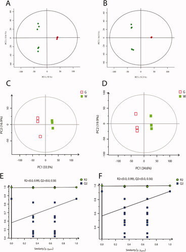
Figure 3. Histogram of differentially expressed metabolites (DEMs). (A) Histogram of DEMs in negative ion mode; (B) histogram of DEMs in positive ion mode. G stands for the green shell, W stands for the white shell.
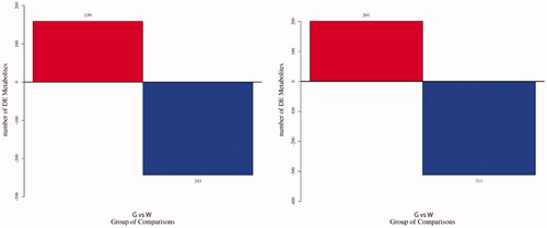
Figure 4. Heat map of differentially expressed metabolites (DEMs). Each column represents a sample, and each row represents a metabolite. The colour in the image indicates the relative expression levels of metabolites in the sample group, and the change from blue to red indicates an increase in the relative expression levels. G stands for the green shell, W stands for the white shell.
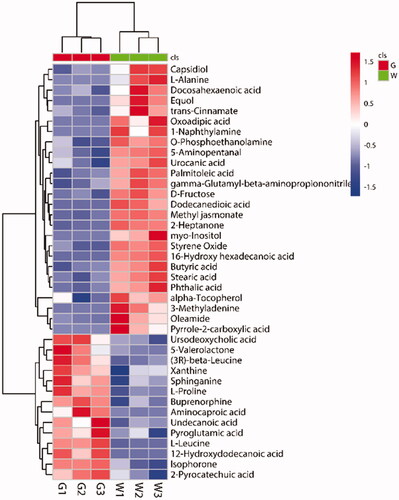
Figure 5. 8 differentially expressed metabolites (DEMs) with extremely significant differences in expression. The histogram area shows the expression level of DEMs in eggshells with different colours. G stands for the green shell, W stands for the white shell.
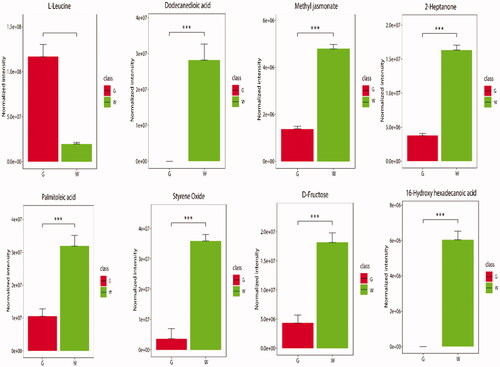
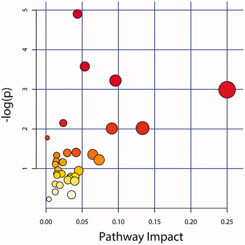
Figure 6. KEGG pathway enrichment analysis. The X-axis represented the pathway impact value. Large size and dark colour represented the main pathway enriched and the high pathway impact value, respectively.
Data availability statement
All data generated and analysed during this study are included in this published article.