
Figures & data
Figure 1. The panel a represents the Jacetania comarca (red dot) on the Western side of the Aragonese Pyrenees where the two study areas are located, which are represented in Panel B (villages of Ansó – blue dot – and Hecho – orange dot).
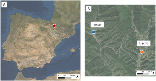
Table 1. Description of the indices used in the structural and positional approaches within SNA (Social Network Analysis).
Table 2. Description of the network and ERGM metrics used in the analysis.
Figure 2. The main results emerged from the three focus groups and inductive content analysis.
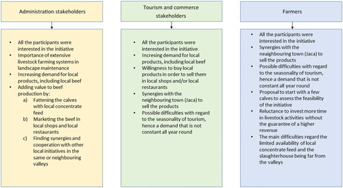
Table 3. The main characteristics of the actors surveyed. The figures refer to numbers of actors.
Table 4. General information on the farmers and their livestock activities.
Figure 3. SNA of the advisory network including all the actors (surveyed and non-surveyed) involved in developing the quality brand. The graph represents the exchange of advice between the actors: nodes represent actors, and links (edges) represent the connections between them (44 nodes, 196 links). The node’s size indicates the in-degree value of the actor (Central actors have the largest values). The network is directional with arrows indicating the direction of advice requests; bi-directional arrows indicate mutual relationships/requests. The colours of the nodes represent the different employment sectors as reported in the legend.
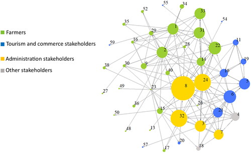
Figure 4. SNA of the trust network of the actors surveyed. F preceding the number indicates a farmer, and O a non-farmer. The size of the nodes in Figure indicates the in-degree value of the actor, whereas in Figure it indicates the betweenness value given by the other actors in the network (Central actors have the largest values). The colours of the nodes represent the different employment sectors, as reported in the legend. The edges are thicker or thinner according to the average value of trust given by the actors during the survey (26 nodes; 131 links).
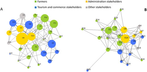
Table 5. Nodes, links, structural and positional indicators for the advisory SNA and the trust SNA.
Figure 5. Panel A, communities in the trust network identified by the Louvain’s algorithm. Each is indicated by a different colour: community A-red; community B-green; community C-blue; community D-purple. The colours of the nodes represent the different employment sectors while their size corresponds to the betweenness values, according to Figure ; panel B, barplot of employment sectors’ distribution among the communities identified by Louvain’s algorithm; panel C, barplot of educational levels’ distribution among the communities identified by Louvain’s algorithm.
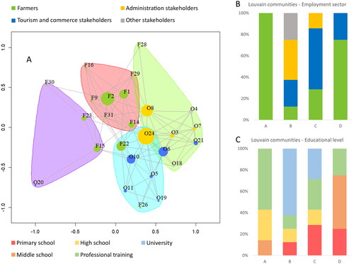
Table 6. Results of the multinomial models to test the variability of the employment sector and educational level categories in function of the Louvain communities.
Table 7. Estimates, standard errors, and z-values for the endogenous and exogenous attributes of the exponential random graph model (ERGM).