
Figures & data
Figure 1. ABFA allocation and utilization, education priority area, and the Free SHS (2017–2019). The data is from the Ministry of Finance (Citation2020).
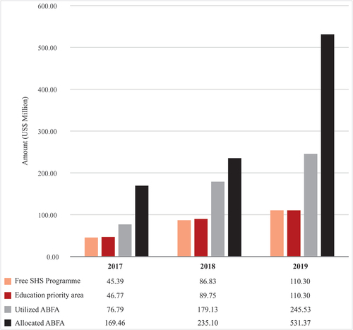
Table 1. Summary statistics for both response and explanatory variables.
Figure 2. Survey participants’ location (with 100 meters offset to secure privacy), the total number of participants per region, urban areas, and the opposition political party’s strongholds in Ghana.
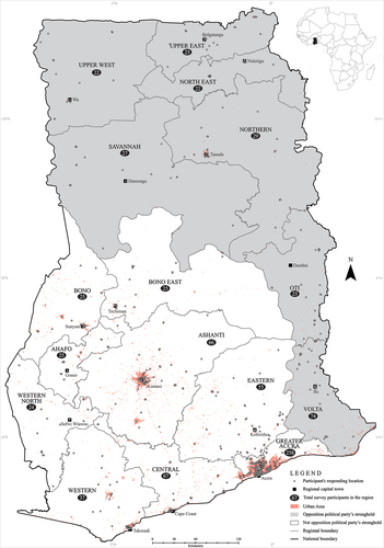
Table 2. Mean differences for the response variables (RV1 – RV3) and the most prioritized area for ABFA funding across the regions.
Figure 3. Geographic variation in the response variables (RV1 – RV3) at the regional level.
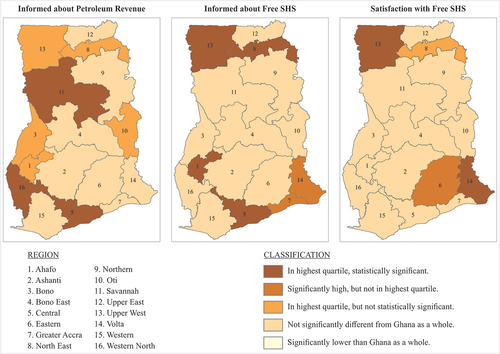
Table 3. Level of information about the petroleum revenue management and Free SHS, level of satisfaction about the Free SHS, and the two most prioritized areas for ABFA funding.