
Figures & data
Table 1. Descriptive statistics in groups.
Table 2. Sub-group analyses.
Figure 1. Aneuploidy and normal embryo rates among groups. Ascending numbers from left to right on the X-axis represent the study groups (corresponding to Kruger’s morphological scores). Blue bars show percentage of normal embryos. Lines represent percentage of total aneuploidy (Total AE, Red), Trisomy (Green), and Monosomy (Purple). Values of each line and bars are shown in the bottom of the graph.
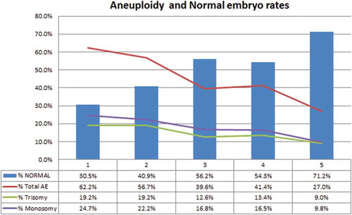
Table 3. Correlation analyses (rho test).