
Figures & data
Table 1. General characteristics of the two groups.
Table 2. Clinical outcomes of the two groups.
Table 3. Pregnancy outcomes between the two groups.
Figure 1. Volcano plot and hierarchical cluster analysis for the differentially expressed genes (DEGs) in the two groups. (A) Volcano plot for the differentially expressed genes (DEGs). The X-axis represents the fold change in gene expression in different samples and the Y-axis represents the -log10(P-value) as per the figure; red, green, and blue represent the DEGs that are significantly upregulated, down-regulated, and normally expressed, respectively. (B) Hierarchical cluster analysis of differentially expressed gene (DEG) levels. The X-axis represents samples (A_granule1 represents sample 1 in older group, and Y_granule1 represents sample 1 in younger group, etc.) and the Y-axis represents genes; upregulated genes are shown in red and downregulated genes in dark blue.
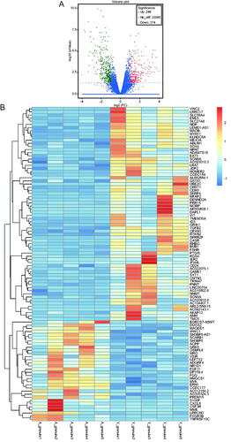
Figure 2. Scatter plot and histogram of GO enrichment for differentially expressed genes (DEGs). (A) Scatter plot of Gene Ontology (GO) annotation for differentially expressed genes (DEGs). Rich Factor on the X-axis refers to the ratio of DEGs enriched in the GO term to the total number of DEGs in the GO analysis. The larger Rich Factor corresponds to higher richness of the GO term. (B) Histogram of GO enrichment for upregulated DEGs. Distribution of DEGs enriched in GO terms for biological processes (BP), cellular component (CC), and molecular function (MF). (C) Histogram of GO enrichment for down-regulated DEGs. Distribution of DEGs enriched in GO terms for biological processes (BP), cellular component (CC), and molecular function (MF).
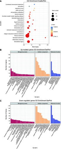
Figure 3. Scatter plot and histogram of KEGG enrichment for differentially expressed genes (DEGs). (A) Scatter plot of Kyoto Encyclopedia of Genes and Genomes (KEGG) pathway enrichment analysis for differentially expressed genes (DEGs). The top 20 statistically significant KEGG pathways are shown. Rich Factor on the X-axis refers to the ratio of DEGs enriched in the KEGG pathway to the total number of DEGs in the KEGG analysis. Larger Rich Factor corresponds to higher richness of the KEGG pathway. (B) Subclass histogram for the enrichment of upregulated DEGs. (C) Subclass histogram for the enrichment of downregulated DEGs.
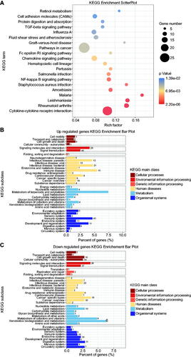
Figure 4. The validation of four selected differentially expressed genes between the two groups using quantitative reverse transcription-polymerase chain reaction. The Y-axis represents the relative gene expression. * refers to statistically significant differences (* for p < 0.05, ** for p < 0.01, and *** for p < 0.001).
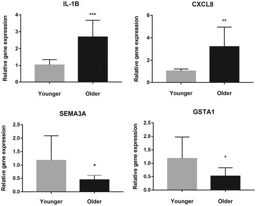
Table 4. Sequences of qRT-PCR primers.
Data availability statement
The data that support the findings of this study are available from the corresponding author, FL, upon reasonable request. Sequence data are available in figshare database, DOI: 10.6084/m9.figshare.17827307.