Figures & data
Figure 1. Schematic illustration of base methodology.
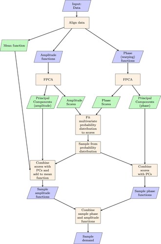
Table 1. Building and metering information.
Figure 2. Plug Loads: first 4 Principal Components for phase, X. The impact of adding each PC to the mean function is shown using a + ve (solid red) or -ve (dotted red) score.
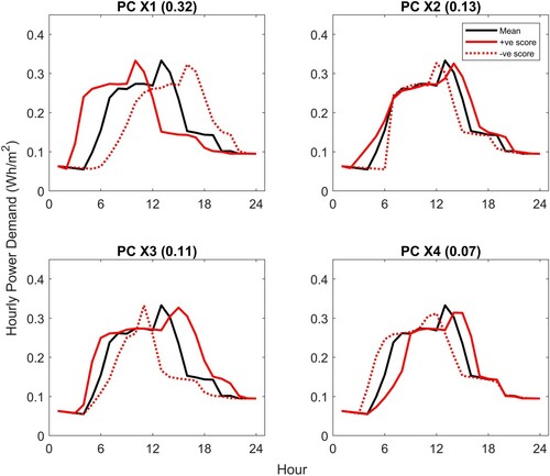
Figure 3. Plug Loads: first 4 Principal Components for amplitude, Y. The impact of adding each PC to the mean function is shown using a + ve (solid red) or -ve (dotted red) score.
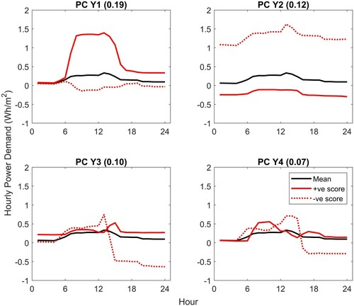
Figure 4. Scores for first phase and amplitude PCs, with normalized electricity consumption for each zone.
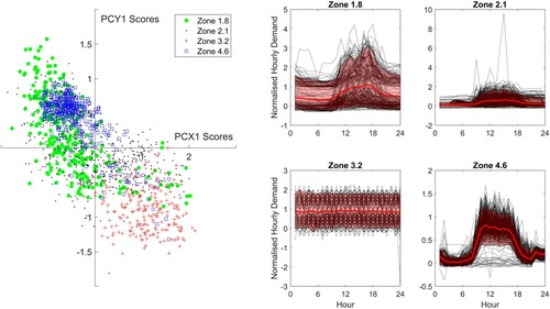
Figure 5. Plug Loads: sample data generated from scores sampled from probability distribution used in conjunction with PCs.
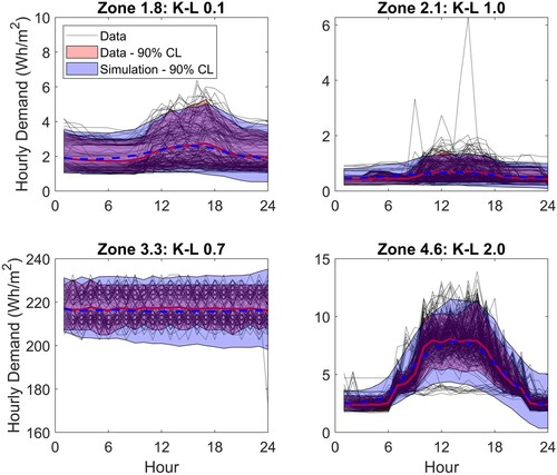
Figure 6. Lights: sample data generated from scores sampled from probability distribution used in conjunction with PCs.
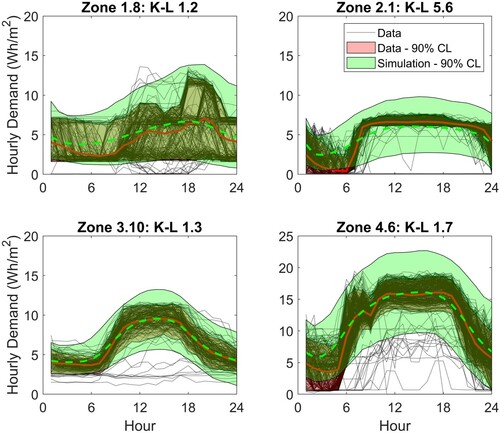
Figure 7. Scores for the first phase and amplitude components for lighting, Zone 2.1. The highlighted area shows sampled scores that fall outside the score space defined by the data.
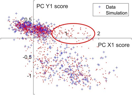
Figure 8. Dendrogram for plug loads and normalized monitored data. The dendrogram shows the hierarchical relationship between zones with zones linked together according to similarity. On the right hand side the normalized monitored data have been plotted by cluster grouped in 12, 7 and 4 clusters.
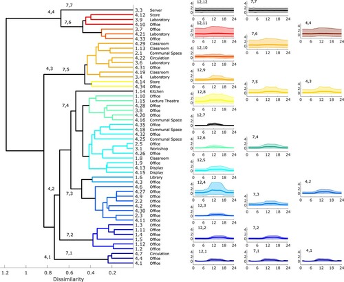
Figure 9. Comparison of demand reconstructed from scores and generated from clusters. The monitored data are shown as black dotted lines with the mean and 90% CL highlighted in red. The model output 90% CL is shown coloured according to the variability selected (Figure ).
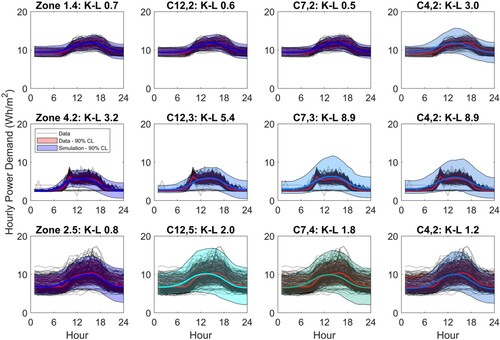
Figure 10. Wasserstein distance for KPIs.
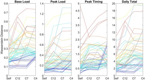
Figure 11. Dendrogram for lighting and normalized monitored data. The dendrogram shows the hierarchical relationship between zones with zones linked together according to similarity. On the right hand side the normalized monitored data have been plotted by cluster grouped in 10, 5 and 3 clusters.
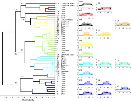
Figure 12. Sample weekly data, variability from 1 (top) to 4 (bottom). Sample data are calculated for 2019 and start on a Tuesday. Black dotted lines show the individual weekly demand profiles and the mean and 90% CL are highlighted in red.
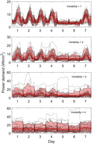
Table 2. Test zone information: base load and load range from the test data compared against the mean values for zones with similar activity in the training dataset and the NCM activity database values (Building Research Establishment (Citation2016)). Also given is the assumed variability used for generation of sample data.
Figure 13. Model outputs for 10 test zones calculated using known base load and load range and assumed variability as given in Table . The monitored data are shown as black dotted lines with the mean and 90% CL highlighted in red. The model output 90% CL is shown coloured according to the variability selected (Figure ).
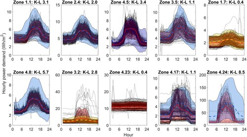
Figure 14. Plug load model outputs for 10 test zones calculated using known base load and load range and assumed variability as given in Table , comparison of KPIs.
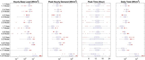
Table 3. Plug load model outputs for 10 test zones calculated using known base load and load range and assumed variability as given in Table , numerical comparison of KPIs.
Figure 15. Lighting: sample weekly data calculated with a mean base load of 3 Wh/m2 and a mean load range of 8 Wh/m2, variability from 1 (top) to 5 (bottom). The data are calculated for 2019 and start on a Tuesday. Black dotted lines show the individual weekly demand profiles and the mean and 90% CL are highlighted in red.
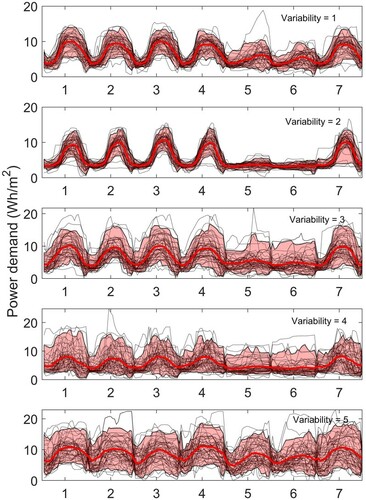
Table 4. Test zone information: base load and load range from the test data compared against the mean values for zones with similar activity in the training data set and the NCM activity database values. (Building Research Establishment Citation2016).
Figure 16. Lighting: model outputs for 9 test zones calculated using known mean base load and load range and assumed variability as given in Table . The monitored data are shown as black dotted lines with the mean and 90% CL highlighted in red. The model output 90% CL is shown coloured according to the variability selected (Figure ).
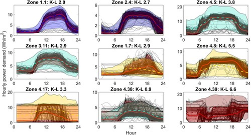
Figure 17. Lighting: comparison of KPIs for model outputs for 9 test zones calculated using known mean base load and load range and assumed variability as given in Table .
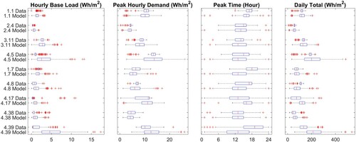
Table 5. Lighting: numerical comparison of KPIs for model outputs for 9 test zones calculated using known mean base load and load range and assumed variability as given in Table .
Figure 18. Lighting: Zone 1.7 with X1 and X3 scores shifted by −2. The monitored data are shown as black dotted lines with the mean and 90% CL highlighted in red. The model output 90% CL is shown in blue.
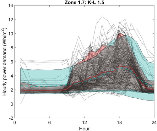
Figure 19. Lighting: Zone 4.8 with X1 and X3 scores shifted, limits imposed. The monitored data are shown as black dotted lines with the mean and 90%CL highlighted in red. The model output 90% CL is shown in blue.
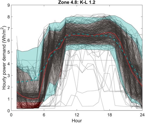
Figure 20. Retrofit model results for lighting Zone 1.7. In the left plot the monitored data are shown in black with the mean and 90% CL highlighted in red; the mean and 90% CL of the simulation results are shown in blue. The box plots show the KPI comparison.
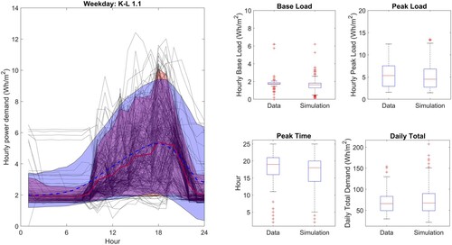
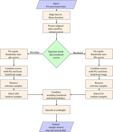
Figure A1. Procedure for generation of sample plug loads; the procedure for lighting is the same except there are 5 clusters instead of 4.
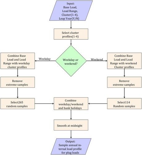
Figure A2. Procedure for generation of stochastic sample loads from existing data.