
Figures & data
Figure 1. Common design decision problem where a design alternative needs to be chosen from multiple design proposals (i) shows an example design problem – the site and its context (ii) shows potential conceptual design options from which one must be chosen for the design process to proceed.
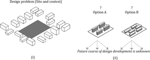
Figure 2. Exploded view showing incremental levels of façade detail at which 3D models are produced by the grasshopper workflow.
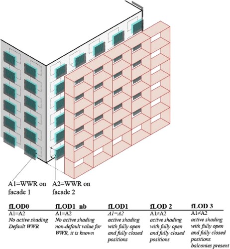
Table 1. Possible values for decision criteria for various performance metrics.
Figure 3. Diagram showing multiple design variants emerging at each level of detail. Two fLOD3 variants of the massing schemes A and B are considered comparable peers of each other if the designer would make similar design choices (indicated by branches with arrows) to arrive at them (e.g. same WWR, same balcony type).
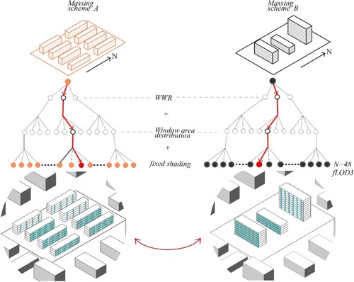
Figure 4. Diagrammatic representation of sequential decision making and strategy-based risk management. Black lines indicate possible paths of design development leading to no regret. Red lines indicate paths leading to regret. Each node in the tree represents an additional design detail being specified.
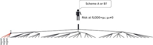
Figure 5. Example set of massing-schemes (total number of schemes = 40) for a given site. Five different types of site arrangements were attempted: regularly spaced buildings, regularly spaced buildings but varying heights, clustered buildings creating open spaces, courtyard and horizontally staggered arrangement.
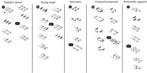
Figure 6. (Left Column) Evolution of performance of design options A, B shown in Figure , on three metrics (1) sDA, shown on top (2) Annual Heating Demand, middle (3) Annual Cooling Demand, bottom. The highlighted regions show evolution of performance values when ‘low’ WWR (20%) is decided upon by the designer at fLOD1. (Right Column) Evolution of performance of design options C, D shown in Figure on three metrics in the same order as column on left. The highlighted regions show evolution of performance values when ‘high’ WWR (40%) is decided upon by the designer at fLOD1.
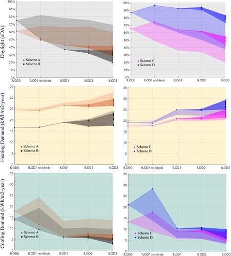
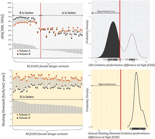
Figure 7. Relative performance comparison for massing-scheme A,B at fLOD3 shown when strict one-to-one pairing is done for the 48 design variants at FLOD3. The comparisons to the right of the vertical dotted line (if present) reflect opportunity loss due to rank reversal.
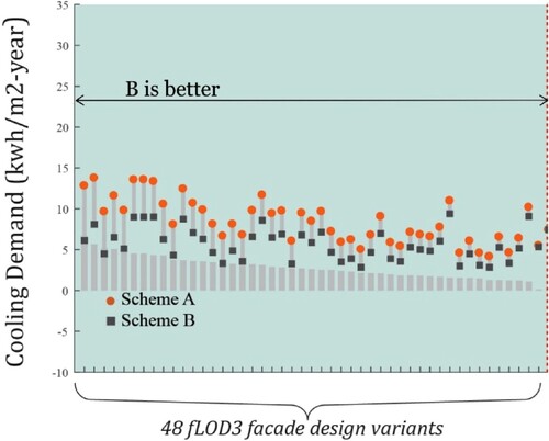
Figure 8. Probability density of relative performance values (A-B) at high fLOD (fLOD3) when a cross comparison between patterns of distribution of glazing on facades is permitted. Area under the curve to the left of the solid vertical line is equal to the Expected Opportunity Loss
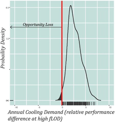
Figure 9. Probability density of relative performance values (A-B) at high fLOD (fLOD3) 30 neighbourhood comparisons. Area under the curve to the left of the solid vertical line indicates possible Expected Opportunity Loss.
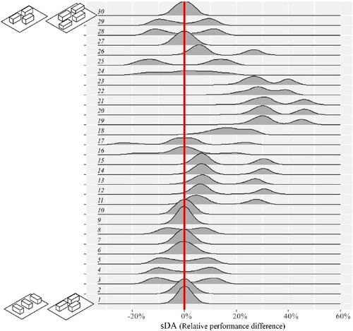
Table 2. Risk of erroneous decision making when performance is evaluated at low fLOD.
Figure 10. Distribution of risk of performance loss at fLOD0 (ERPL at fLOD0) observed in 780 comparisons. Source causes of performance loss indicated by colour (a) sDA, top (b) Annual Heating Demand, middle (c) Annual Cooling Demand, bottom.
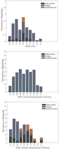
Table A1. Change in inputs for façade variants at each fLOD.
Table A2. Daylight simulation inputs.
Table A3 Yearly dynamic thermal simulation model inputs.
Data availability statement
Raw data were generated at the institute servers (ENAC, EPFL, Switzerland). Derived data, supporting the findings of this study are available from the corresponding author MA on request.