Figures & data
Table 1. Therapeutics analyzed for HCP content organized by the Year of FDA approval
Figure 1. (a) Comparison of the host cell proteins identified in NISTmAb in this study (blue) to Ma et al. (green) and Pengelley et al. (red). In this study, HCP identity was attained leveraging native digestion LC-MS/MS vs. Ma et al., 2020 nanoLC-MS/MS.Citation26 and Pengelley et al., 2018 nano-LC-MS/MS with trapped ion mobility and PASEF (parallel accumulation and serial fragmentation) MS method.Citation27 (b) Correlation between the relative abundances of HCP measured in NISTmAb from the current publication to previously reported relative abundances using the native digest method reported by Huang et al.Citation22 and a complete tryptic digest followed by 2D-LC MS reported by Doneanu et al.Citation28
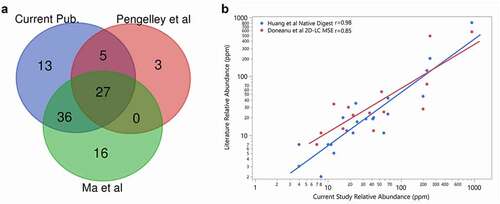
Figure 2. Heatmap of HCP abundance in approved therapeutic proteins. Columns represent a therapeutic protein ordered by decreasing number of HCP identified. Each row is an individual HCP identified in the current analysis. Colors signify HCP abundances ranging from >100 ppm (red) to 0 ppm (not detected, blue)
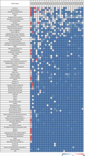
Figure 3. Heatmap of HCP in percent abundance within each individual therapeutic protein. Each column represents the data from an individual therapeutic protein. Each row is an individual HCP identified in the current analysis. Each individual HCP amount was divided by the sum of HCP identified for that product and multiplied by 100 to give a fractional abundance. The heatmap was colored by the HCP fractional level, where red is 100% of the HCP profile contributed by one protein and green indicates that the HCP was not detected
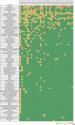
Figure 4. Frequency and maximum abundance for individual HCP identified in approved therapeutic products. Top panel (blue): Percent of products where HCP was identified above a 1 ppm relative abundance. The HCP are ordered by frequency of identification. Middle panel (green): Maximum abundance in ppm of each HCP across all products. Bottom panel (orange): Maximum abundance in ppm across all products excluding Drug 1, which was an outlier
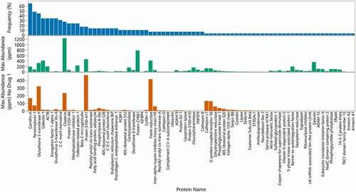
Figure 5. Number of HCP identified in each product compared to the aggregate amount of HCP identified. 95% of drugs had fewer than 14 HCP identified during this analysis (dotted vertical line). 85% of drugs exhibited total HCP of equal or less than 133 ppm (below dotted horizontal line). Drug 1 was excluded from the analysis
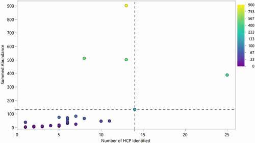
Figure 6. Comparison of HCP properties (theoretical isoelectric point and molecular weight based on sequence) for a representative harvest material (a) and all the HCP identified in the 29 approved biotherapeutic proteins (b)
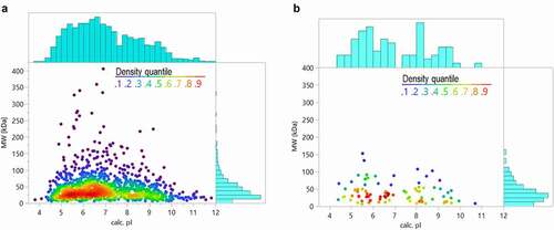
Figure 7. Mean predicted host cell protein isoelectric points plotted against the predicted isoelectric points for approved therapeutic proteins. Mean HCP pI greater than 7 are marked with triangles and mean pI less than 7 are marked with dots. The distributions of drug and HCP isoelectric point are shown in blue on the borders of the plot
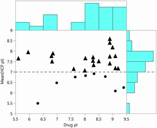
Figure 8. Gene ontology terms related to HCP identified in approved biotherapeutics analyzed in this study
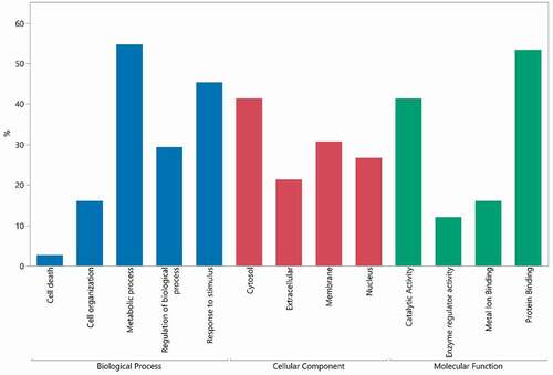
Figure 9. Relative abundance of all HCP identified in approved therapeutic proteins (N = 28) and proteins (N = 12) produced in house using a first-in-human (FIH) platform process and commercially enabling process. Points are colored by relative abundance. Mean is indicated by red line and annotated. Drug 1 was not included in this analysis
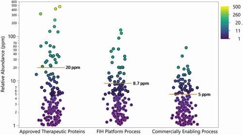
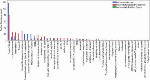
Figure 10. Relative abundance of HCPs identified in a drug candidate from different processes of development, FIH platform process (blue), intermediate process development (red), and commercially enabling process (green)