
Figures & data
Table 1. Description of the categories used to classify people’s reactions as expressed in their tweets. The categories were adapted from the study by O’Neill et al. (Citation2015).
Figure 1. Examples of tweets referring to the climate Central publication regarding sea level rise, including maps, links to research or gifs. Left: L1, first classification: realist, second classification: realist. Middle: L1, first classification: realist, second classification: realist. Right: L2, first classification: conspiracy theorist, second classification: denier.

Figure 2. Number of tweets per elaborated category.
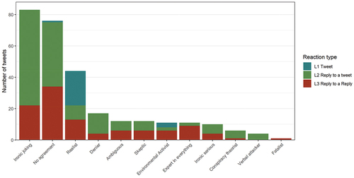
Figure 3. Multiple correspondence analysis of the elaborated categories as classified by three raters (A, B and C). The colour of the labels indicates the contribution made by that category to the first two dimensions.
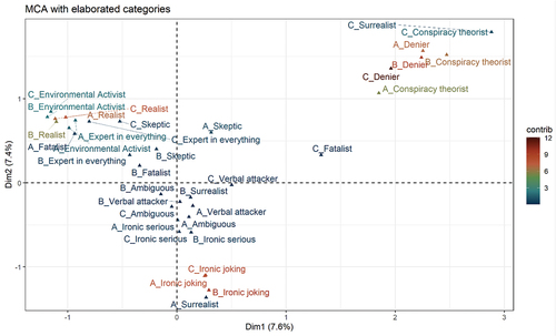
Figure 4. Correlation matrix of clustered categories using Spearman correlation.
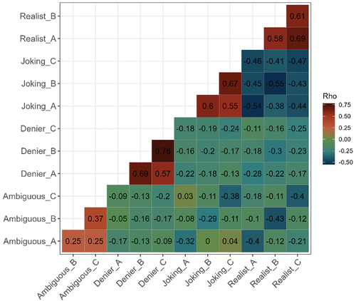
Figure 5. Number of tweets per clustered category and the reaction types of tweets.
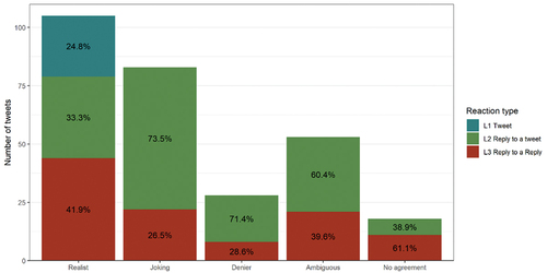
Table 2. Example of tweets showing different narratives in relation to sea level rise.
Data availability statement
The data used in this study is available in a Zenodo repository at https://zenodo.org/record/6559169