
Figures & data

Figure 1. Flowchart presenting the different steps in the unknown identification procedure.
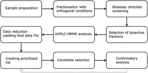
Figure 2. Flowchart of data reduction after baseline correction for both MetAlign® approaches. The different symbols represent different compounds, the triangle is the compound of interest.
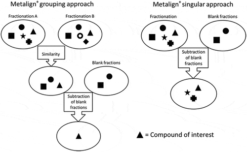
Table 1. Tentative candidate list for sample III; the numbers correspond to the figures in the supporting information.
Figure 3. Result of the targeted MS/MS analysis of m/z 326.3781 in (a) the bioactive fraction of sample III and (b) a DDAC reference standard solution (2 mg L−1).
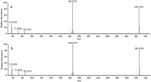
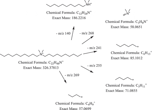
Figure 4. Structure of DDAC (m/z 326.378) and tentative product ion.
Supplemental material