Figures & data
Table 1. Summary and guide to the more detailed discussion in this paper.
Figure 1. The observed data contains information about patient characteristics , assigned treatments and observed (factual outcomes) outcomes. The observed outcomes for the control (blue) and treated (red) patients can be used to train machine learning methods to estimate the response surfaces
for each treatment option. Using these response functions we can estimate individualized treatment effects and thus identify patients who would benefit most and patients who would benefit least most from receiving the treatment. This would not be possible if we only estimated the average treatment effect.
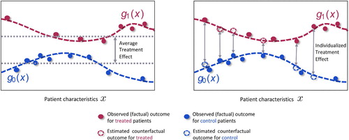
Figure 2. Given an observational dataset with patient features , assigned treatments
and factual outcomes
jointly sampled from the distribution
, validation is needed (e.g. Alaa and van der Schaar 2019) to select the causal inference method, out of the large number available (e.g. Causal Forests (Athey and Imbens 2016), NSGP (Alaa and van der Schaar 2019), and GANITE (Yoon et al. 2018)) that will achieve the best estimate of the individualized treatment effects.
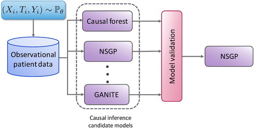
Figure 3. Distribution of treatment effects for subgroups identified by R2P and four benchmark methods using simulated data. The vertical axis is the estimated treatment effect; the horizontal axis indexes the subgroups identified by each method. R2P, CCT and CT-A each identify 5 subgroups, CT-H identifies 4 subgroups and CT-L identifies 3. (See the text for the description of the four benchmark methods.) Each box represents the range between the 25th and 75th percentiles of the treatment effects of the test samples; each whisker represents the range between the 5th and 95th percentiles.
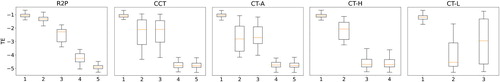
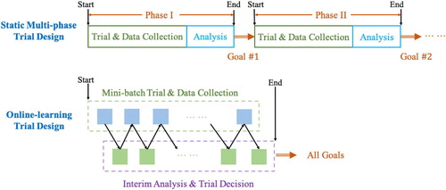
Figure 4. Static vs online-learning-based clinical trial design.