Figures & data
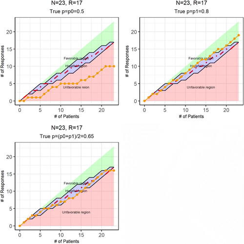
Fig. 1 Dynamic Data Monitoring (DDM) system radar screen displays. Use the conditional power under the alternative hypothesis to define the hopeful (and other two) regions. The red dotted line is for
Illustrations with data generated (the orange dotted line) when the true response rates are p0, p1, and
, respectively, as indicated in the figure title.
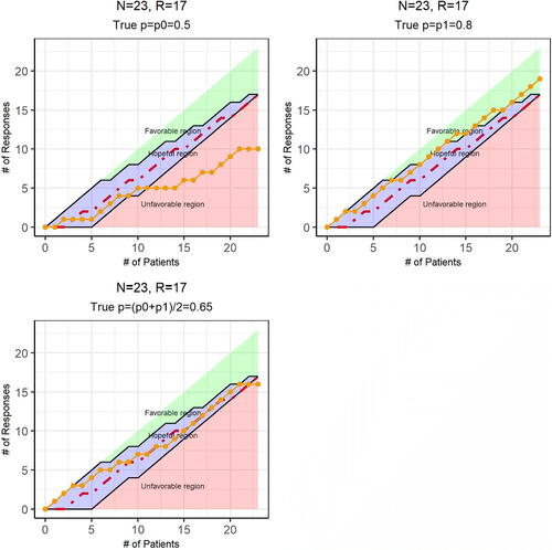
Fig. 2 Dynamic Data Monitoring (DDM) system radar screen displays. Use the conditional power under the current trend to define the hopeful (and other two) regions. The red dotted line is for
Illustrations with data generated (the orange dotted line) when the true response rates are
and
, respectively, as indicated in the figure title.