
Figures & data
Figure 1. Overall landscape analysis framework.
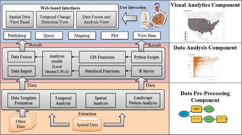
Table 1. Landscape metrics used in the study.
Table 2. Result of principal component analysis.
Figure 2. Metric calculation example of patch density.
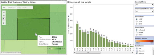
Figure 3. Overview of spatial data view panel.
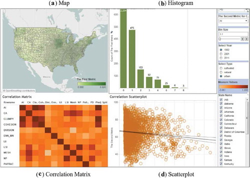
Figure 4. Identifying region of interest through scatterplot (the first metric is PD and the second metric is AI.
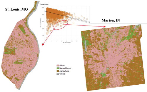
Figure 5. Temporal change detection panel (an example for metric CA for urban land cover type).
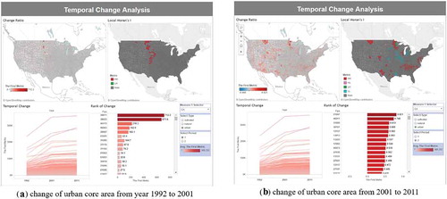
Figure 6. Data fusion panel. The example illustrates the relationship between economic change and urban metrics (CA, AI and Cohesion).
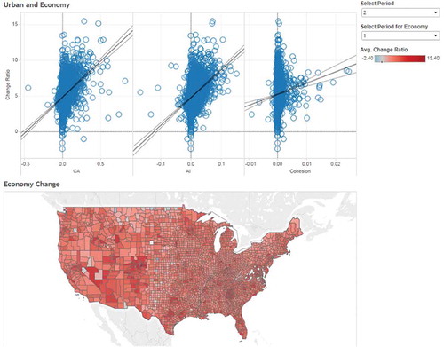
Figure 7. Data fusion panel (an example of exploring the relationship between population change and landscape metrics).
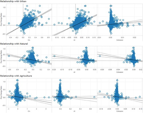
Table 3. Regions of interest based on urban CA metric.