Figures & data
Table 1. List of geo-enriched variables from Esri’s cloud database for a one-mile buffer radius from school locations.
Figure 1. Visual representation of distance between each of the school locations in the sample. One-mile buffer from the centre of each circle represents the geo enrichment area for each location.
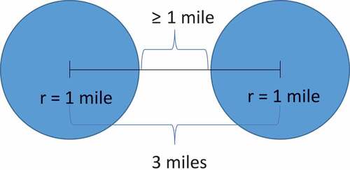
Figure 2. Distribution of 408 public, magnet, and charter high schools located in California that are at least three miles apart from one another.
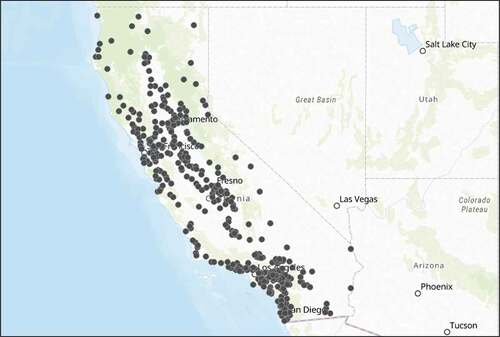
Figure 3. Hot spot analysis on SAT scores for each school within the sample, performed through ArcGIS online, demonstrates the academic achievement gap between the northern and southern part of the state. There is also a visible disparity between high and low performing schools in San Diego and Los Angeles County within southern California.
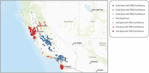
Figure 4. Hot spot analysis on average household size within a one-mile radius of each school within the sample, performed through ArcGIS Online, shows that southern and central California families are significantly larger than northern California families.
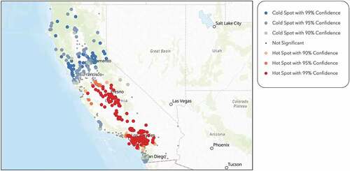
Figure 5. Hot spot analysis on SPI on health insurance within a one-mile radius of each school within the sample, performed through ArcGIS Online, shows that southern California and bay area spend significantly more money on health insurance than central California.
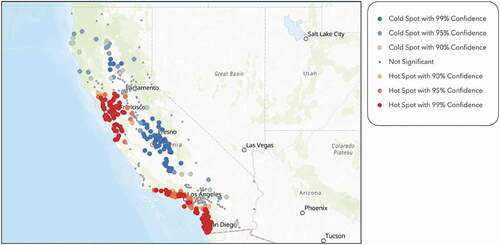
Figure 6. Hot spot analysis on number of multigenerational households within a one-mile radius of each school within the sample, performed through ArcGIS Online, shows that southern California has a significant number of multigenerational households.
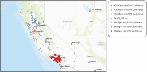
Figure 7. Hot spot analysis on number of husband-wife households within a one-mile radius of each school within the sample, performed through ArcGIS Online, shows that southern California and the bay area have a significant number of two parent households.
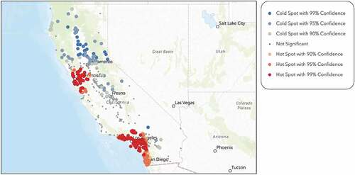
Figure 8. Hot spot analysis on number educational services within a one-mile radius of each school within the sample, performed through ArcGIS Online, shows that both the bay area and Los Angeles County have a significant number of educational services.
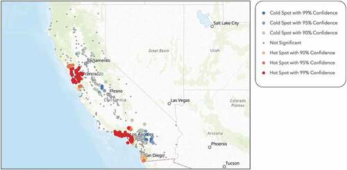
Figure 9. Hot spot analysis on diversity index within a one-mile radius of each school within the sample, performed through ArcGIS Online, shows that southern California is much more diverse than northern California.
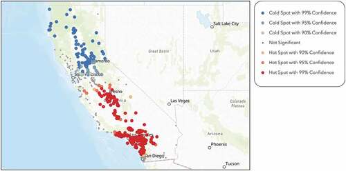
Table 2. Final regression model effects of independent variables in stepwise multilinear regression analysis.
Table 3. Effect summary of significant independent variables and its interpretation in stepwise multilinear regression model.
Figure 10. The map illustrates the negative relationship between SAT scores and average household sizes within a one-mile radius of each school location.
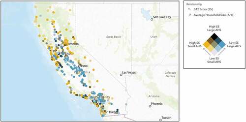
Figure 11. The map illustrates the positive relationship between SAT scores and spending on health insurance within a one-mile radius of each school location.
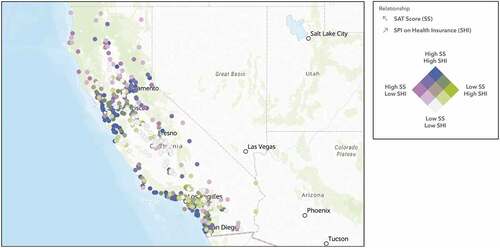
Table 4. Geographically weighted regression (GWR) model diagnostics.
Figure 12. The map illustrates the negative relationship between SAT scores and the number of multigenerational households within a one-mile radius of each location.
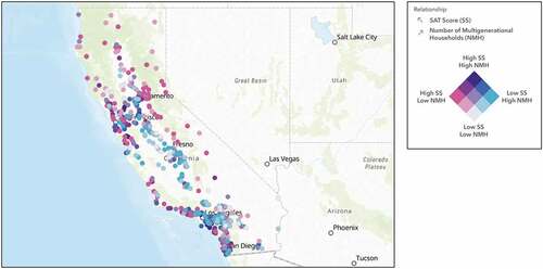
Figure 13. The map illustrates the positive relationship between SAT scores and the number of two parent households within a one-mile radius of each school location.
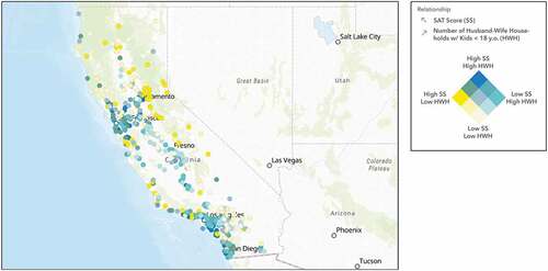
Figure 14. The map illustrates the positive relationship between SAT scores and the number of educational services within a one-mile radius of each school location.
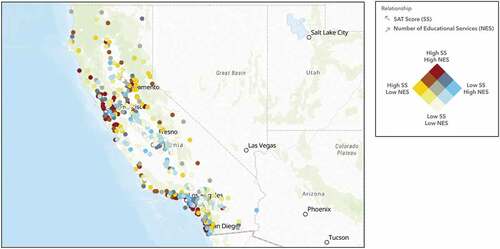
Figure 15. The map illustrates the negative relationship between SAT scores and the diversity index within a one-mile radius of each school location.

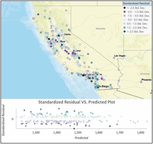
Figure 16. Standardized residual distribution from geographically weighted regression model. A lack of distinct structure across the map confirms robustness of the prediction model. Some prediction outliers are seen near Los Angeles county that may need further investigation.