
Figures & data
Figure 1. The impact areas and non-affected areas in Winter Storm Diego. The impact areas (red) are places where Winter Storm watches and/or alarms were issued.
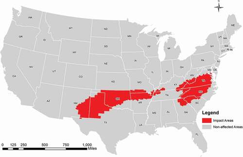
Table 1. Tweet classification in six topics (topic principal components are keywords that accounted for a large proportion of the variance in each topic)
Figure 2. Frequencies of original tweets with different numbers of retweets (log scale in y-axis).
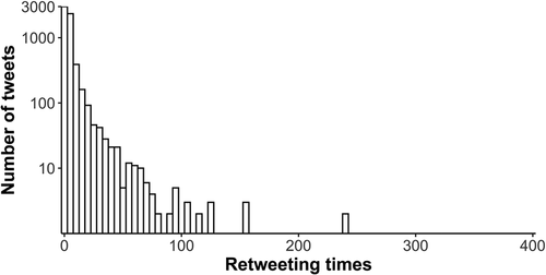
Figure 3. The top 20 most frequent words in the popular group (left) and the unpopular group (right). The same words in the two groups are linked by lines. The line width indicates the ranking difference in the two groups, and the line colours indicate the increase and decrease in the ranking positions in the two groups.
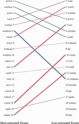
Figure 4. LDA model training result: the upper limit of topics was set to 10 to ensure the result to be interpretable; 509 unique popular original tweets were processed in these models.
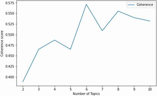
Table 2. Summarized topics of tweets (after geocoding and screening)
Table 3. The number of retweets by diffusion direction
Figure 5. The ratio of retweets by diffusion direction in affected areas.
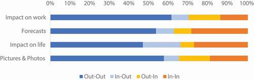
Figure 6. Number of tweets by each topic and diffusion direction.
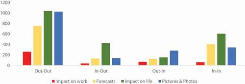
Figure 7. Standard Deviational Ellipses of retweets in the Contiguous United States (CONUS).
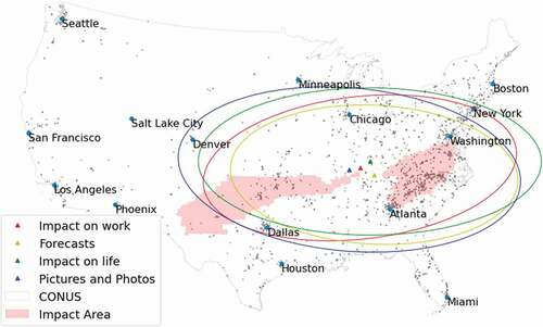
Table 4. Parameters of SDE
Figure 8. Kernel density (a) and kernel density proportion (b) of retweets in varying distance (km) from the original tweets in four topics.
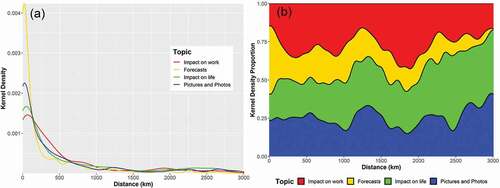
Figure 9. Average sentiment score of retweets by each county.
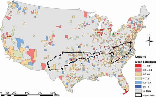
Figure 10. Average sentiment in each topic by diffusion direction using Equation 2.
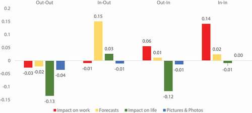
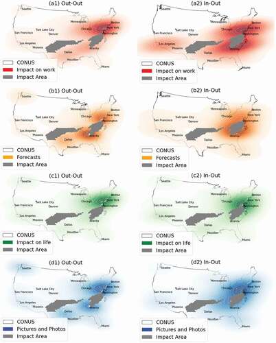
Figure 11. Kernel density map of retweets in non-affected areas relating to (a) ‘Impact on work’; (b) ‘Forecasts’; (c) ‘Impact on life’; (d) ‘Pictures and Photos’.
Data availability statement
The dataset used in this study is available in the following DOI: 10.5281/zenodo.3573973