Figures & data
Table 1. An example from the collected raw data
Figure 1. The visual analytical workflow chaining together four modules: data preprocessing, data modeling, geovisualization and the interactive tool.
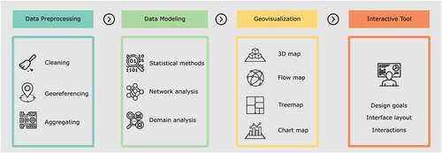
Figure 2. The data schema of the restructured scholarly data.
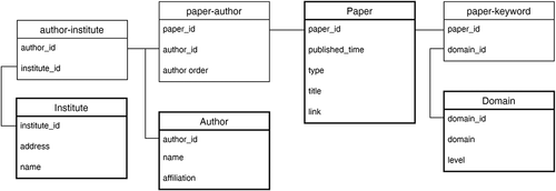
Figure 3. The visualization methods that show the patterns of knowledge innovation with spatial information.
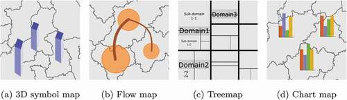
Figure 4. The interface layout of the interactive tool.
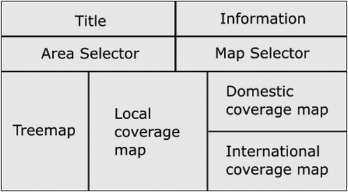
Figure 5. The administrative boundaries and location of the Yangtze River Delta (YRD).
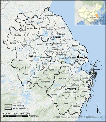
Figure 6. Spatiotemporal distribution of institutes that have joint publications with the YRD region.
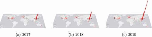
Table 2. The statistics of the publications and collaborations of the YRD from 2017 to 2019
Figure 7. Flow maps showing the number of publications and co-authorship connections between cities in the YRD.
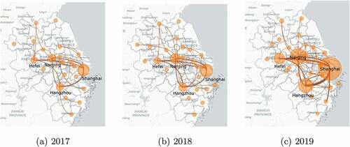
Table 3. Statistics of the academic networks at the city level within the YRD from 2017 to 2019
Figure 8. Histograms illustrating the number of collaborations between cities in the YRD.
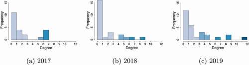
Figure 9. Flow maps of international collaborations of the YRD.
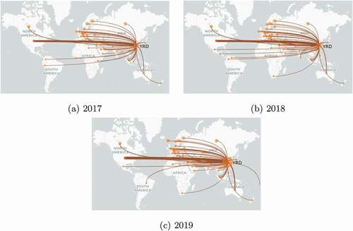
Figure 10. A treemap showing the popular domains of the ACM publications in the YRD from 2017 to 2019.
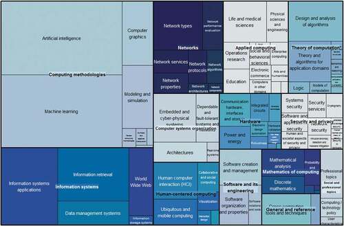
Figure 11. Bar charts showing the spatial distribution of the four selected subdomains in the YRD. AI in red, HCI in purple, LiMS in green and ML in yellow.
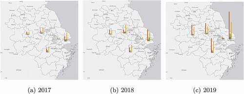
Figure 12. The movement of the centroids in the subdomains of AL, HCI, LiMS and ML from 2017 to 2019 in the YRD.
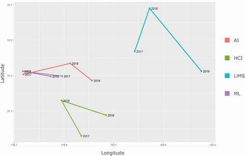
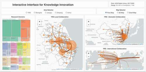
Figure 13. Visual interface of the analysis tool.