
Figures & data
Figure 1. (a) Hurricane threat level and (b) damage per 1000 people during Hurricane Sandy in the affected 53 counties and 1342 zip code areas in the north-eastern US.
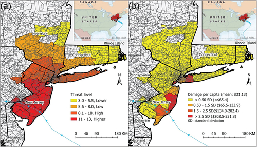
Table 1. Geographical, damage and socioeconomic variables.
Figure 2. Workflow of methodology.
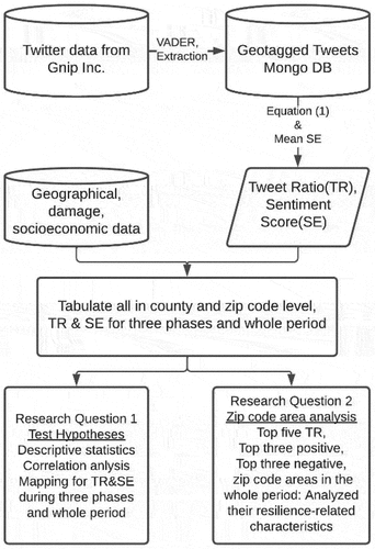
Figure 3. Daily numbers of total Hurricane Sandy tweet (including tweets without geotags, grey dash lines separate emergency response phases).
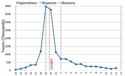
Table 2. Number of geotagged tweets and all tweets in each phase during Hurricane Sandy.
Figure 4. Tweet Ratio (TR) mapped at the county level during (a) preparedness, (b) response, (c) recovery phases and (d) the whole period. For example, counties of >1.0 have at least 1 tweet per 10,000 people per day.
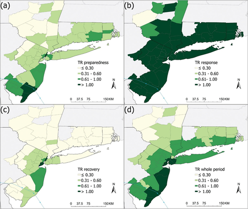
Figure 5. Tweet Ratio (TR) mapped at the zip code area level during (a) preparedness, (b) response, (c) recovery phases and (d) the whole period. For example, zip code areas of >1.0 have at least 1 tweet per 10,000 people per day.
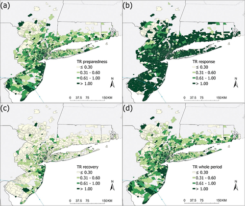
Figure 6. Average sentiment scores (SE) of tweets by county during (a) preparedness, (b) response, (c) recovery phases and (d) the whole period. Generally, scores below −0.1 indicate negative sentiment whereas scores above 0.1, positive sentiment. The interval −0.1 to 0.1 indicates mixed sentiment.
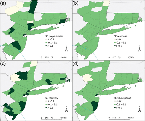
Figure 7. Average sentiment scores (SE) of tweets by zip code area during (a) preparedness, (b) response, (c) recovery phases and (d) the whole period. Generally, scores below −0.1 indicate negative sentiment whereas scores above 0.1, positive sentiment. The interval −0.1 to 0.1 indicates mixed sentiment.
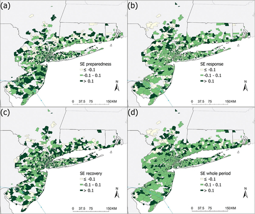
Table 3. The top five negative and positive Sandy-related tweets from all geotagged tweets.
Table 4. Descriptive statistics of Twitter indices and geographical, damage and socioeconomic variables at both county and zip code area levels.
Table 5. Tweet indices correlations at county and zip code area levels.
Table 6. Socioeconomic characteristics of zip code areas with top five Tweet Ratios and top three positive and negative sentiment scores.
Table 7. Top five positive and negative tweets in top three positive and negative zip code areas.
Data availability statement
Samples of the Twitter data during Hurricane Sandy can be accessed at the LSU Interdisciplinary Computation & Analysis of Resilience (ICAR) website: https://icar.lsu.edu/datasets/index.html.